 Menu
Menu
I have a site with a bar on the left that should stay with the user. So when the user scrolls, the sidebar scrolls along until it's lets say 5px from the top of the page. From then on, it should be locked in place there.
Of course it's possible that the view-port is smaller than the left bar, so the left bar doesn't fully fit in the screen. Not really dramatic though. However I would like it if the user scrolls to the bottom, the bottom of the sidebar 'hits' the footer of the page and then scrolls along with the page again.
Here's the code I've got: a basic setup of my site and an attempt of the first part of my question (but you'll see it doesn't work): jsfiddle.
I think the first part of the question is rather clear, but the second part might be a bit hard to understand, so here's a mockup: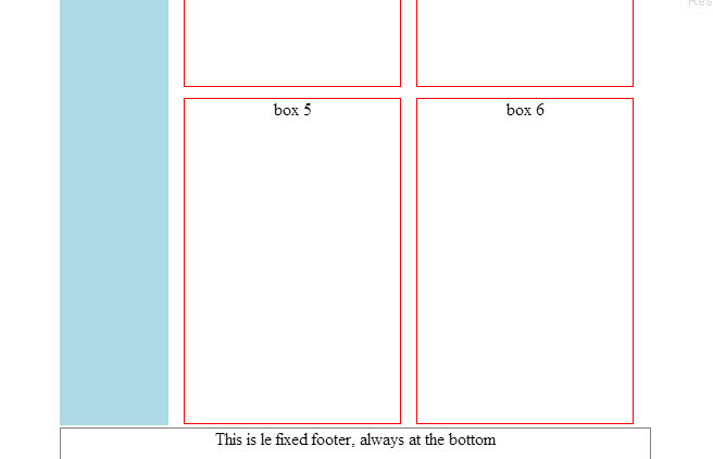 You can see that there is no text shown because the text is above the viewport.
Here's the js for my attempt for part one:
$(document).ready(function () {
    var theLoc = 5;
    var links = $('#left');
    $(window).scroll(function () {
        console.log('scroll');
        if (theLoc >= $(window).scrollTop()) {
            if (links.hasClass('fixed')) {
                links.removeClass('fixed');
            }
        } else {
            if (!links.hasClass('fixed')) {
                links.addClass('fixed');
            }
        }
    });
});
But possibly more a css issue:
.fixed {
    position:fixed;
}
I tried specifying the height etc again (because it show up like very big), but with no advance.
 711
711
I did this a while ago, here is the code I created to do this: View the JSFiddle.
(You may have to change your markup a bit, Im not sure how well this would work with the table'd layout you have, I would suggest using divs and floating them to layout your content.), alternatively, you can use the code/logic below and roll your own with your own layout.
Basically,
- Get our elements
- Get the position of the sidebar on page load
- Get #content.outerHeight()
Once we have these vars, on window scroll test to see if we are <= (less than or equal to) our original sidebarTop position or check if we are past the blogHeight, if any off the 2 are true, remove the sticky class, elseif our scroll is >= our original sidebar position, then add the .sticky class (which has the position: fixed).
Check the JSFiddle (Click here)
The Javascript is like so:
// Cache our vars for the fixed sidebar on scroll
var $sidebar = $('#sidebar-nav');

// Get & Store the original top of our #sidebar-nav so we can test against it
var sidebarTop = $sidebar.position().top;

// Edit the `- 10` to control when it should disappear when the footer is hit.
var blogHeight = $('#content').outerHeight() - 10;

// Add the function below to the scroll event
$(window).scroll(fixSidebarOnScroll);

// On window scroll, this fn is called (binded above)
function fixSidebarOnScroll(){

    // Cache our scroll top position (our current scroll position)
    var windowScrollTop = $(window).scrollTop();

    // Add or remove our sticky class on these conditions
    if (windowScrollTop >= blogHeight || windowScrollTop <= sidebarTop){
        // Remove when the scroll is greater than our #content.OuterHeight()
        // or when our sticky scroll is above the original position of the sidebar
        $sidebar.removeClass('sticky');
    }
    // Scroll is past the original position of sidebar
    else if (windowScrollTop >= sidebarTop){
        // Otherwise add the sticky if $sidebar doesnt have it already!
        if (!$sidebar.hasClass('sticky')){
            $sidebar.addClass('sticky');
        }
    }
}
The HTML:
<header>This is the header!</header>
<ul id="sidebar-nav" class="nav nav-list">
    <li><a href="#">Home</a></li>
    <li><a href="#">Blog</a></li>
</ul>
<div id="content">Content in here, scroll down to see the sticky in action!</div>
<div class="clear"></div>
<div id="footer">This is the #footer</div>
The CSS:
/* Sticky our navbar on window scroll */
#sidebar-nav.sticky {position:fixed;top:5px;}

/* Other styling for the html markup */
header {
    border:1px solid #aaa;
    background-color:yellow;
    margin-bottom:5px;
    height:50px;
}
#sidebar-nav {
    width:150px;
    border:1px solid #ddd;
    margin:0;
    padding:0;
    float:left;
}
#sidebar-nav li {
    list-style:none;
    border:1px solid #ddd;
    margin:10px;
    padding:2px;
}
#content {
    height:2000px;
    width:500px;
    padding:10px;
    border:1px solid #ddd;
    margin:0 0 10px 5px;
    float:right;
}
#footer {
    height:800px;
    border:1px solid green;
    background-color:#ddd;
}
.clear {
    clear:both;
}
:)
152
If you love us? You can donate to us via Paypal or buy me a coffee so we can maintain and grow! Thank you!
Donate Us With