 Menu
Menu
Here's an example where it is not working:
<Window x:Class="WpfApplication2.MainWindow"
        xmlns="http://schemas.microsoft.com/winfx/2006/xaml/presentation"
        xmlns:x="http://schemas.microsoft.com/winfx/2006/xaml"
        xmlns:d="http://schemas.microsoft.com/expression/blend/2008"
        xmlns:mc="http://schemas.openxmlformats.org/markup-compatibility/2006"
        xmlns:local="clr-namespace:WpfApplication2"
        mc:Ignorable="d"
        Title="MainWindow" Height="350" Width="525">
    <TreeView HorizontalAlignment="Stretch">
        <TreeViewItem Header="Stuff" HorizontalAlignment="Stretch" HorizontalContentAlignment="Stretch">
            <Grid HorizontalAlignment="Stretch">
                <Grid.ColumnDefinitions>
                    <ColumnDefinition Width="auto"/>
                    <ColumnDefinition Width="*"/>
                </Grid.ColumnDefinitions>
                <Label Grid.Column="0">Some random text</Label>
                <TextBox Grid.Column="1"></TextBox>

            </Grid>
        </TreeViewItem>
    </TreeView>
</Window>
I want the text box to stretch to the width of the window, but instead you get this:
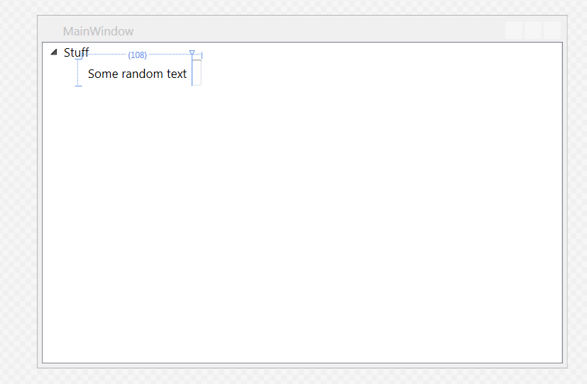

The textbox expands as you type, which is not what I want.
I am thinking now it might be possible to set a binding on the width of the 2nd column to the width of the TreeViewItem but I'm not sure how to do that.
I've tried putting the grid in assorted panels, but that doesn't work either. I have also set the HorizontalAlignment and HorizontalContentAlignment to Stretch on the textbox itself, but that also doesn't work.
Is this some limitation of the Grid control? Putting a textbox in a tree view by itself will make it expand as I want, but I need the label to be next to it and if there are multiple fields it looks MUCH better if all the textboxes are aligned.
UPDATE
Using a different ControlTemplate allows headers to stretch but contents still don't stretch.
<TreeView HorizontalAlignment="Stretch">
        <TreeViewItem Style="{DynamicResource StretchableTreeViewItemTemplate}" HorizontalAlignment="Stretch" Header="Stuff">
            <Grid HorizontalAlignment="Stretch">
                <Grid.ColumnDefinitions>
                    <ColumnDefinition Width="Auto"/>
                    <ColumnDefinition Width="*"/>
                </Grid.ColumnDefinitions>
                <Label Grid.Column="0">Some random text</Label>
                <TextBox Grid.Column="1" HorizontalAlignment="Stretch"></TextBox>
            </Grid>
        </TreeViewItem>
    </TreeView>


<Style x:Key="StretchableTreeViewItemTemplate" TargetType="TreeViewItem"
   BasedOn="{StaticResource {x:Type TreeViewItem}}">
        <Setter Property="HorizontalContentAlignment"
      Value="Center" />
        <Setter Property="Template">
            <Setter.Value>
                <ControlTemplate TargetType="TreeViewItem">
                    <StackPanel>
                        <Grid>
                            <Grid.ColumnDefinitions>
                                <ColumnDefinition Width="Auto"
                            MinWidth="19" />
                                <ColumnDefinition Width="*" />
                            </Grid.ColumnDefinitions>
                            <Grid.RowDefinitions>
                                <RowDefinition Height="Auto" />
                                <RowDefinition />
                            </Grid.RowDefinitions>
                            <!--
                         Note that the following do not work, but I believe the top 2 should?!
                         <ToggleButton IsChecked="{TemplateBinding IsExpanded}" ClickMode="Press" Name="Expander">
                         <ToggleButton IsChecked="{TemplateBinding Property=IsExpanded}" ClickMode="Press" Name="Expander">
                         <ToggleButton IsChecked="{TemplateBinding Path=IsExpanded}" ClickMode="Press" Name="Expander">
                    -->
                            <ToggleButton IsChecked="{Binding Path=IsExpanded, RelativeSource={RelativeSource TemplatedParent}}"
                      ClickMode="Press"
                      Name="Expander">
                                <ToggleButton.Style>
                                    <Style TargetType="ToggleButton">
                                        <Setter Property="UIElement.Focusable"
                      Value="false" />
                                        <Setter Property="FrameworkElement.Width"
                      Value="16" />
                                        <Setter Property="FrameworkElement.Height"
                      Value="16" />
                                        <Setter Property="Control.Template">
                                            <Setter.Value>
                                                <ControlTemplate TargetType="ToggleButton">
                                                    <Border Padding="5,5,5,5"
                            Background="#00FFFFFF"
                            Width="16"
                            Height="16">
                                                        <Path Fill="#00FFFFFF"
                            Stroke="#FF989898"
                            Name="ExpandPath">
                                                            <Path.Data>
                                                                <PathGeometry Figures="M0,0L0,6L6,0z" />
                                                            </Path.Data>
                                                            <Path.RenderTransform>
                                                                <RotateTransform Angle="135"
                                           CenterX="3"
                                           CenterY="3" />
                                                            </Path.RenderTransform>
                                                        </Path>
                                                    </Border>
                                                    <ControlTemplate.Triggers>
                                                        <Trigger Property="UIElement.IsMouseOver"
                               Value="True">
                                                            <Setter TargetName="ExpandPath"
                                Property="Shape.Stroke"
                                Value="#FF1BBBFA" />
                                                            <Setter TargetName="ExpandPath"
                                Property="Shape.Fill"
                                Value="#00FFFFFF" />
                                                        </Trigger>
                                                        <Trigger Property="ToggleButton.IsChecked"
                               Value="True">
                                                            <Setter TargetName="ExpandPath"
                                Property="UIElement.RenderTransform">
                                                                <Setter.Value>
                                                                    <RotateTransform Angle="180"
                                             CenterX="3"
                                             CenterY="3" />
                                                                </Setter.Value>
                                                            </Setter>
                                                            <Setter TargetName="ExpandPath"
                                Property="Shape.Fill"
                                Value="#FF595959" />
                                                            <Setter TargetName="ExpandPath"
                                Property="Shape.Stroke"
                                Value="#FF262626" />
                                                        </Trigger>
                                                    </ControlTemplate.Triggers>
                                                </ControlTemplate>
                                            </Setter.Value>
                                        </Setter>
                                    </Style>
                                </ToggleButton.Style>
                            </ToggleButton>
                            <Border x:Name="Bd"
                HorizontalAlignment="Stretch"
                BorderThickness="{TemplateBinding Border.BorderThickness}"
                BorderBrush="{TemplateBinding Border.BorderBrush}"
                Padding="{TemplateBinding Control.Padding}"
                Background="{TemplateBinding Panel.Background}"
                SnapsToDevicePixels="True"
                Grid.Column="1">
                                <ContentPresenter x:Name="PART_Header"
                            Content="{TemplateBinding HeaderedContentControl.Header}"
                            ContentTemplate="{TemplateBinding HeaderedContentControl.HeaderTemplate}"
                            ContentStringFormat="{TemplateBinding HeaderedItemsControl.HeaderStringFormat}"
                            ContentTemplateSelector="{TemplateBinding HeaderedItemsControl.HeaderTemplateSelector}"
                            ContentSource="Header"
                            HorizontalAlignment="{TemplateBinding Control.HorizontalContentAlignment}"
                            SnapsToDevicePixels="{TemplateBinding UIElement.SnapsToDevicePixels}" />
                            </Border>
                            <ItemsPresenter x:Name="ItemsHost"
                        Grid.Column="1"
                        Grid.Row="1" />
                        </Grid>
                    </StackPanel>
                    <ControlTemplate.Triggers>
                        <Trigger Property="TreeViewItem.IsExpanded"
               Value="False">
                            <Setter TargetName="ItemsHost"
                Property="UIElement.Visibility"
                Value="Collapsed" />
                        </Trigger>
                        <Trigger Property="ItemsControl.HasItems"
               Value="False">
                            <Setter TargetName="Expander"
                Property="UIElement.Visibility"
                Value="Hidden" />
                        </Trigger>
                        <Trigger Property="TreeViewItem.IsSelected"
               Value="True">
                            <Setter TargetName="Bd"
                Property="Panel.Background"
                Value="{DynamicResource {x:Static SystemColors.HighlightBrushKey}}" />
                            <Setter Property="TextElement.Foreground"
                Value="{DynamicResource {x:Static SystemColors.HighlightTextBrushKey}}" />
                        </Trigger>
                        <MultiTrigger>
                            <MultiTrigger.Conditions>
                                <Condition Property="TreeViewItem.IsSelected"
                     Value="True" />
                                <Condition Property="Selector.IsSelectionActive"
                     Value="False" />
                            </MultiTrigger.Conditions>
                            <Setter TargetName="Bd"
                Property="Panel.Background"
                Value="{DynamicResource {x:Static SystemColors.ControlBrushKey}}" />
                            <Setter Property="TextElement.Foreground"
                Value="{DynamicResource {x:Static SystemColors.ControlTextBrushKey}}" />
                        </MultiTrigger>
                        <Trigger Property="UIElement.IsEnabled"
               Value="False">
                            <Setter Property="TextElement.Foreground"
                Value="{DynamicResource {x:Static SystemColors.GrayTextBrushKey}}" />
                        </Trigger>
                    </ControlTemplate.Triggers>
                </ControlTemplate>
            </Setter.Value>
        </Setter>
    </Style>
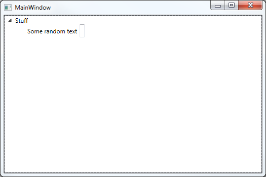
Results:
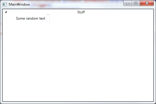
Trying with Pikoh's solution:
<local:StretchingTreeView HorizontalAlignment="Stretch">
    <local:StretchingTreeViewItem HorizontalAlignment="Stretch" Header="Stuff">
        <Grid HorizontalAlignment="Stretch">
            <Grid.ColumnDefinitions>
                <ColumnDefinition Width="Auto"/>
                <ColumnDefinition Width="*"/>
            </Grid.ColumnDefinitions>
            <Label Grid.Column="0">Some random text</Label>
            <TextBox Grid.Column="1" HorizontalAlignment="Stretch"></TextBox>
        </Grid>
    </local:StretchingTreeViewItem>
</local:StretchingTreeView>
 238
238
Try something like this:
<TextBox Grid.Column="1" Width="{Binding Path=ActualWidth, RelativeSource={RelativeSource AncestorType={x:Type Grid}}, Mode=OneWay}"></TextBox>
Edit
Ok,i've found one solution Here. It basically creates a new class inheriting Treeview:
class StretchingTreeView : TreeView
{
    protected override DependencyObject GetContainerForItemOverride()
    {
        return new StretchingTreeViewItem();
    }

    protected override bool IsItemItsOwnContainerOverride(object item)
    {
        return item is StretchingTreeViewItem;
    }
}

class StretchingTreeViewItem : TreeViewItem
{
    public StretchingTreeViewItem()
    {
        this.Loaded += new RoutedEventHandler(StretchingTreeViewItem_Loaded);
    }

    private void StretchingTreeViewItem_Loaded(object sender, RoutedEventArgs e)
    {
        // The purpose of this code is to stretch the Header Content all the way accross the TreeView.
        if (this.VisualChildrenCount > 0)
        {
            Grid grid = this.GetVisualChild(0) as Grid;
            if (grid != null && grid.ColumnDefinitions.Count == 3)
            {
                // Remove the middle column which is set to Auto and let it get replaced with the
                // last column that is set to Star.
                grid.ColumnDefinitions.RemoveAt(1);
            }
        }
    }

    protected override DependencyObject GetContainerForItemOverride()
    {
        return new StretchingTreeViewItem();
    }

    protected override bool IsItemItsOwnContainerOverride(object item)
    {
        return item is StretchingTreeViewItem;
    }
}
Example usage:
<Window x:Class="WpfApplication2.Window2"
    xmlns="http://schemas.microsoft.com/winfx/2006/xaml/presentation"
    xmlns:x="http://schemas.microsoft.com/winfx/2006/xaml"
    xmlns:local="clr-namespace:WpfApplication2"
    Title="Window2" Height="300" Width="300">
<Grid>

    <local:StretchingTreeView HorizontalAlignment="Stretch" >

        <local:StretchingTreeViewItem Header="Stuff" HorizontalAlignment="Stretch" HorizontalContentAlignment="Stretch" >
            <Grid HorizontalAlignment="Stretch" >
                <Grid.ColumnDefinitions>
                    <ColumnDefinition Width="auto"/>
                    <ColumnDefinition Width="*"/>
                </Grid.ColumnDefinitions>
                <Label Grid.Column="0">Some random text</Label>
                <TextBox Grid.Column="1" ></TextBox>

            </Grid>
        </local:StretchingTreeViewItem>
    </local:StretchingTreeView>
</Grid>
The core of the issue (and the way to fix it) is described here:
The default ControlTemplate for the TreeViewItem uses a grid of 3 columns x 2 rows, defined such that the content cannot stretch horizontally. The author also gives a modified style, that changes the grid so that the content can stretch.
Note that the modified style sets the HorizontalContentAlignment of TreeViewItem to Center, and that the ControlTemplate uses this property for aligning the content.
To achieve the desired effect, either set HorizontalContentAlignment to Stretch in the modified style, or override just that property on the TreeView (or specific TreeViewItems).
Missing the BasedOn="{StaticResource {x:Type TreeViewItem}}" part causes the TreeViewItem to revert to using the default ControlTemplate, with the non-stretchable grid.
<Style TargetType="TreeViewItem" BasedOn="{StaticResource {x:Type TreeViewItem}}">
    <Setter Property="HorizontalContentAlignment" Value="Stretch"/>
</Style>
In a HierarchicalDataTemplate, the effect would be achieved by using the ItemContainerStyle property.
@pikoh's method of deriving from TreeView and TreeViewItem achieves the same, by modifying the grid from code.
Complete example:
<Window x:Class="WpfApp1.MainWindow"
        xmlns="http://schemas.microsoft.com/winfx/2006/xaml/presentation"
        xmlns:x="http://schemas.microsoft.com/winfx/2006/xaml"
        xmlns:d="http://schemas.microsoft.com/expression/blend/2008"
        xmlns:mc="http://schemas.openxmlformats.org/markup-compatibility/2006"
        xmlns:local="clr-namespace:WpfApp1"
        mc:Ignorable="d"
        Title="MainWindow" Height="450" Width="800">
    <Window.Resources>
        <Style TargetType="TreeViewItem" BasedOn="{StaticResource {x:Type TreeViewItem}}">
            <Setter Property="HorizontalContentAlignment" Value="Center" />
            <Setter Property="Template">
                <Setter.Value>
                    <ControlTemplate TargetType="TreeViewItem">
                        <StackPanel>
                            <Grid>
                                <Grid.ColumnDefinitions>
                                    <ColumnDefinition Width="Auto"
                                MinWidth="19" />
                                    <ColumnDefinition Width="*" />
                                </Grid.ColumnDefinitions>
                                <Grid.RowDefinitions>
                                    <RowDefinition Height="Auto" />
                                    <RowDefinition />
                                </Grid.RowDefinitions>
                                <!-- Note that the following do not work, but I believe the top 2 should?! -->
                                <ToggleButton IsChecked="{Binding Path=IsExpanded, RelativeSource={RelativeSource TemplatedParent}}" ClickMode="Press" Name="Expander">
                                    <ToggleButton.Style>
                                        <Style TargetType="ToggleButton">
                                            <Setter Property="UIElement.Focusable" Value="false" />
                                            <Setter Property="FrameworkElement.Width" Value="16" />
                                            <Setter Property="FrameworkElement.Height" Value="16" />
                                            <Setter Property="Control.Template">
                                                <Setter.Value>
                                                    <ControlTemplate TargetType="ToggleButton">
                                                        <Border Padding="5,5,5,5" Background="#00FFFFFF" Width="16" Height="16">
                                                            <Path Fill="#00FFFFFF" Stroke="#FF989898" Name="ExpandPath">
                                                                <Path.Data>
                                                                    <PathGeometry Figures="M0,0L0,6L6,0z" />
                                                                </Path.Data>
                                                                <Path.RenderTransform>
                                                                    <RotateTransform Angle="135" CenterX="3" CenterY="3" />
                                                                </Path.RenderTransform>
                                                            </Path>
                                                        </Border>
                                                        <ControlTemplate.Triggers>
                                                            <Trigger Property="UIElement.IsMouseOver" Value="True">
                                                                <Setter TargetName="ExpandPath" Property="Shape.Stroke" Value="#FF1BBBFA" />
                                                                <Setter TargetName="ExpandPath" Property="Shape.Fill" Value="#00FFFFFF" />
                                                            </Trigger>
                                                            <Trigger Property="ToggleButton.IsChecked" Value="True">
                                                                <Setter TargetName="ExpandPath" Property="UIElement.RenderTransform">
                                                                    <Setter.Value>
                                                                        <RotateTransform Angle="180" CenterX="3" CenterY="3" />
                                                                    </Setter.Value>
                                                                </Setter>
                                                                <Setter TargetName="ExpandPath" Property="Shape.Fill" Value="#FF595959" />
                                                                <Setter TargetName="ExpandPath" Property="Shape.Stroke" Value="#FF262626" />
                                                            </Trigger>
                                                        </ControlTemplate.Triggers>
                                                    </ControlTemplate>
                                                </Setter.Value>
                                            </Setter>
                                        </Style>
                                    </ToggleButton.Style>
                                </ToggleButton>
                                <Border x:Name="Bd"
                    HorizontalAlignment="Stretch"
                    BorderThickness="{TemplateBinding Border.BorderThickness}"
                    BorderBrush="{TemplateBinding Border.BorderBrush}"
                    Padding="{TemplateBinding Control.Padding}"
                    Background="{TemplateBinding Panel.Background}"
                    SnapsToDevicePixels="True"
                    Grid.Column="1">
                                    <ContentPresenter x:Name="PART_Header"
                                Content="{TemplateBinding HeaderedContentControl.Header}"
                                ContentTemplate="{TemplateBinding HeaderedContentControl.HeaderTemplate}"
                                ContentStringFormat="{TemplateBinding HeaderedItemsControl.HeaderStringFormat}"
                                ContentTemplateSelector="{TemplateBinding HeaderedItemsControl.HeaderTemplateSelector}"
                                ContentSource="Header"
                                HorizontalAlignment="{TemplateBinding Control.HorizontalContentAlignment}"
                                SnapsToDevicePixels="{TemplateBinding UIElement.SnapsToDevicePixels}" />
                                </Border>
                                <ItemsPresenter x:Name="ItemsHost" Grid.Column="1" Grid.Row="1" />
                            </Grid>
                        </StackPanel>
                        <ControlTemplate.Triggers>
                            <Trigger Property="TreeViewItem.IsExpanded" Value="False">
                                <Setter TargetName="ItemsHost" Property="UIElement.Visibility" Value="Collapsed" />
                            </Trigger>
                            <Trigger Property="ItemsControl.HasItems" Value="False">
                                <Setter TargetName="Expander" Property="UIElement.Visibility" Value="Hidden" />
                            </Trigger>
                            <Trigger Property="TreeViewItem.IsSelected" Value="True">
                                <Setter TargetName="Bd" Property="Panel.Background" Value="{DynamicResource {x:Static SystemColors.HighlightBrushKey}}" />
                                <Setter Property="TextElement.Foreground"  Value="{DynamicResource {x:Static SystemColors.HighlightTextBrushKey}}" />
                            </Trigger>
                            <MultiTrigger>
                                <MultiTrigger.Conditions>
                                    <Condition Property="TreeViewItem.IsSelected" Value="True" />
                                    <Condition Property="Selector.IsSelectionActive" Value="False" />
                                </MultiTrigger.Conditions>
                                <Setter TargetName="Bd"  Property="Panel.Background"  Value="{DynamicResource {x:Static SystemColors.ControlBrushKey}}" />
                                <Setter Property="TextElement.Foreground" Value="{DynamicResource {x:Static SystemColors.ControlTextBrushKey}}" />
                            </MultiTrigger>
                            <Trigger Property="UIElement.IsEnabled" Value="False">
                                <Setter Property="TextElement.Foreground" Value="{DynamicResource {x:Static SystemColors.GrayTextBrushKey}}" />
                            </Trigger>
                        </ControlTemplate.Triggers>
                    </ControlTemplate>
                </Setter.Value>
            </Setter>
        </Style>
    </Window.Resources>
    <TreeView HorizontalAlignment="Stretch">
        <TreeView.Resources>
            <Style TargetType="TreeViewItem" BasedOn="{StaticResource {x:Type TreeViewItem}}">
                <Setter Property="HorizontalContentAlignment" Value="Stretch"/>
            </Style>
        </TreeView.Resources>
        <TreeViewItem Header="Stuff" HorizontalAlignment="Stretch">
            <Grid HorizontalAlignment="Stretch">
                <Grid.ColumnDefinitions>
                    <ColumnDefinition Width="auto"/>
                    <ColumnDefinition Width="*"/>
                </Grid.ColumnDefinitions>
                <Label Grid.Column="0">Some random text</Label>
                <TextBox Grid.Column="1"></TextBox>
            </Grid>
        </TreeViewItem>
    </TreeView>
</Window>

20
If you love us? You can donate to us via Paypal or buy me a coffee so we can maintain and grow! Thank you!
Donate Us With

