 Menu
Menu
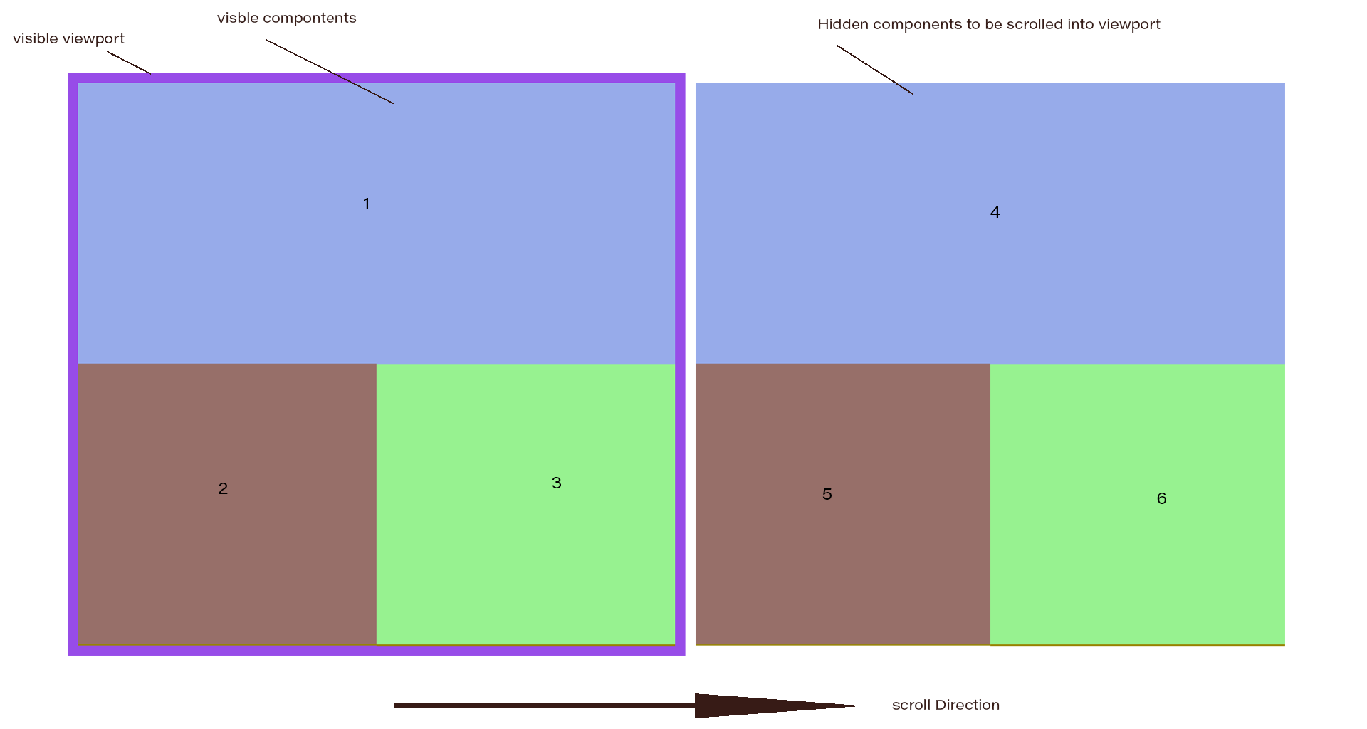
I need to have different layouts for a dashboard. I need only horizontal scroll for layout-container if the items exceed to fit in a visible viewport. I came across a layout with the following requirements.
I have created the layout style using CSS-flexbox, but could not get the horizontal scroll, got the vertical scroll only.
html,
body {
  height: 100%;
  margin: 0px;
}
* {
  box-sizing: border-box;
}
.flexbox {
  height: 100%;
  width: 100%;
  display: flex;
  flex-wrap: wrap;
  overflow-x: auto;
  background-color: lightgreen;
}
.item {
  min-width: 50%;
  min-height: 50%;
  flex: 1 0 0;
  border: 1px solid;
}
.item:nth-child(odd) {
  background-color: lightblue;
}

.item:nth-child(even) {
  background-color: lightslategray;
}
.item1 {
  min-width: 100%;
}
<div class="flexbox">
<div class="item item1">1</div>
<div class="item item2">2</div>
<div class="item item3">3</div>
<div class="item item1">4</div>
<div class="item item2">5</div>
<div class="item item3">6</div>
</div>https://codepen.io/TechnoGeek/pen/GdZodo
So, I thought, CSS grid can help with this. So I tried something but did not understand how to get it.
html,
body {
  height: 100%;
  margin: 0px;
}

.grid {
  display: grid;
  height: 100%;
  background-color: lightgreen;
  grid-template-columns: repeat(2, 1fr);
  grid-template-row: repeat(2, 1fr);
  grid-gap: 5px;
  /*   grid-auto-flow: column; */
}

.item {
  border: 1px solid;
}

.item:nth-child(odd) {
  background-color: lightblue;
}

.item:nth-child(even) {
  background-color: lightslategray;
}

.item1 {
  grid-column: 1/3;
}
<div class="grid">
<div class="item item1">1</div>
<div class="item item2">2</div>
<div class="item item3">3</div>
<div class="item item1">4</div>
<div class="item item2">5</div>
<div class="item item3">6</div>
</div>https://codepen.io/TechnoGeek/pen/BxKoaG
In the grid layout, items are shrinking to fit within the layout.
The number of items inside the container is dynamic. Irrespective of the item count the layout must maintain the structure for each visible group.
Can someone help how to achieve this?
Thanks in advance.
 915
915
I found a satisfactory answer using CSS Grid layout.
In the grid layout, items are shrinking to fit within the layout.
I have defined the grid lines using fr in my question that is why the items are shrinking. Now I have used % because I want the cell items to flow out of visible area to produce scroll if needed.
and span keyword in defining grid cell areas helped a lot for auto placement of grid cells.
From MDN:
span && [ <integer> || <custom-ident> ]Contributes a grid span to the grid item’s placement such that the corresponding edge of the grid item’s grid area is n lines from the opposite edge.
html,
body {
  height: 100%;
  margin: 0px;
}

.grid {
  display: grid;
  height: 100%;
  background-color: lightgreen;
  grid-template-columns: repeat(2, 50%);
  grid-template-rows: repeat(2, 50%);
  /*grid-gap: 5px;*/
  grid-auto-columns: 50%;
  grid-auto-flow: column;
}

.item {
  border: 1px solid;
  grid-area: span 1 / span 1;
}

.item:nth-child(odd) {
  background-color: lightblue;
}

.item:nth-child(even) {
  background-color: lightslategray;
}

.item1 {
  grid-area: span 1/ span 2;
}
<div class="grid">
<div class="item item1">1</div>
<div class="item item2">2</div>
<div class="item item3">3</div>
<div class="item item1">4</div>
<div class="item item2">5</div>
<div class="item item3">6</div>
</div>If you love us? You can donate to us via Paypal or buy me a coffee so we can maintain and grow! Thank you!
Donate Us With