 Menu
Menu
Using Delphi Tokyo 10.2, with Stylized Themes. I am trying to highlight components on the form, e.g., ComboBoxes, EditTexts, etc. For example, if a user entered invalid data, I would like to highlight the component.
In the past, we just colored components Red, and the color persisted through resizes/movement/repaints in general. Now with theming, we need to do a bit more to get the color to show and persist.
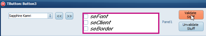
I have tried disabling each component's StyleElements [seFont, seClient, seBorder] properties to force show the color. This works but seems kludgy, particularly when there are many components being validated. Also, simply coloring a component red might not look right with some of the themes.
I have also tried simply drawing a red rectangle around the components using WinAPI SetRop2(..). E.g., here is some clever code, I tweaked to take a TWinControl and Draw a redbox around it; I can also remove the redbox using a similar call. This works:
…but doesn't persist through repaints, obviously. It seems like adding custom paint methods might be an overkill here. Unless, there is some better way?
Other things I have considered:
All of the components sit on panels, and I have considered using a protected hack to draw red rects on the panel's canvas around the components, but again, more custom paint routines…
I am also considering drawing TShapes dynamically as needed, but this strikes me as silly.
There must be others in the same situation, e.g., data entry validation that worked neatly in older versions of Delphi, but doesn't look so good when themed. What is the best approach when using themes? The SetRop2(..) approach seems to be the cleanest, but can someone suggest a simple way to make the color persist? I would welcome other ideas, too. Thank you.
EDIT
So maybe, just dynamically drawing TShapes around the invalid responses isn't so bad. They persist through repaints and don't descend from TWinControl, meaning they automatically show up behind the control they are highlighting.
This works quite well for me and I hope it's helpful to others.
// assuming owning control will be free'd properly and
// will in turn free HI_LITE Box.
//
// tantamount to adding an instance variable, TShape, to existing Control,
// since class helpers don't allow. And I don't want to descend
// new controls just to have a hiLiteBox Instance Variable.

procedure HiLiteMe(aControl : TWinControl; HILITE_FLAG : Boolean = TRUE; aColor : TColor = clRed);
const OFFSET = 4;                         // specify the offset of the border size of the box.
const BOX_NAME_PREFIX = 'HI_LITE_BOX_';

var
   hiLiteBox : TShape;      // reference created on stack, but object created on the heap,
   uniqueBoxName : String;    // so use the persistent aControl's owned component list to maintain the reference.
begin
  uniqueBoxName := BOX_NAME_PREFIX + aControl.Name;              // uniquename for each associated HiLiteBox.
  HiLiteBox := aControl.FindComponent(uniqueBoxName) as TShape;  // phishing for the HiLiteBox if it was previously created.

  if NOT Assigned(hiLiteBox) then         // create HiLiteBox and make persist outside this proc.
  begin
    if NOT HILITE_FLAG then exit;         // don't create a box if we're just going to hide it anyway.
    hiLiteBox := TShape.Create(aControl); // Create HiLiteBox, setting aControl as owner, quicker retrieval using aControl.findComponent
    hiLiteBox.Parent := aControl.Parent;  // Render the box on the control's parent, e.g., panel, form, etc.
    hiLiteBox.Name :=  uniqueBoxName;
    hiLiteBox.Pen.Color := aColor;        // Color the Pen
    hiLiteBox.Pen.Width := offset-1;      // Make the Pen just slightly smaller than the offset.
    hiLiteBox.Brush.Color := clWindow;    // Choose a brush color, to fill the space between the pen and the Control
    hiLiteBox.Left := aControl.Left - offset;
    hiLiteBox.Width := aControl.Width + offset*2;
    hiLiteBox.Top := aControl.Top - offset;
    hiLiteBox.Height := aControl.Height + offset*2;
  end;

  hiLiteBox.Visible := HILITE_FLAG; // Show/Hide HiLite as appropriate.
end;
Called like this to HiLite with a red and blue box...
begin
  HiLiteMe(checkListBox1, TRUE, clRed);   // Draw a RedBox around the CheckListBox, e.g., Invalid.
  HiLiteMe(bitBtn3, TRUE, clBlue);        // Draw a Blue Box around the Button, e.g., Required.
end;
Called like this to remove HiLites…
begin
  HiLiteMe(checkListBox1, FALSE);   // Draw a RedBox around the CheckListBox, e.g., Invalid.
  HiLiteMe(bitBtn3, FALSE);        // Draw a Blue Box around the Button, e.g., Required.
end;
 912
912
I suggest having a red TShape on only one side of the control (e.g. just the left or bottom) that you show or hide.
198
If you love us? You can donate to us via Paypal or buy me a coffee so we can maintain and grow! Thank you!
Donate Us With

