 Menu
Menu
Question: Why does my CPU register ~30% when blur is applied versus ~6% when no blur is applied to an animated object?
Details:
I have a set of randomly generated items on a page that have a CSS animation assigned (in a CSS file) and randomly generated values for width, height, and importantly, blur, applied inline.
CSS file styles looks like:
animation-name: rise;
animation-fill-mode: forwards;
animation-timing-function: linear;
animation-iteration-count: 1;
-webkit-backface-visibility: hidden;
-webkit-perspective: 1000;
-webkit-transform: translate3d(0,0,0);

transform: translateZ(0);
width, height and blur are applied inline via style attribute.
<div class="foo" style="width:99px;height:99px;
                        filter:blur(2px);
                        -webkit-filter:blur(2px) opacity(0.918866247870028);
                        -moz-filter:blur(2px) opacity(0.918866247870028);
                        -o-filter:blur(2px) opacity(0.918866247870028);
                        -ms-filter:blur(2px) opacity(0.918866247870028);"></div>
With the blur enabled my CPU usage is ~30%. When I disable the blur, CPU usage goes down to ~6%.
What's happening here? Is chrome only able to GPU accelerate when no blur is applied? If so, why?
Update 1:
The animation rise looks as follows:
@keyframes rise {
    0% {
        transform: translateY(0px);
    }
    100% {
        transform: translateY(-1000px);
    }
}
 649
649
I don’t think the blur is actually causing your issues, it just seems to make it more noticeable than before. The problem is that the transform: translateY in your animation is overwriting the transform: translateZ(0) you’re using to force GPU acceleration.
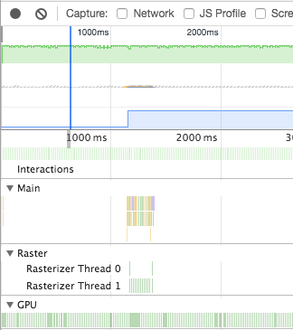
This is a timeline recording for the the code you’re running right now, notice how there’s all this activity on the main and raster threads:
Now compare this to a recording where I applied will-change: transform to the .foo:
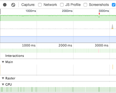
No activity on the main and raster whatsoever.
There’s two steps to applying this fix:
Apply will-change: transform to .foo. This will let the browser know you intend to change that property and have it render that element on the GPU to account for this.
No versions of Edge and IE support will-change at the moment. Therefore we’ll use transform: translate3d(0, -1000px, 0); in the animation to force GPU acceleration. Note this is a hack, so we’ll detect support for will-change and use transform: translateY in browsers that support it.
Final code:
@keyframes rise {
    0% {
        transform: translate3d(0, 0, 0);
    }
    100% {
        transform: translate3d(0, 1000px, 0);
  }
}

@supports (will-change: transform) {
  @keyframes rise {
      0% {
          transform: translateY(0px);
      }
      100% {
          transform: translateY(1000px);
    }
  }
}

div {
  width: 100px;
  height: 100px;
  background: #f00;
  animation: rise forwards 2s linear infinite;
  will-change: transform;
}
See here for a working version: http://jsbin.com/mosuvikoto/edit?html,css,output
159
If you love us? You can donate to us via Paypal or buy me a coffee so we can maintain and grow! Thank you!
Donate Us With