 Menu
Menu
There have been a few articles recently about Google's new imageless buttons:
I really like how these new buttons work in Gmail. How can I use these or similar buttons on my site? Are there any open source projects with a similar look & feel?
If I wanted to roll my own button package like this using JQuery/XHTML/CSS, what elements could I use? My initial thoughts are:
Standard <input type="button"> with css to improve the look (the design article talked mostly about the css/imges involves.)
Jquery javascript to bring up a custom dialog rooted to the button on the "onclick" event which would have <a> tags in them and a search bar for filtering? Would a table layout for that popup be sane?
I'm terrible at reverse engineering things on the web, what are some of the tools that I could use to help reverse engineer these buttons? Using Firefox's web developer toolbar I can't really see the css or javascript (even if it is minified) that is used on the buttons popup dialogs. What browser tool or other method could I use to peek at them and get some ideas?
I'm not looking to steal any of Google's IP, just get an idea of how I could create similar button functionality.
 417
417
-- EDIT -- I didn't see the link in the original post. Sorry! Will try and re-write to reflect actual question
StopDesign has an excellent post on this here. [edit 20091107] These were released as part of the closure library: see the button demo.
Basically the custom buttons he shows are created using a simple bit of CSS.
He originally used 9 tables to get the effect: 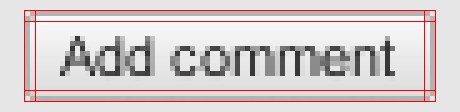
But later he used a simple 1px left and right margin on the top and bottom borders to achieve the same effect.
The gradient is faked by using three layers: 
All of the code can be found at the Custom Buttons 3.1 page. (although the gradient without the image is only working in Firefox and Safari)
1 - Insert the following CSS:
/* Start custom button CSS here ---------------------------------------- */ .btn { display:inline-block; background:none; margin:0; padding:3px 0; border-width:0; overflow:visible; font:100%/1.2 Arial,Sans-serif; text-decoration:none; color:#333; } * html button.btn { padding-bottom:1px; } /* Immediately below is a temporary hack to serve the following margin values only to Gecko browsers Gecko browsers add an extra 3px of left/right padding to button elements which can't be overriden. Thus, we use -3px of left/right margin to overcome this. */ html:not([lang*=""]) button.btn { margin:0 -3px; } .btn span { background:#f9f9f9; z-index:1; margin:0; padding:3px 0; border-left:1px solid #ccc; border-right:1px solid #bbb; } * html .btn span { padding-top:0; } .btn span span { background:none; position:relative; padding:3px .4em; border-width:0; border-top:1px solid #ccc; border-bottom:1px solid #bbb; } .btn b { background:#e3e3e3; position:absolute; z-index:2; bottom:0; left:0; width:100%; overflow:hidden; height:40%; border-top:3px solid #eee; } * html .btn b { top:1px; } .btn u { text-decoration:none; position:relative; z-index:3; } /* pill classes only needed if using pill style buttons ( LEFT | CENTER | RIGHT ) */ button.pill-l span { border-right-width:0; } button.pill-l span span { border-right:1px solid #ccc; } button.pill-c span { border-right-style:none; border-left-color:#fff; } button.pill-c span span { border-right:1px solid #ccc; } button.pill-r span { border-left-color:#fff; } /* only needed if implementing separate hover state for buttons */ .btn:hover span, .btn:hover span span { cursor:pointer; border-color:#9cf !important; color:#000; } /* use if one button should be the 'primary' button */ .primary { font-weight:bold; color:#000; } 2 - Use one of the following ways to call it (more can be found in the links above)
<a href="#" class="btn"><span><span><b> </b><u>button</u></span></span></a> or
<button type="button" class="btn"><span><span><b> </b><u>button</u></span></span></button> If you love us? You can donate to us via Paypal or buy me a coffee so we can maintain and grow! Thank you!
Donate Us With

