 Menu
Menu
Recently I dug a bit more into mobile UX design and I found a interesting topic regarding 1 hand / thumb selection.
The main idea is that you have 2 triangle areas that are clickable with your thumb. I did try to find a solution via CSS or jQuery to create 2 triangle areas that are click/touch-able with but I failed.
I tried:
- icon fonts
- svgs (this did not work, since svgs are still rectangular)
- divs with borders shaped into a triangle
- canvas (did not work out so well)
- ASCII fonts
- jQuery, nothing really useful on this front :/
- rotated divs (CSS transform)
Do you have any suggestion about how I can achieve 2 responsive triangles that fit the screen, do not overlap as in this screen, that are clickable and accessible in the DOM?
The main point in terms of UI is that the users need so see the click / touchable areas (visually) in order to determine the possibility of interaction. Getting the area of a click (in a triangle style) is most likely not the problem. However, showing the users that they need to interact on a certain area is key.
I do not want to have scaled or different versions of pictures! Id like to see CSS or JavaScript solution...
I guess the biggest problem is that the triangle is not proportional + the responsiveness
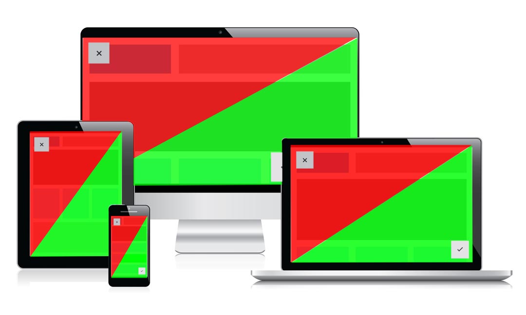
This picture should illustrate the idea:
 626
626
Your best bet may be to use a simple SVG
<svg viewBox="0 0 1 1" preserveAspectRatio="none">
    <polyline points="0,0  1,0  0,1" fill="#F00" id="top"/>
    <polyline points="1,0  1,1  0,1" fill="#0F0" id="bottom"/>
</svg>
You can use CSS to style the elements on hover:
#top:hover {
    fill: #880000;
}
And jQuery to detect if an element has been clicked:
$('#top').click(function () { ...
Here's a demo: http://codepen.io/Godwin/pen/mIqlA
52
If you love us? You can donate to us via Paypal or buy me a coffee so we can maintain and grow! Thank you!
Donate Us With