 Menu
Menu
I use a flexbox container that includes two divs of equal width. The left displays an image and the right some text. The code wraps the items for Google Chrome but in Internet Explorer 11, it moves the right part on top of the left. How could I fix this? I tried to use flex: auto on both children, as well as flex-grow: 1, flex-shrink: 1 and flex-basis: 0 / flex-basis: auto. I also tried to add px or % to 0 but they all give the same results...

.d1 {
  display: flex;
  flex-wrap: wrap;
  padding: 4%;
}

.image-container {
  align-items: center;
  display: flex;
  flex: 1;
  justify-content: center;
}

.d1 .text {
  flex: 1;
  padding: 2%;
}
<div class="d1">
<div class="image-container">
<img src="https://emilythompsonflowers.com/wp-content/uploads/2016/08/hippie-flower-300x300.jpg">
</div>
<div class="text">
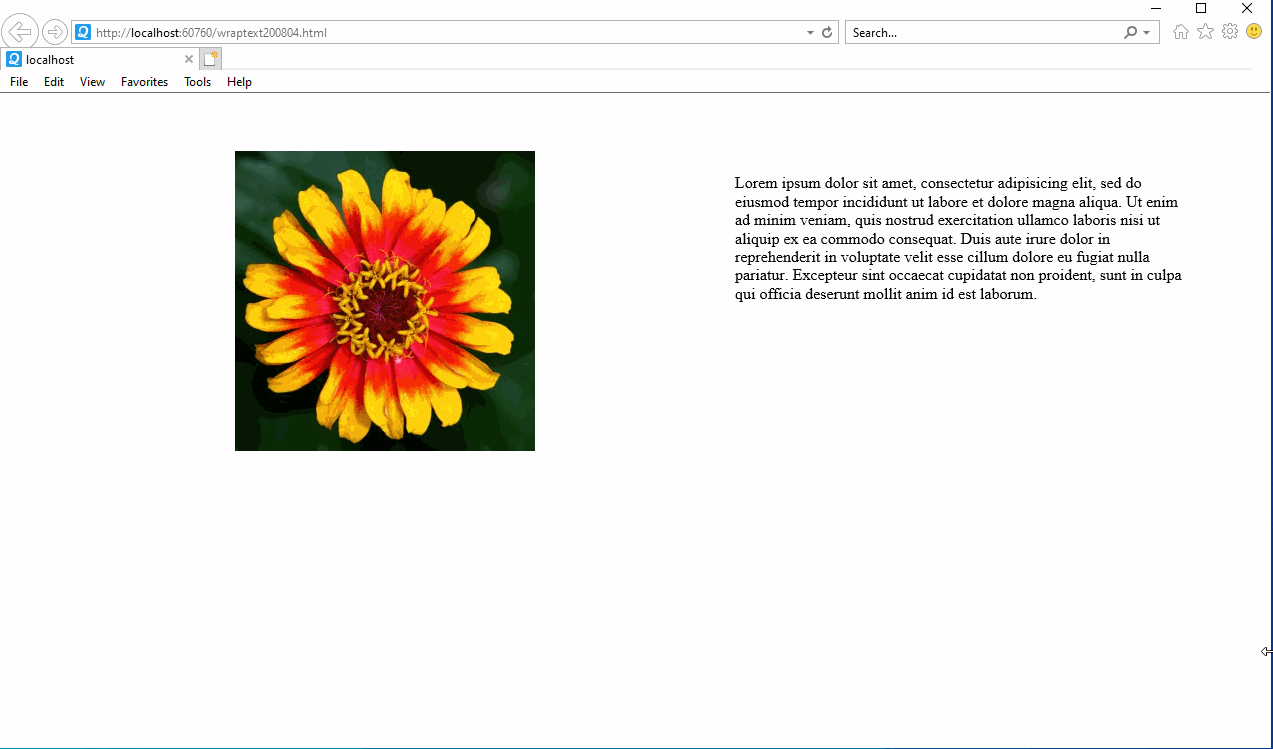
Lorem ipsum dolor sit amet, consectetur adipisicing elit, sed do eiusmod tempor incididunt ut labore et dolore magna aliqua. Ut enim ad minim veniam, quis nostrud exercitation ullamco laboris nisi ut aliquip ex ea commodo consequat. Duis aute irure dolor
in reprehenderit in voluptate velit esse cillum dolore eu fugiat nulla pariatur. Excepteur sint occaecat cupidatat non proident, sunt in culpa qui officia deserunt mollit anim id est laborum.
</div>
</div> 839
839
If you add content and/or width and/or flex-basis to one or more items, and the items grow to exceed 800px (the width of the container), then your flex items will wrap. But note, they won't wrap based on your re-sizing of the browser window, because the container doesn't occupy width: 100% of the viewport.
Note also that Internet Explorer 11 supports the modern display: flex specification however it has a number of bugs in the implementation.
Internet Explorer doesn't fully support Flexbox due to: Partial support is due to large amount of bugs present (see known issues).
If you want to cause them to wrap once they become too wide you must add the flex-wrap property with a value of wrap , or use the shorthand flex-flow with values of row wrap or column wrap . Items will then wrap in the container.
You could refer to this code sample. The image is original size at first and the left and right parts are of the same width. It works well in IE 11 :
.d1 {
  display: flex;
  flex-wrap: wrap;
  padding: 4%;
}

.image-container {
  align-items: center;
  display: flex;
  flex: 1;
  justify-content: center;
  min-width: 200px;
}

.d1 .text {
  flex: 1;
  padding: 2%;
}

/* adjustment */
img {
  width: 100%;
  height: auto;
  max-width: 300px;
}
<div class="d1">
<div class="image-container">
<img src="https://emilythompsonflowers.com/wp-content/uploads/2016/08/hippie-flower-300x300.jpg">
</div>
<div class="text">
Lorem ipsum dolor sit amet, consectetur adipisicing elit, sed do eiusmod tempor incididunt ut labore et dolore magna aliqua. Ut enim ad minim veniam, quis nostrud exercitation ullamco laboris nisi ut aliquip ex ea commodo consequat. Duis aute irure dolor
in reprehenderit in voluptate velit esse cillum dolore eu fugiat nulla pariatur. Excepteur sint occaecat cupidatat non proident, sunt in culpa qui officia deserunt mollit anim id est laborum.
</div>
</div>Result in IE:
121
Add flex: auto to the first child.
For image scaling, add img { width: 100%; height: auto; }
.d1 {
  display: flex;
  flex-wrap: wrap;
  padding: 4%;
}

.image-container {
  align-items: center;
  display: flex;
  flex: auto; /* adjustment */
  justify-content: center;
  max-width: 250px; /* optional; limits image size */
}


/* image scaling */
img {
  width: 100%;
  height: auto;
}

.d1 .text {
  flex: 1;
  padding: 2%;
}
<div class="d1">
<div class="image-container">
<img src="https://emilythompsonflowers.com/wp-content/uploads/2016/08/hippie-flower-300x300.jpg">
</div>
<div class="text">
Lorem ipsum dolor sit amet, consectetur adipisicing elit, sed do eiusmod tempor incididunt ut labore et dolore magna aliqua. Ut enim ad minim veniam, quis nostrud exercitation ullamco laboris nisi ut aliquip ex ea commodo consequat. Duis aute irure dolor
in reprehenderit in voluptate velit esse cillum dolore eu fugiat nulla pariatur. Excepteur sint occaecat cupidatat non proident, sunt in culpa qui officia deserunt mollit anim id est laborum.
</div>
</div>If you love us? You can donate to us via Paypal or buy me a coffee so we can maintain and grow! Thank you!
Donate Us With