 Menu
Menu
How can I create a button so that on hover the background colour fills the element from center to left and right of the element.
Example :
I know how to use CSS3 transitions and can get it to animate to the desired shape but can't get it to transition from center outwards.
The shape does not change size I just want to fill it using a transition.
 780
780
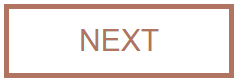
Another way to achieve a similar effect would be to use linear-gradient as the background-image, position the image at the center of the element and then transition background-size from 0% 100% to 100% 100% on hover. Incrementing background-size in X axis from 0% to 100% would mean that the background color will slowly fill up the element and keeping its position fixed at the center would mean that the color would grow from center to the left and right edges at the same time.
Gradients have lower support than transforms and that is one drawback compared to the answer that has been provided by web-tiki's but this approach does not require any extra pseudo-elements which mean that they can be used for other purposes.
div {
  position: relative;
  display: inline-block;
  padding: 15px 70px;
  border: 5px solid #B17461;
  color: #B17461;
  font-size: 30px;
  font-family: arial;
  background-image: linear-gradient(#B17461, #B17461);
  background-position: 50% 50%;
  background-repeat: no-repeat;
  background-size: 0% 100%;
  transition: background-size .5s, color .5s;
}
div:hover {
  background-size: 100% 100%;
  color: #fff;
}<div>NEXT</div>The very same approach can be used for producing a variety of different fill approaches depending on the position of the gradient image.
div {
  position: relative;
  display: inline-block;
  padding: 15px 70px;
  border: 5px solid #B17461;
  color: #B17461;
  font-size: 30px;
  font-family: arial;
  background-image: linear-gradient(#B17461, #B17461);
  background-repeat: no-repeat;
  transition: background-size .5s, color .5s;
}
.center-right-left, .center-top-bottom, .center-corner {
  background-position: 50% 50%;
}
.to-left {
  background-position: 100% 50%;
}
.to-right {
  background-position: 0% 50%;
}
.to-top {
  background-position: 50% 100%;
}
.to-bottom {
  background-position: 50% 0%;
}
.center-right-left, .to-left, .to-right {
  background-size: 0% 100%;
}
.center-top-bottom, .to-top, .to-bottom {
  background-size: 100% 0%;
}
.center-corner {
  background-size: 0% 0%;
}
div:hover {
  background-size: 100% 100%;
  color: #fff;
}
<h4>From center towards left and right</h4>
<div class='center-right-left'>NEXT</div>
<h4>From center towards top and bottom</h4>
<div class='center-top-bottom'>NEXT</div>
<h4>From center towards corners</h4>
<div class='center-corner'>NEXT</div>
<h4>From right to left</h4>
<div class='to-left'>NEXT</div>
<h4>From left to right</h4>
<div class='to-right'>NEXT</div>
<h4>From bottom to top</h4>
<div class='to-top'>NEXT</div>
<h4>From top to bottom</h4>
<div class='to-bottom'>NEXT</div>If you love us? You can donate to us via Paypal or buy me a coffee so we can maintain and grow! Thank you!
Donate Us With

