 Menu
Menu
Trying to extend the Material-ui Button component to add new props.
Purpose is to add a new prop: fontSize which has three options - small, medium, large.
<Button variant="outlined" color="primary" fontSize="small">
    button_small
</Button>
and to use it in css to make the required changes.
As per the material ui documentation for typescript theme customisation, I have already customised the theme and it works fine.
Only problem is trying to update the prop types for Button doesn't work.
And I get this error for no overload match which is obvious because material ui Button component doesn't know about the "fontSize" new props.
error TS2769: No overload matches this call.
Overload 1 of 3, '(props: { href: string; } & { children?: ReactNode; color?: Color | undefined; disabled?: boolean | undefined; disableElevation?: boolean | undefined; disableFocusRipple?: boolean | undefined; ... 5 more ...; variant?: "text" | ... 2 more ... | undefined; } & { ...; } & CommonProps<...> & Pick<...>): Element', gave the following error. Type '{ children: string; variant: "outlined"; color: "primary"; fontSize: string; }' is not assignable to type 'IntrinsicAttributes & { href: string; } & { children?: ReactNode; color?: Color | undefined; disabled?: boolean | undefined; disableElevation?: boolean | undefined; ... 6 more ...; variant?: "text" | ... 2 more ... | undefined; } & { ...; } & CommonProps<...> & Pick<...>'. Property 'fontSize' does not exist on type 'IntrinsicAttributes & { href: string; } & { children?: ReactNode; color?: Color | undefined; disabled?: boolean | undefined; disableElevation?: boolean | undefined; ... 6 more ...; variant?: "text" | ... 2 more ... | undefined; } & { ...; } & CommonProps<...> & Pick<...>'.
Overload 2 of 3, '(props: { component: ElementType; } & { children?: ReactNode; color?: Color | undefined; disabled?: boolean | undefined; disableElevation?: boolean | undefined; ... 6 more ...; variant?: "text" | ... 2 more ... | undefined; } & { ...; } & CommonProps<...> & Pick<...>): Element', gave the following error. Property 'component' is missing in type '{ children: string; variant: "outlined"; color: "primary"; fontSize: string; }' but required in type '{ component: ElementType; }'.
Overload 3 of 3, '(props: DefaultComponentProps<ExtendButtonBaseTypeMap<ButtonTypeMap<{}, "button">>>): Element', gave the following error. Type '{ children: string; variant: "outlined"; color: "primary"; fontSize: string; }' is not assignable to type 'IntrinsicAttributes & { children?: ReactNode; color?: Color | undefined; disabled?: boolean | undefined; disableElevation?: boolean | undefined; ... 6 more ...; variant?: "text" | ... 2 more ... | undefined; } & { ...; } & CommonProps<...> & Pick<...>'. Property 'fontSize' does not exist on type 'IntrinsicAttributes & { children?: ReactNode; color?: Color | undefined; disabled?: boolean | undefined; disableElevation?: boolean | undefined; ... 6 more ...; variant?: "text" | ... 2 more ... | undefined; } & { ...; } & CommonProps<...> & Pick<...>'.
Attempt 1: Following the answer from this stack-overflow question I tried to redeclare the Button, but it throws a typescript error (https://github.com/Microsoft/TypeScript/issues/17547) which seems to be unresolved.
declare module '@material-ui/core' {
    export interface MyButtonProps {
        fontSize: 'small' | 'medium' | 'large';
    }
    export class Button extends StyledComponent<ButtonProps & MyProps> {
    }
}
Attempt2: Trying to overwrite the ButtonTypeMap instead of the Button but that doesn't help either.
declare module '@material-ui/core/Button' {
    export type ButtonTypeMap<P = {}, D extends React.ElementType<any> = "button"> = ExtendButtonBaseTypeMap<{
        props: P & {
            children?: React.ReactNode;
            color?: CustomColors;
            disabled?: boolean;
            disableElevation?: boolean;
            disableFocusRipple?: boolean;
            endIcon?: React.ReactNode;
            fullWidth?: boolean;
            href?: string;
            size?: 'small' | 'medium' | 'large';
            startIcon?: React.ReactNode;
            variant?: 'text' | 'contained';
            fontSize: 'small' | 'medium' | 'large';
        };
        defaultComponent: D;
        classKey: ButtonClassKey;
    }>
    // The next line throws error with 'Button' is already declared in the upper scope
    // declare const Button: ExtendButtonBase<ButtonTypeMap>;
}
Versions:
typescript: 4.2.4
@material-ui/core: 4.11.4
Edit: There are a few answers here (https://stackoverflow.com/a/65344567/2860486) which adds a Custom HOC which extends material-ui component to achieve desired behaviour but I want to overwrite the material UI component itself just to be consistent with importing component from "material-ui" not from my local custom-component folder.
Edit 2: I was lucky to migrate the project from version 4 to version 5 where this problem has been solved already. If you're stuck at version 4 (and upgrade is not an option) then adding a HOC is your best option.
 550
550
You can simply use ButtonProps and extend it and add your custom properties along with speading all the rest properties.
import {
  Button as MuiButton,
  ButtonProps,
  makeStyles
} from "@material-ui/core";

interface IButtonProps extends ButtonProps {
  fontSize?: "small" | "medium" | "large";
}

const useStyles = makeStyles({
  small: {
    fontSize: "0.7em"
  },
  medium: {
    fontSize: "1.0em"
  },
  large: {
    fontSize: "1.4em"
  }
});

function Button({ fontSize = "medium", children, ...rest }: IButtonProps) {
  const classes = useStyles();
  return (
    <MuiButton classes={{ label: classes[fontSize] }} {...rest}>
      {children}
    </MuiButton>
  );
}

export default Button;
You'll have every prop of MUI Button to auto complete along with your custom props like fontSize:
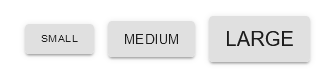
<div className="buttons">
  <Button
    fontSize="small"
    variant="contained"
    onClick={() => console.log("small button")}
  >
    Small
  </Button>
  <Button
    fontSize="medium"
    variant="contained"
    onClick={() => console.log("medium button")}
  >
    Medium
  </Button>
  <Button
    fontSize="large"
    variant="contained"
    onClick={() => console.log("large button")}
  >
    Large
  </Button>
</div>
You can try the working example with full code completetion at this CodeSandBox React TS Demo App.
PS: If you use ESLint, don't forget to allow JSX Props Spreading by disabling the rule react/jsx-props-no-spreading.
/* eslint-disable react/jsx-props-no-spreading */
With Mui5 use
import React, { useState } from 'react';
import { Button as MuiButton, ButtonProps } from '@mui/material';
import { styled } from '@mui/material/styles';

import { ITheme } from '../../mytheme';

export interface IButton extends Omit<ButtonProps, 'size'> {
  size?: 'small' | 'medium' | 'large' | 'huge';
  theme?: ITheme;
}

const Button: React.FC<IButton> = styled(MuiButton, {
  skipSx: true,
  skipVariantsResolver: true,
})<IButton>(({ theme }) => {
  return {//..add your styleoverrides here! or use a theming only approach};
});
Theming only without nesting MuiComponents follow https://mui.com/customization/theme-components/#adding-new-component-variants
declare module '@mui/material/Button' {
  interface ButtonPropsVariantOverrides {
   size: 'large' | 'small' | 'likemoon | 'whatsoever';
  }
}
cheers
30
If you love us? You can donate to us via Paypal or buy me a coffee so we can maintain and grow! Thank you!
Donate Us With