 Menu
Menu
I'm working on HTML for a small web application; the design calls for a content area with rounded corners and a drop shadow. I've been able to produce this with CSS3, and it works flawlessly on Firefox and Chrome:
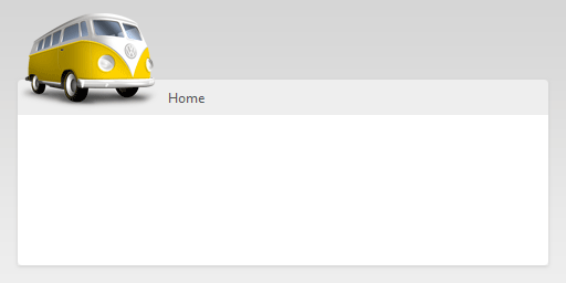
However, Internet Explorer 7 and 8 (not supporting CSS3) is a different story:

Is there an easy, lightweight JavaScript solution that would allow me to either 1) use IE-specific features to achieve this, or 2) modify the DOM (programmatically) in such a way that adds custom images around the content area to emulate the effect?
 470
470
Check out this post: http://www.smashingmagazine.com/2010/04/28/css3-solutions-for-internet-explorer/
It covers specifically rounded corners and box shadow for CSS3 in IE7/8.
135
This is my method, I use the conditionals to target CSS files to IE browsers.
Say you have your div with the id #page_container. In your regular master.css or css3.css file, you would give it your width, height, rounded corners and drop shadow with styles.
Now, when IE hits your page, it will pull in the condition css you had set up. For that same div#page_container, you may alter the width a bit, height, maybe some padding, then give it a background-image to make it look like the drop shadow, rounded-corner version.
So your head will have this:
<head>
<link rel="stylesheet" type="text/css" href="master.css" />
<!--[if lte IE 8]> <link rel="stylesheet" type="text/css" href="ie.css" /> <![endif]-->
</head>
In the master.css file, you would have this definition for your main div:
div#page_container {
  width: 960px;
  height: auto;
  padding: 10px 10px 10px 10px;
  background: #ccc;
  drop-shadow: whatever...
  rounded-corner: whatever...
}
Now, in your ie.css file, and because it is referenced in your second, the definition will cascade down so you can alter it a bit:
div#page_container {
  width: 960px;
  height: auto;
  padding: 15px 15px 15px 15px; /* this is key */
  background: #ccc url(/path/to/image.file) no-repeat top left;
}
Add just enough extra padding so the drop shadows fit in with your background-image. Because it cascades down, it will overwrite the original 10px padding you had, expanding the box model to fit in your extra shadow graphics.
Couple benefits to this method include:
27
First of all I like to mention that there is no perfect solution for this until IE9, where the CSS border-radius is gonna be implemented.
Here are the different solutions you have until then:
You could use one of many JS scripts that simulates rounded corners. But none of them implement the shadow properly. Here is the list of the scripts i tried and my conclusions. All of this scripts have something in common, they are placing additional elements in your HTML to give you the illusion of rounded corners.
DD Roundies: This script is very lightweight an works pretty well. It works without any framework and plays nice with jQuery & Prototype (i assume its working well with the others to, but i can't tell for sure). It uses the CSS3 proprieties on browsers who support CSS3. And uses the same hack as all the others for IE. The antialiazing on this one works very good. edit i have to correct my self here. This one works with a HTC File. It does not placing additional elements in your HTML.
Curvy Corners and the jQuery Plugin Curvy Corners: I like this one to. The antialiazing is working very good to. And it plays nice with background images. But it does not play nice with CSS3 shadows. It does not check if your Browser support CSS3 and always uses the ugly solution of adding elements to your dom.
Here is the reason why none of them is a proper solution in my opinion:
curvy corners dom messing screenshot http://meodai.ch/stackoverflow/curvy.png curvy dom mess
nifty dom mess http://meodai.ch/stackoverflow/nifty.png nifty dom mess
There are a few other but i think they are not mentionable at this place.
As you can see they are adding a lot of elements to your dom. This can cause trouble if you want to add rounded corners to a huge amount of elements. It can make some older browser / computers crash. For the shadows its pretty much the same problem. There is a jQuery plugin that handles shadows on boxes and fonts: http://dropshadow.webvex.limebits.com/
My conclusion: If i am doing a small budget job, IE users just have edges and no shadows. If the client has some money to spend, so i am doing it with CSS only and i make images for every corner. If they absolutely have to be there but there is no time or no money to do it, i use one of the mentioned JS Scripts DD_roundies with preference. Now its up to you.
PS: IE users are used to ugly interfaces, they don't gonna see that the corners and shadows are missing anyway :P
24
It was just released and it's in beta but check it out: http://css3pie.com/
22
I've started using the .htc script found here: CSS3 support for Internet Explorer 6, 7, and 8
It's the simplest implementation of CSS3 for IE6+ that I've seen.
.box {
  -moz-border-radius: 15px; /* Firefox */
  -webkit-border-radius: 15px; /* Safari and Chrome */
  border-radius: 15px; /* Opera 10.5+, future browsers, and now also Internet Explorer 6+ using IE-CSS3 */

  -moz-box-shadow: 10px 10px 20px #000; /* Firefox */
  -webkit-box-shadow: 10px 10px 20px #000; /* Safari and Chrome */
  box-shadow: 10px 10px 20px #000; /* Opera 10.5+, future browsers and IE6+ using IE-CSS3 */

  behavior: url(ie-css3.htc); /* This lets IE know to call the script on all elements which get the 'box' class */
}
If you love us? You can donate to us via Paypal or buy me a coffee so we can maintain and grow! Thank you!
Donate Us With