 Menu
Menu
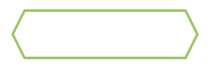
I would like to make a button like these one just with CSS without using another element.
Button Image
Since the button has a border attached, I think I normally need both, the :before and :after elements to create just one arrow at one side. So to make one arrow at each side I would need another span element inside the link.
The second method I tried is the one you see below. But with this solution they are not properly centered and each side of the arrow is different in length.
Has someone a solution?
/* General Button Style */

.button {
  display: block;
  position: relative;
  background: #fff;
  width: 300px;
  height: 80px;
  line-height: 80px;
  text-align: center;
  font-size: 20px;
  text-decoration: none;
  text-transform: uppercase;
  color: #e04e5e;
  margin: 40px auto;
  font-family: Helvetica, Arial, sans-serif;
  box-sizing: border-box;
}
/* Button Border Style */

.button.border {
  border: 4px solid #e04e5e;
}
.button.border:hover {
  background: #e04e5e;
  color: #fff;
}
/* Button Ribbon-Outset Border Style */

.button.ribbon-outset.border:after,
.button.ribbon-outset.border:before {
  top: 50%;
  content: " ";
  height: 43px;
  width: 43px;
  position: absolute;
  pointer-events: none;
  background: #fff;
}
.button.ribbon-outset.border:after {
  left: -3px;
  margin-top: -40px;
  transform-origin: 0 0;
  box-sizing: border-box;
  border-bottom: 4px solid #e04e5e;
  border-left: 4px solid #e04e5e;
  transform: rotate(57.5deg) skew(30deg);
}
.button.ribbon-outset.border:before {
  right: -46px;
  margin-top: -40px;
  transform-origin: 0 0;
  box-sizing: border-box;
  border-top: 4px solid #e04e5e;
  border-right: 4px solid #e04e5e;
  transform: rotate(57.5deg) skew(30deg);
}
.button.ribbon-outset.border:hover:after {
  background: #e04e5e
}
.button.ribbon-outset.border:hover:before {
  background: #e04e5e
}
<a href="#" class="button ribbon-outset border">Click me!</a>CodePen Demo
 347
347
This is just a simpler alternative to Harry's answer.
This approach uses scale() and rotate(45deg) transforms. Using this approach, you can very easily change the angle of right and left chevrons.
Fiddle
div {
    height: 70px;
    width: 200px;
    margin-left: 40px;
    border-top: 4px solid #E04E5E;
    border-bottom: 4px solid #E04E5E;
    position: relative;
    text-align: center;
    color: #E04E5E;
    line-height: 70px;
    font-size: 21px;
    font-family: sans-serif;
}
div:before, div:after {
    content:'';
    position: absolute;
    top: 13px;
    height: 40px;
    width: 40px;
    border: 4px solid #E04E5E;
    -webkit-transform: scale(0.8,1.25) rotate(45deg);
    -moz-transform: scale(0.8,1.25) rotate(45deg);
    -ms-transform: scale(0.8,1.25) rotate(45deg);
    transform: scale(0.8,1.25) rotate(45deg);
}
div:before {
    left: -22px;
    border-top: 0px solid transparent;
    border-right: 0px solid transparent;
}
div:after {
    right: -22px;
    border-bottom: 0px solid transparent;
    border-left: 0px solid transparent;
}
div:hover, div:hover:before, div:hover:after {
    background-color: #E04E5E;
    color: #EEE;
}<div>HELLO!</div>Want a wider arrow? Simply decrease scale() transform's x value : Fiddle (wide)
Narrower one? Increase scale() transform's x value : Fiddle (narrow)
Note: IE 8 and below don't support CSS Transforms (9 supports with -ms- prefix), so you can check out this site for supporting them: IE Transform Translator
179
Here is another alternate way to get this done with only one element.
This approach works like below:
:before and :after which are about half the size (including borders) of the main .button element. The height of each pseudo-element is 34px + 4px border on one side (top/bottom) and 2px on the other side.:before element whereas the bottom half is achieved using the :after element.rotateX with perspective to achieve the tilted effect and positioning to place the two elements such that they form the expected shape./* General Button Style */
.button {
position: relative;
display: block;
background: transparent;
width: 300px;
height: 80px;
line-height: 80px;
text-align: center;
font-size: 20px;
text-decoration: none;
text-transform: uppercase;
color: #e04e5e;
margin: 40px auto;
font-family: Helvetica, Arial, sans-serif;
box-sizing: border-box;
}
.button:before,
.button:after {
position: absolute;
content: '';
width: 300px;
left: 0px;
height: 34px;
z-index: -1;
}
.button:before {
transform: perspective(15px) rotateX(3deg);
}
.button:after {
top: 40px;
transform: perspective(15px) rotateX(-3deg);
}
/* Button Border Style */
.button.border:before,
.button.border:after {
border: 4px solid #e04e5e;
}
.button.border:before {
border-bottom: none; /* to prevent the border-line showing up in the middle of the shape */
}
.button.border:after {
border-top: none; /* to prevent the border-line showing up in the middle of the shape */
}
/* Button hover styles */
.button.border:hover:before,
.button.border:hover:after {
background: #e04e5e;
}
.button.border:hover {
color: #fff;
}<!-- Library included to avoid browser prefixes -->
<script src="https://cdnjs.cloudflare.com/ajax/libs/prefixfree/1.0.7/prefixfree.min.js"></script>
<a href="#" class="button ribbon-outset border">Click me!</a>Fixed Width Demo | Dynamic Width Demo
Output Screenshot:

This is tested in Chrome v24+, Firefox v19+, Opera v23+, Safari v5.1.7, IE v10.
As-is, this would degrade quite well in IE 8 and IE 9 into a square button with borders. However, due to the nullification of one border (border-bottom for :before and border-top for :after) it would leave a white area (resembling a strike-through line) in the middle. This can be overcome by adding a couple of IE < 10 specific styles using conditional comments like in this demo.
<!--[if IE]>
  <style>
    .button.border:after{
      top: 38px;
    }
    .button.border:hover:before, .button.border:hover:after {
      border-bottom: 4px solid #e04e5e;
    }
  </style>
<![endif]-->
Output Screenshot from IE 9 and IE 8:

37
I forked your Pen
Codepen Demo
The essential changes are that I removed the side borders from the main button (as they were superflous
/* Button Border Style */
.button.border {
    border-top: 4px solid #e04e5e;
   border-bottom: 4px solid #e04e5e;
}
and changed a couple of values to tweak it all into place
/* Button Ribbon-Outset Border Style */
.button.ribbon-outset.border:after,
.button.ribbon-outset.border:before {
        top: 50%;
        content: " ";
        height: 43px;
        width: 43px;
        position: absolute;
        pointer-events: none;
}

.button.ribbon-outset.border:after {
        left:0;
        margin-top:-40px;
        transform-origin:0 0;
        box-sizing:border-box;
        border-bottom:4px solid #e04e5e;
        border-left:4px solid #e04e5e;
        transform:rotate(57.5deg) skew(30deg);
    }
    .button.ribbon-outset.border:before {
        right:-43px;
        margin-top:-40px;
        transform-origin:0 0;
        box-sizing:border-box;
        border-top:4px solid #e04e5e;
        border-right:4px solid #e04e5e;
        transform:rotate(57.5deg) skew(30deg);
    }
I got the answer myself. It was a problem of the transform property of the :before and :after elements.
CSS changed:
/* Button Border Style */
.button.border {
    border-top:4px solid #e04e5e;
    border-bottom:4px solid #e04e5e;
}
/* Button Ribbon-Outset Border Style */
.button.ribbon-outset.border:after, .button.ribbon-outset.border:before {
    height: 42px;
    width: 42px;
}
.button.ribbon-outset.border:after {
    left:0;
    border-bottom:5px solid #e04e5e;
    border-left:5px solid #e04e5e;
    transform:rotate(45deg) skew(19deg,19deg);
}
.button.ribbon-outset.border:before {
    right:-42px;
    border-top:5px solid #e04e5e;
    border-right:5px solid #e04e5e;
    transform:rotate(45deg) skew(19deg,19deg);
}
Updated Codepen
1
If you love us? You can donate to us via Paypal or buy me a coffee so we can maintain and grow! Thank you!
Donate Us With