 Menu
Menu
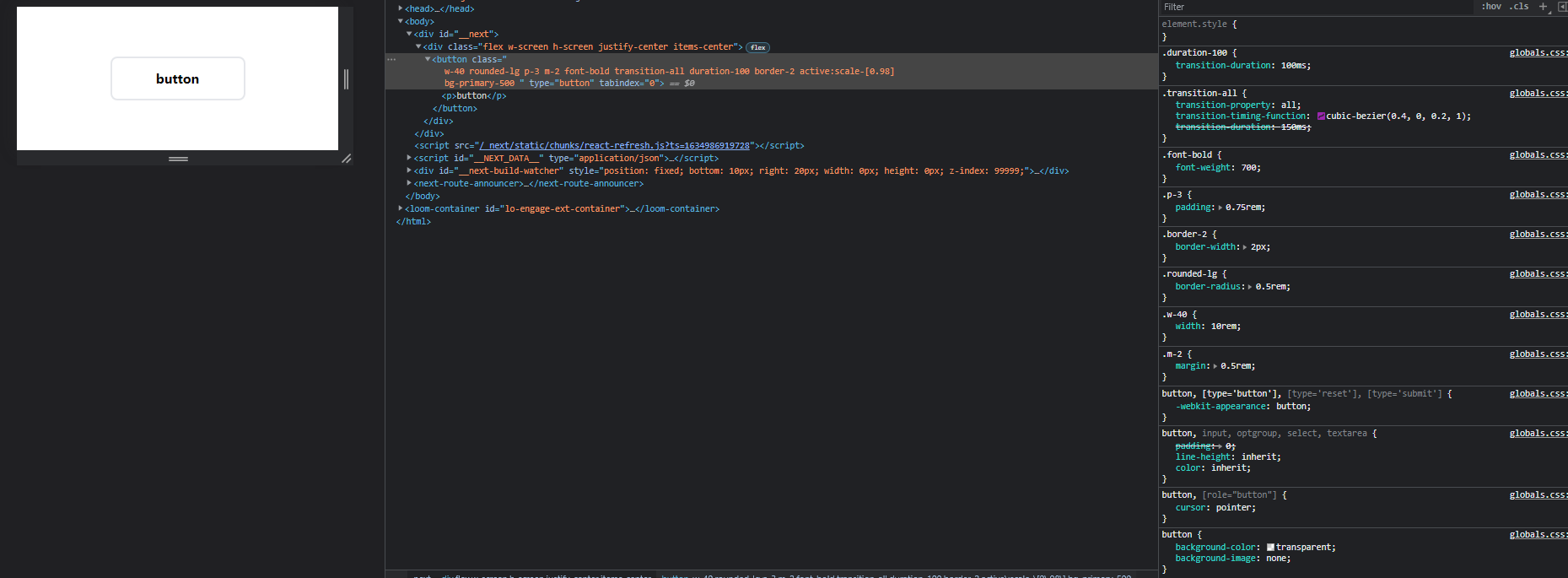
I am currently building a component library for my next project with TailwindCss, I just ran into a small issue when working on the Button component.
I'm passing in a prop like 'primary' or 'secondary' that matches a color I've specified in the tailwind.config.js then I want to assign that to the button component using Template literals like so: bg-${color}-500
<button
    className={`
    w-40 rounded-lg p-3 m-2 font-bold transition-all duration-100 border-2 active:scale-[0.98]
    bg-${color}-500 `}
    onClick={onClick}
    type="button"
    tabIndex={0}
  >
    {children}
</button>
The class name comes through in the browser just fine, it shows bg-primary-500 in the DOM, but not in the applied styles tab.
The theming is configured like so:
  theme: {
    extend: {
      colors: {
        primary: {
          500: '#B76B3F',
        },
        secondary: {
          500: '#344055',
        },
      },
    },
  },
But it doesn't apply any styling. if I just add bg-primary-500 manually it works fine.
I'm honestly just wondering if this is because of the JIT compiler not picking dynamic classnames up or if I'm doing something wrong (or this is just NOT the way to work with tailWind).
Any help is welcome, thanks in advance!
 829
829
So after finding out that this way of working is not recommended and that JIT doesn't support it (Thanks to the generous commenters). I have changed the approach to a more 'config' based approach.
Basically I define a const with the basic configuration for the different props and apply those to the component. It's a bit more maintenance work but it does the job.
Here is the example of a config. (Currently without typing) and up for some better refactoring but you'll get the idea.
const buttonConfig = {
  // Colors
  primary: {
    bgColor: 'bg-primary-500',
    color: 'text-white',
    outline:
      'border-primary-500 text-primary-500 bg-opacity-0 hover:bg-opacity-10',
  },
  secondary: {
    bgColor: 'bg-secondary-500',
    color: 'text-white',
    outline:
      'border-secondary-500 text-secondary-500 bg-opacity-0 hover:bg-opacity-10',
  },

  // Sizes
  small: 'px-3 py-2',
  medium: 'px-4 py-2',
  large: 'px-5 py-2',
};
Then I just apply the styling like so:
  <motion.button
    whileTap={{ scale: 0.98 }}
    className={`
    rounded-lg font-bold transition-all duration-100 border-2 focus:outline-none
    ${buttonConfig[size]}
    ${outlined && buttonConfig[color].outline}
    ${buttonConfig[color].bgColor} ${buttonConfig[color].color}`}
    onClick={onClick}
    type="button"
    tabIndex={0}
  >
    {children}
  </motion.button>
this way of writing Tailwind CSS classes is not recommended. Even JIT mode doesn't support it, to quote Tailwind CSS docs: "Tailwind doesn’t include any sort of client-side runtime, so class names need to be statically extractable at build-time, and can’t depend on any sort of arbitrary dynamic values that change on the client"
32
If you love us? You can donate to us via Paypal or buy me a coffee so we can maintain and grow! Thank you!
Donate Us With