 Menu
Menu
Spinners provide two states. The first and default state (state A) shows the currently selected value. The second (state B) shows a dropdown menu when the spinner display is touched.
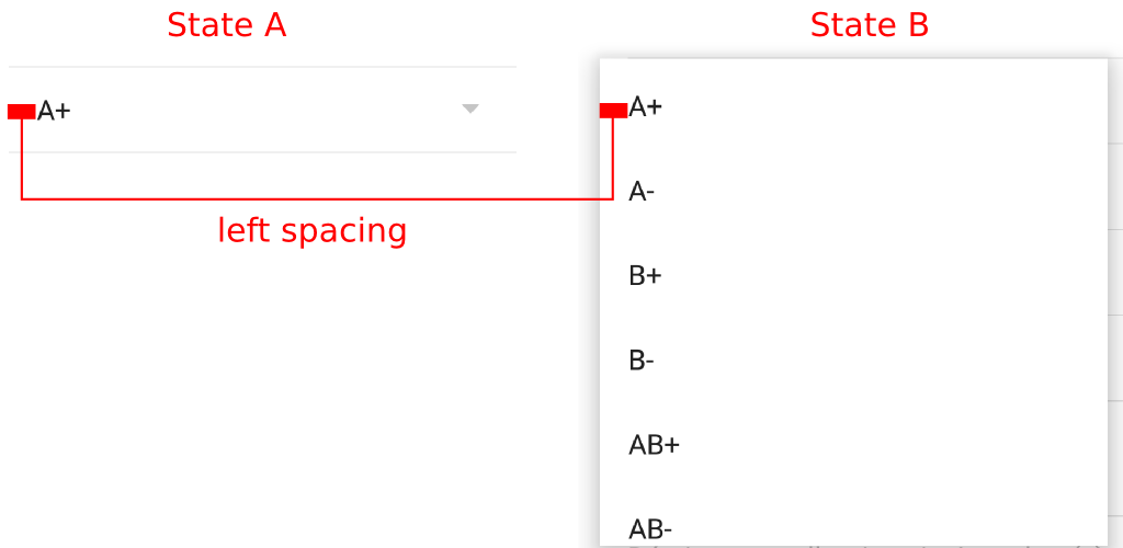
By default a left padding is added to the items displayed in state A and B. I would like to remove it when the current selected value is displayed (state A) but to keep it when items are displayed in the dropdown menu (state B).
Since the padding is set with the CheckedTextView used in the layout that is specified when the spinner is created, my first try was to pass to the spinner constructor a custom layout that contains a CheckedTextView with empty padding. This way, the left padding disapears in state A but also in state B. However, my goal was to keep it for state A.
My second try was to customize android:dropDownSpinnerStyle in my theme definition. Since changing background color for android:dropDownSpinnerStyle changes the background color of the item in state A only, my thought was to override the marginLeft or paddingLeft with a negative value. Unfortunately, it has no effect.
Given that negative margin/padding seems not to be taken into account, I have tried the opposite. Firstly, I have used a custom item layout (as explained for my first try) in order to remove left padding on both states (A and B). Secondly, I have defined a custom style for property android:dropDownListViewStyle. Unfortunately, using a positive marginLeft value with the last property has no effect. Thus, I have set paddingLeft. It works and allows me to get the left spacing for state B only. However, the left space applies also to the background touch color (cf. image below).
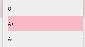
I think that only the style for state A should be altered if I want to have the on touch background color that fully fills the dropdown menu width. Any idea, suggestion or example is welcomed.
Below is my theme definition for the third try:
<style name="Theme.App.Base" parent="Theme.App">
    ...
    <item name="android:dropDownListViewStyle">@style/Widget.Spinner.DropDown.ListView</item>
</style>

<style name="Widget.Spinner.DropDown.ListView" parent="Widget.AppCompat.ListView.DropDown">
    <item name="android:paddingLeft">16dp</item>
</style>
 505
505
State A takes on the following style:
// Theme (Base) // Theme.AppCompat
@android:style/Widget.TextView.SpinnerItem

// Holo & Holo Light
@android:style/Widget.Holo.TextView.SpinnerItem
The attribute at play here is spinnerItemStyle.
Moreover, the padding provided is not paddingLeft, but paddingStart - to support LTR & RTL languages. Similarly, paddingEnd is set instead of paddingRight. This info applies to API >=17.
If you are using AppCompat, you will still override the spinnerItemStyle attribute, but provide paddingLeft and paddingRight.
Example:
<style name="Theme.App.Base" parent="Theme.App">
...
    <item name="android:spinnerItemStyle">@style/TextViewSpinnerItem</item>
</style>

<style name="TextViewSpinnerItem" parent="@android:style/Widget.TextView.SpinnerItem">
    <item name="android:paddingLeft">40dp</item>
    <item name="android:paddingRight">40dp</item>
</style>
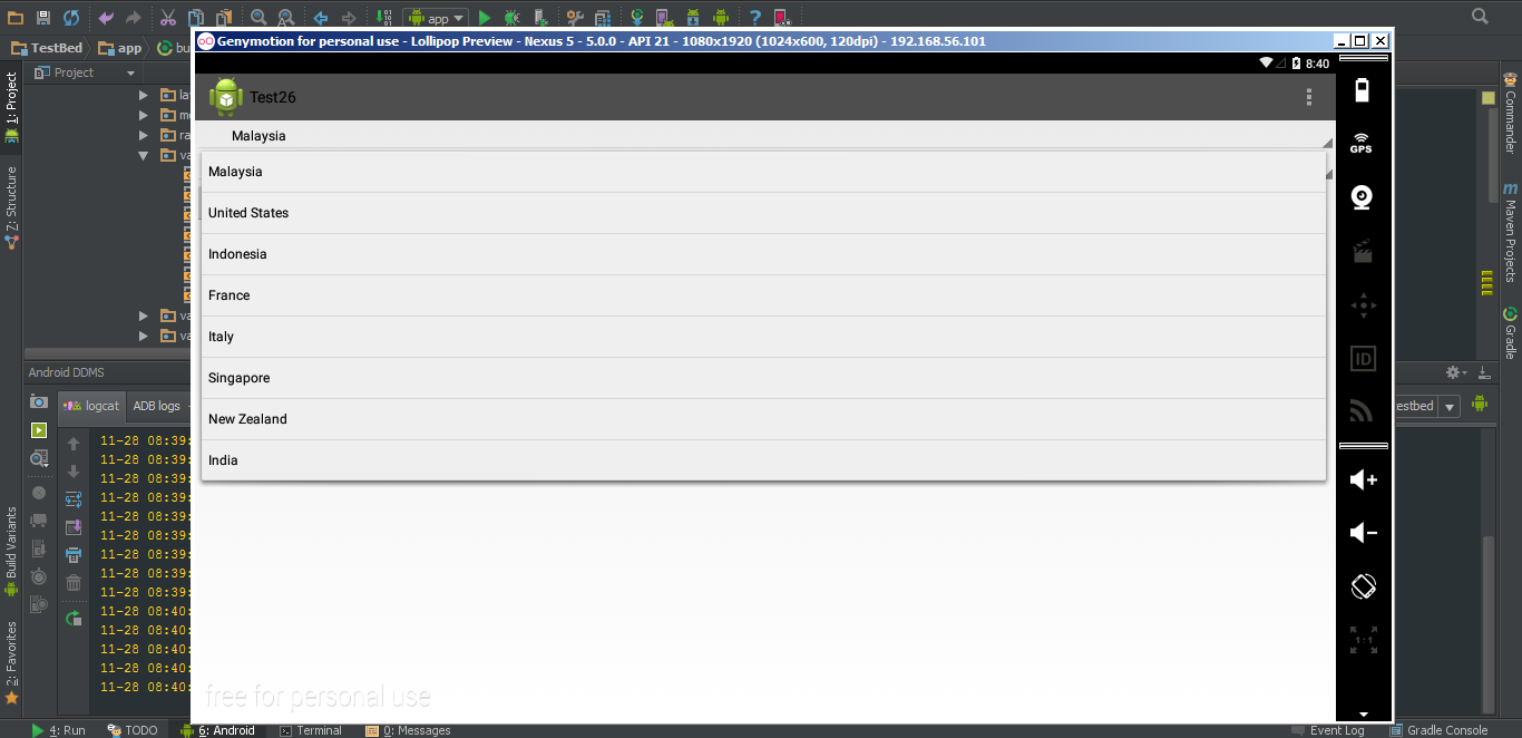
The 40dp value is for testing if setting this style even works. This should only pad State A(with 40dp), leaving State B with default padding of 8dp. Once confirmed, you can make it 0dp, or as per your requirement.
This is the result I get:
Update:
In reference to the sample project - MainActivity:
spinner.setAdapter(ArrayAdapter.createFromResource(this,
            R.array.planets_array, android.R.layout.simple_spinner_item));
By giving the adapter android.R.layout.simple_spinner_item, you are telling it to use the layout for both State A and State B. This is a problem because of the way this layout is defined:
<TextView xmlns:android="http://schemas.android.com/apk/res/android"
    android:id="@android:id/text1"
    style="?android:attr/spinnerItemStyle"
    android:singleLine="true"
    android:layout_width="match_parent"
    android:layout_height="wrap_content"
    android:ellipsize="marquee"
    android:textAlignment="inherit"/>
Notice the style applied to this TextView. Earlier, I had suggested that you override this attribute. And it worked. But since this layout is used for both the states, the outcome is not as desired.
In fact, the statement right above (though not doing anything at the moment) is more promising:
ArrayAdapter.createFromResource(this,
            R.array.planets_array, android.R.layout.simple_spinner_item)
            .setDropDownViewResource(android.R.layout.simple_spinner_dropdown_item);
By using setDropDownViewResource(int), you will allow the possibility of introducing different style attributes. In this case, State A will be represented by android.R.layout.simple_spinner_item and State B will use android.R.layout.simple_spinner_dropdown_item.
Let's take a look at android.R.layout.simple_spinner_dropdown_item:
<CheckedTextView xmlns:android="http://schemas.android.com/apk/res/android"
    android:id="@android:id/text1"
    style="?android:attr/spinnerDropDownItemStyle"
    android:singleLine="true"
    android:layout_width="match_parent"
    android:layout_height="?android:attr/dropdownListPreferredItemHeight"
    android:ellipsize="marquee"/>
Now we can override another attribute - spinnerDropDownItemStyle - and give State B a whole different look. But, we won't. On Lollipop, spinnerDropDownItemStyle points to style Widget.Material.DropDownItem.Spinner which sets the paddingX to 8dp. And you said that you're okay with the default padding in State B.
So, here's what you need:
// Create an ArrayAdapter
ArrayAdapter<CharSequence> mAdapter = ArrayAdapter.createFromResource(this,
            R.array.planets_array, android.R.layout.simple_spinner_item);

// State B
mAdapter.setDropDownViewResource(android.R.layout.simple_spinner_dropdown_item);
AND, if you don't have this already, add it to values/styles.xml:
<style name="AppTheme" parent="Theme.AppCompat.Light.DarkActionBar">
    <item name="android:spinnerItemStyle">@style/TextViewSpinnerItem</item>
</style>

<style name="TextViewSpinnerItem" parent="@android:style/Widget.TextView.SpinnerItem">
    <item name="android:paddingLeft">0dp</item>
    <item name="android:paddingRight">0dp</item>
</style>
You should also create values-v21/styles.xml and add:
<style name="TextViewSpinnerItem" parent="@android:style/Widget.Material.TextView.SpinnerItem">
    <item name="android:paddingLeft">0dp</item>
    <item name="android:paddingRight">0dp</item>
</style>
If you love us? You can donate to us via Paypal or buy me a coffee so we can maintain and grow! Thank you!
Donate Us With