 Menu
Menu
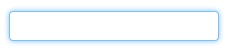
In this tutorial, you'll find some methods of creating a glowing border around an input field with CSS properties. In the example below, we add the :focus pseudo-class to the <input> element and then, specify the border-color and box-shadow properties. Also, we set the outline property to “none”.
You can use the CSS border property to add a border around your HTML textboxes. You can also use border-width , border-style , and border-color , but the border property covers all of these anyway.
Here you go:
.glowing-border {
    border: 2px solid #dadada;
    border-radius: 7px;
}

.glowing-border:focus {
    outline: none;
    border-color: #9ecaed;
    box-shadow: 0 0 10px #9ecaed;
}
Live demo: http://jsfiddle.net/simevidas/CXUpm/1/show/
(to view the code for the demo, remove "show/" from the URL)
label {
    display:block;
    margin:20px;
    width:420px;
    overflow:auto;
    font-family:sans-serif;
    font-size:20px;
    color:#444;
    text-shadow:0 0 2px #ddd;
    padding:20px 10px 10px 0;
}

input {
    float:right;
    width:200px;
    border:2px solid #dadada;
    border-radius:7px;
    font-size:20px;
    padding:5px;
    margin-top:-10px;
}

input:focus {
    outline:none;
    border-color:#9ecaed;
    box-shadow:0 0 10px #9ecaed;
}
<label> Aktuelles Passwort: <input type="password"> </label>
<label> Neues Passwort: <input type="password"> </label>How about something like this... http://jsfiddle.net/UnsungHero97/Qwpq4/1207/
CSS
input {
    border: 1px solid #4195fc; /* some kind of blue border */

    /* other CSS styles */

    /* round the corners */
    -webkit-border-radius: 4px;
       -moz-border-radius: 4px;
            border-radius: 4px;


    /* make it glow! */
    -webkit-box-shadow: 0px 0px 4px #4195fc;
       -moz-box-shadow: 0px 0px 4px #4195fc;
            box-shadow: 0px 0px 4px #4195fc; /* some variation of blue for the shadow */

}
Use a normal blue border, a medium border-radius, and a blue box-shadow with position 0 0.
SLaks hit the nail on the head but you might want to look over the changes for inputs in CSS3 in general. Rounded corners and box-shadow are both new features in CSS3 and will let you do exactly what you're looking for. One of my personal favorite links for CSS3/HTML5 is http://diveintohtml5.ep.io/ .
I combined two of the previous answers (jsfiddle).
input {
/* round the corners */
border-radius: 4px;
-moz-border-radius: 4px;
-webkit-border-radius: 4px;
}
input:focus {
outline:none;
border: 1px solid #4195fc;
/* create a BIG glow */
box-shadow: 0px 0px 14px #4195fc;
-moz-box-shadow: 0px 0px 14px #4195fc;
-webkit-box-shadow: 0px 0px 14px #4195fc;
}
Modified version with little less glowing version.
input {
    /* round the corners */
    //background-color: transparent;
    border: 1px solid;
    height: 20px;
    width: 160px;
    color: #CCC;
    border-radius: 4px;
    -moz-border-radius: 4px;
    -webkit-border-radius: 4px;
}

input:focus {
    outline:none;
    border: 1px solid #4195fc;
    /* create a BIG glow */
    box-shadow: 0px 0px 5px #4195fc;
    -moz-box-shadow: 0px 0px 5px #4195fc;
    -webkit-box-shadow: 0px 0px 5px #4195fc;
}
If you love us? You can donate to us via Paypal or buy me a coffee so we can maintain and grow! Thank you!
Donate Us With