 Menu
Menu
Respected stackoverflowers,
How do i create a triangle element with the background pattern?
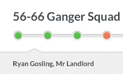
For example i need the div like this :
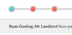
But my state is like this :
All examples with triangle elements use borders which cant have an img in that ....
This is my subsection class which needs the coolarrow:
<div class="subsection"><span>Ryan Gosling, Mr Landlord</span></div>

.subsection {
  .box-shadow (0, -1px, 1px, 0, rgba(0, 0, 0, 0.3));
  background: url('/assets/pattern-lorem.png'); // The inner part of the slider have the pattern
  display: block;
  clear: both;
  float: left;
  width: 100%;
  padding-top: 15px;
  padding-bottom: 15px;
  display: none;
}
.subsection {
    position:relative;
}
.subsection:before {
    content:'';
    position:absolute;
    top:0;
    left:0;
    height:20px;
    width:0;
    border-left:20px solid white;
    border-bottom:16px solid transparent;
}
.subsection:after {
    content:'';
    position:absolute;
    top:36px;
    left:0;
    bottom:0;
    width:0;
    border-left:20px solid white;
    border-top:16px solid transparent;
}
And im getting :
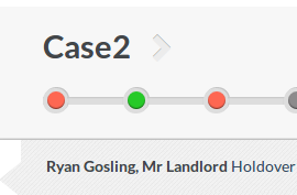
Which is fine ...how can i bring the arrow on the top in the required form ? ... and overlaying the cases div ? ... Thanks.
 745
745
If you don't care for cross browser compatibility, you can use a pseudo-element that you rotate by 45 degrees and attach the styles to it. The only thing you need additionally would be the background, rotated (back) by 45deg to attach to the pseudo element:
div.coolarrow:before {
    content: '';
    position: absolute;
    z-index: -1;
    top: -24.7px;
    left: 10px;
    background-color: #bada55;
    width: 50px;
    height: 50px;

    background: url(url/to/your/45deg/rotated/background.gif);

    box-shadow: inset 0 0 10px #000000;
    transform: rotate(45deg);
}
Here's a short fiddle to illustrate (without background):
Fiddle
To work this out for other cases but 90degree arrows, you need to skew the rect additionaly. And I don't really know what then happens with the background image...
141
If you love us? You can donate to us via Paypal or buy me a coffee so we can maintain and grow! Thank you!
Donate Us With