 Menu
Menu
It was hard to explain with words, so I tried to explain with graphics.
There is a div here with its style.
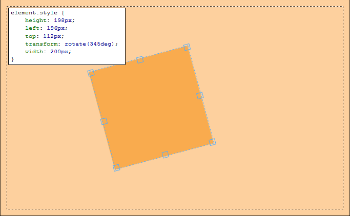
Now if I change its width with 400px here...

because of it is a transformed (rotated) object, something happens and "TOP-LEFT" corner of it, moves down.
Now I want to keep its "TOP-LEFT" position fixed. But I couldnt find a correct correlation to fix it. I guess I need a trigonometric formula using rotation angle.
Also I know it is related with 'scale' and 'transform-origin' and can be easily done with them but I dont want to use any other transformation parameters. Especialy 'transform-origin' because of lack of browser support.
Does anybody here who can help me with the correlation which will be used in JavaScript to fix its corner. Maybe getBoundingClientRect() can be used for this.
Here is the FIDDLE
Thank you.
 789
789
CSS transforms are really matrices, where transforming the elements are done withmatrix(a, b, c, d, tx, ty).
Then someone clever figured out it would be too complicated for webdesigners to understand such a matrix, so they added shorthand solutions, like transform: rotate() etc.
In other words, if you view the computed styles, there won't be a style whith the rotated degrees, and you can't do element.style.transform and get the rotation angle back again, all you'll get is the matrix.
Since the browsers use a matrix, all browsers that support CSS transform, also support changing the origin of that transform, so if you can rotate the element, you can change the origin.
The exception is Microsoft's filters, but even there you can rotate and change the origin, it's just a little more complicated to figure out.
As it makes no sense to not just change the origin of the transformation, and calculating it yourself would do the exact same thing, only a hundred times more complicated, you should really just add this to the CSS to solve the issue
-moz-transform-origin: 0 0;
-o-transform-origin: 0 0;
-webkit-transform-origin: 0 0;
transform-origin: 0 0;
FIDDLE
Just to confirm this, looking at MDN, at the bottom of the following pages, you'll find browser support, and it's just about the same for transform and transform-origin, as you generally never have one without the other
https://developer.mozilla.org/en-US/docs/Web/CSS/transform
https://developer.mozilla.org/en-US/docs/Web/CSS/transform-origin
As a final note, if it were me, I wouldn't even worry about IE8 and below, as those users are probably used to things looking weird these days anyway.
141
If you don't want to use transform-origin you can do this :
FIDDLE
$(function () {
    var isScaled = false;
    $('#box').on('click', function () {
        if (isScaled) {
            isScaled = false;
            $(this).width('200').css({'top':'50px','left':'50px'})
        } else {
            isScaled = true;
            $(this).width('400').css({'top':'24px','left':'46px'});
        }
    })
});
As other people has stated, you can use transform-origin. However, if you still want to do it via Javascript, I've done it for you in this jsfiddle.
Basically, what I do is to calculate the rotated position of the top left corners of each figure using the matrix transform for rotations (simplified), assuming the center point of the figures as (0, 0), which is, basically, what the browser does. Once I calculate the new positions for the corners, I calculate the difference, and substract that difference from the original left and top positions. I hope you find it instructive.
$(function () {

    var isScaled = false;
    var box = $('#box');

    box.on('click', function () {
        if (isScaled) {
            isScaled = false;
            $(this).width('200');
            placeBox(400, 200);
        } else {
            isScaled = true;
            $(this).width('400')
            placeBox(200, 400);
        }
    });
    var left = parseInt(box.css('left'));
    var top = parseInt(box.css('top'));
    var angle = (345 / 360) * 2 * Math.PI; //in radians;

    function placeBox(oldWidth, newWidth) {
        var midHeight = box.height() / 2;
        var midOldWidth = oldWidth / 2;
        var midNewWidth = newWidth / 2;
        var cos = Math.cos(angle);
        var sin = Math.sin(angle);
        //rotation center coordinates
        var cx1 = left + midOldWidth;
        var cx2 = left + midNewWidth;
        var cy = top + midHeight;
        var mx1 = -midOldWidth * cos + midHeight * sin;
        var my1 = -midOldWidth * sin - midHeight * cos;
        var mx2 = -midNewWidth * cos + midHeight * sin;
        var my2 = -midNewWidth * sin - midHeight * cos;
        var difX = cx2 + mx2 - cx1 - mx1;
        var difY = my2 - my1;
        //now, position the element where it should:
        box.css({
            left: (left - difX) + 'px',
            top: (top - difY) + 'px'
        });
    }
})
If you love us? You can donate to us via Paypal or buy me a coffee so we can maintain and grow! Thank you!
Donate Us With