 Menu
Menu
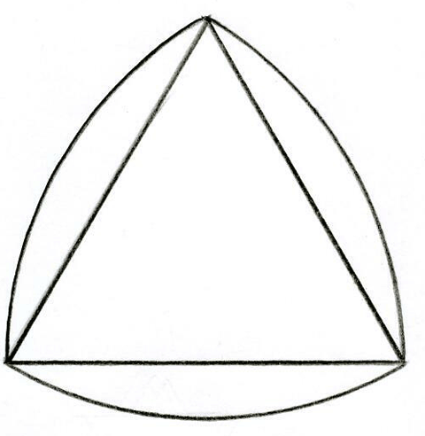
I am trying to create a triangle using purely CSS which has curved edges.
Is this possible without it being totally over the top?
I've added an example below of what I'm trying to achieve (the curved lines - not the straight lines).
So far I have been working with the following code but it's not quite what I'm looking for.
    #inner {
      transform: rotate(45deg);
      -ms-transform: rotate(45deg);
      -webkit-transform: rotate(45deg);
      -o-transform: rotate(45deg);
      -moz-transform: rotate(45deg);
      background-color: silver;
      width: 100px;
      height: 100px;
      top: 20px;
      left: -50px;
      position: relative;
      -moz-border-radius: 20px;
      border-radius: 20px;
    }
    #outer {
      position: absolute;
      width: 70px;
      height: 140px;
      top: 20px;
      left: 50px;
      overflow: hidden;
      border: 1px solid red;
    }
<div id="outer">
<div id="inner"> </div>
</div> 826
826
How about an svg solution?
<svg width="200" height="200" viewBox="-2 0 252 212">
  <path fill="rosybrown" d="M125 0 c-81.6 60 -113.3 130 -125 200 c83.3 40 166.6 40 250 0 c-11.7 -70 -43.4 -140 -125 -200" fill="none" stroke-width="2" stroke="black" />
</svg>Just another posibility, without using any rotation. Just clipping different circles.
.triangle {
    position: relative;
    width: 200px;
    height: 200px;
    border-radius: 50%;
    background-color: lightblue;
    overflow: hidden;
}

.triangle div {
    position: absolute;
    width: 100%;
    height: 100%;
    top: 31%;
    left: 16%;
    background-color: lightyellow;
    border-radius: 50%;
    overflow: hidden;
}

.triangle div:after {
    content: "";
    position: absolute;
    width: 100%;
    height: 100%;
    right: 30%;
    background-color: red;
    border-radius: 50%;
}
<div class="triangle">
<div></div>
</div>The light colors are there just to make the construction of the triangle more visible
22
If you love us? You can donate to us via Paypal or buy me a coffee so we can maintain and grow! Thank you!
Donate Us With