 Menu
Menu
CSS-tag object-fit:cover does not clip/crop videos in Chrome as expected.
This happens only for videos and only in Chrome. Images are OK in Chrome. In all other tested browsers, images and videos are both working fine.
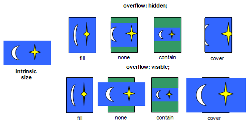
The behavior should be as shown in this image (top right):
I have created a demo that shows the wrong behavior.
You see the effect when you change the browser window size. With large height and small width (as well as with small height and large width) the videos start to overlap which is wrong. The images don't overlap and are therefore correct.
Videos (with the bear) should be divided at 50% screen width as the images (screen test pictures):

The code for the demo -
HTML
<div class="main">
  <div class="container" style="top:0; left:0">
    <video autoplay loop>
      <source src="http://www.w3schools.com/html/movie.mp4" type="video/mp4">
    </video>
  </div>
  <div class="container" style="top:0%; left:50%">
    <video autoplay loop>
      <source src="http://www.w3schools.com/html/movie.mp4" type="video/mp4">
    </video>
  </div>
  <div class="container" style="top:25%; left:0;">
    <video autoplay loop>
      <source src="http://www.w3schools.com/html/movie.mp4" type="video/mp4">
    </video>
  </div>
  <div class="container" style="top:25%; left:50%">
    <video autoplay loop>
      <source src="http://www.w3schools.com/html/movie.mp4" type="video/mp4">
    </video>
  </div>
  <div class="container" style="top:50%; left:0">
    <img src="https://upload.wikimedia.org/wikipedia/commons/c/c4/PM5544_with_non-PAL_signals.png"/>
  </div>
  <div class="container" style="top:50%; left:50%">
    <img src="https://upload.wikimedia.org/wikipedia/commons/c/c4/PM5544_with_non-PAL_signals.png"/>
  </div>
  <div class="container" style="top:75%; left:0">
    <img src="https://upload.wikimedia.org/wikipedia/commons/c/c4/PM5544_with_non-PAL_signals.png"/>
  </div>
  <div class="container" style="top:75%; left:50%">
    <img src="https://upload.wikimedia.org/wikipedia/commons/c/c4/PM5544_with_non-PAL_signals.png"/>
  </div>
</div>
CSS
html, body{
  margin:0;
  padding:0;
  height:100%;
  width:100%;
  overflow:hidden;
}
.main{
  position:relative;
  width: 100%;
  height: 100%;
}
.container{
  position:absolute;
  width:50%;
  height:25%;
}
img, video{
  position: relative;
  object-fit:cover;  /* This is the mainly problematic line*/
  overflow:hidden;
  width:100%;
  height:100%;
}
How can this be solved?
 839
839
Enter object-fit. It's a new CSS3 property that we can use to stretch embedded media (videos and images) across the entire parent, while still maintaining the aspect ratio. No JavaScript required!
For object-fit to work, the image itself needs a width and height . In the OP's CSS, the images do not have width and/or height set, thus object-fit cannot work.
The CSS object-fit property is used to specify how an <img> or <video> should be resized to fit its container. This property tells the content to fill the container in a variety of ways; such as "preserve that aspect ratio" or "stretch up and take up as much space as possible".
Adding a Background to an Image With object-fit: contain # We would benefit from that when also using object-fit: contain . In the example below, we have a grid of images. When the aspect ratios of the image and the container are different, the background color will appear.
Apply -webkit-border-radius: 1px; to a video as a workaround against Chrome's bug https://bugs.chromium.org/p/chromium/issues/detail?id=400829#c31
58
If you love us? You can donate to us via Paypal or buy me a coffee so we can maintain and grow! Thank you!
Donate Us With