 Menu
Menu
I am wanting to make a button with multiple arrows on the right like this:
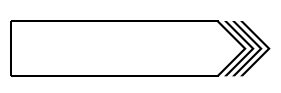
This is what I have done: https://jsfiddle.net/aqjfLy7s/. I am unable to figure out how to get the first arrow flush with the button border. All subsequent arrows must also follow the same pattern.
.wrapper {
  width: 50%;
  border: 1px solid #ccc;
  padding: 50px 0px;
  margin: auto;
  display: flex;
  justify-content: center;
  align-items: flex-end;
}

.w1 {
  display: flex;
  justify-content: center;
  align-items: center;
  width: 100%;
  margin-left: 30px;
}

.w2 {
  display: flex;
  justify-content: center;
  align-items: center;
  margin-left: 30px;
  margin-right: 30px;
  background-color: #ffcc00;
  padding: 10px;
}

.btn {
  color: #000;
  border: 1px solid #000;
  border-right: none;
  padding: 0.5rem 1rem;
  width: 80%;
}

span {
  width: 1rem;
  height: 1rem;
  border: 0.25rem solid;
  border-color: black transparent transparent black;
  transform: rotate(135deg);
  margin-left: -12px;
}
<div class="wrapper">
<div class="w1">
<a class="btn" href="#">Test</a>
<span></span>
<span></span>
<span></span>
<span></span>
</div>
<div class="w2">123</div>
</div> 265
265
Here is another idea with less of code where you can simply rely on pseudo element and skew transformation
.box {
  display:inline-block;
  padding:10px;
  margin-right:60px;
  border:1px solid;
  border-right:none;
  position:relative;
}
.box:before,
.box:after{
  content:"";
  position:absolute;
  margin-left:-1px;
  top:-1px;
  left:100%;
  bottom:50%;
  width:30px;
  background:linear-gradient(to right,#000 28%,transparent 29%) 1px 0/25% 100%;
  transform:skewX(45deg);
  transform-origin:top;
}
.box:after {
  transform:skewX(-45deg);
  transform-origin:bottom;
  bottom:-1px;
  top:50%;
}
<div class="box">
some text
</div>
<div class="box">
some long long text
</div>
<div class="box">
2 lines <br> text
</div>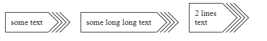
That you can easily scale to any number of border
.box {
  --b:4;
  display:inline-block;
  padding:10px;
  margin:5px;
  margin-right:calc(var(--b)*15px);
  border:1px solid;
  border-right:none;
  position:relative;
}
.box:before,
.box:after{
  content:"";
  position:absolute;
  margin-left:-1px;
  top:-1px;
  left:100%;
  bottom:50%;
  width:calc(var(--b)*7.5px);
  background:linear-gradient(to right,#000 28%,transparent 29%) 1px 0/calc(100%/var(--b)) 100%;
  transform:skewX(45deg);
  transform-origin:top;
}
.box:after {
  transform:skewX(-45deg);
  transform-origin:bottom;
  bottom:-1px;
  top:50%;
}
<div class="box">
some text
</div>
<div class="box" style="--b:2">
some long long text
</div>
<div class="box" style="--b:10">
2 lines <br> text
</div>
<div class="box" style="--b:30">
some long long text
</div>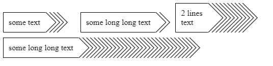
Here is a Codepen to play with the code
153
If you love us? You can donate to us via Paypal or buy me a coffee so we can maintain and grow! Thank you!
Donate Us With

