 Menu
Menu
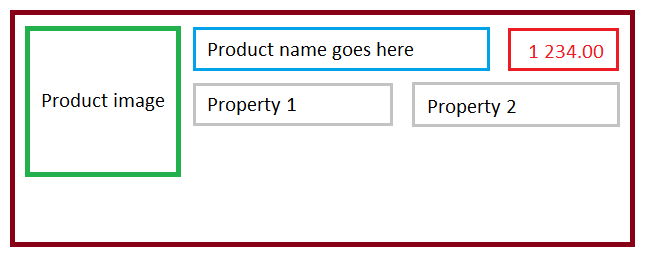
I'm trying to have a specific HTML markup of my divs using css and bootstrap 3.2. The image below demonstrates the result I want to get.
I've used the bootstrap grid system so that my page would be responsive and properly displayed in small screen devices. This is the code I've tried. And I used http://www.bootply.com to test it.
Any ideas how to get the markup ?
<div>
  <div style="display:inline-block; border:1px solid gray; width:150px; height:150px;">
    <img src='' alt="image go here !"/>
  </div>

  <div class="container-fluid" style="display:inline-block;">
    <div class="row" style="border:1px solid gray;">
      <div class="col-md-9">This is the product name</div>
      <div class="col-md-3 text-right">1 230.99</div>
    </div>

    <div class="row" style="display:inline-block; border:1px solid gray;">
      <div class="col-md-6">Property 1</div>
      <div class="col-md-6">Property 2</div>
    </div>
  </div>
</div>
The desired result :
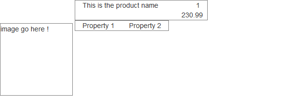
EDIT : The result I get :
 912
912
I've created a Bootply for you.
<div class="container">
    <div class="row">

        <div class="col-md-3">
            <div class="img">
                <img src="">
            </div>
        </div>

        <div class="col-md-9">
            <div class="row">
            <div class="col-md-8">
              This is the product name
            </div>
            <div class="col-md-4">
              1 230.99
            </div>
            </div>

            <div class="row">
            <div class="col-md-6">
              Property 1
            </div>
            <div class="col-md-6">
              Property 2
            </div>
            </div>
        </div>

    </div>
 </div>
If you love us? You can donate to us via Paypal or buy me a coffee so we can maintain and grow! Thank you!
Donate Us With

