 Menu
Menu
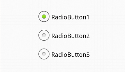
I am trying to get radio button like this..
But I am getting like this

If No option is selected, I need to customize the radio button and it should show white color inside it. If radio button is selected, it should show green color inside the box. How to achieve this?
Here what I tried.
index.html
<!doctype html>
<html>
  <head>
    <meta charset="utf-8">
<style>
/* Radio Button CSS*/
label {
    display: inline;
}
.radio-1 {
    width: 193px;
}
.button-holder {
    float: left;
    margin-left: 6px;
    margin-top: 16px;
}
.regular-radio {
    display: none;
}
.regular-radio + label {
    background-color: #fafafa;
    border: 2px solid #cacece;
    border-radius: 50px;
    box-shadow: 0 1px 2px rgba(0, 0, 0, 0.05), 0 -15px 10px -12px rgba(0, 0, 0, 0.05) inset;
    display: inline-block;
    padding: 11px;
    position: relative;

}
.regular-radio:checked + label:after {
    background: none repeat scroll 0 0 #94E325;
    border-radius: 50px;
    box-shadow: 0 0 10px rgba(0, 0, 0, 0.3) inset;
    content: " ";
    font-size: 36px;
    height: 8px;
    left: 7px;
    position: absolute;
    top: 7px;
    width: 8px;
}
.regular-radio:checked + label {
    background-color: #e9ecee;
    border: 2px solid #adb8c0;
    color: #99a1a7;
    padding: 11px;
}
.regular-radio + label:active, .regular-radio:checked + label:active {
    box-shadow: 0 1px 2px rgba(0, 0, 0, 0.05), 0 1px 3px rgba(0, 0, 0, 0.1) inset;
}
</style>
  </head>
  <body>
 <div class="button-holder">
<input type="radio" checked="" class="regular-radio" name="radio-1-set" id="radio-1-set"><label for="radio-1-set"></label><br>
<input type="radio" checked="" class="regular-radio" name="radio-1-set" id="radio-2-set"><label for="radio-2-set"></label><br>
</div>
    </body>
</html>
 836
836
Just add the :before pseudo element to take care of the color before the radio button is checked. You could add this to your CSS:
 .regular-radio + label:before {
  background: none repeat scroll 0 0 #FDFDFD;
  border-radius: 50px;
  box-shadow: 0 0 10px rgba(0, 0, 0, 0.3) inset;
  content: " ";
  font-size: 36px;
  height: 8px;
  left: 7px;
  position: absolute;
  top: 7px;
  width: 8px;
}
Working demo. You can ofcourse change the background of this label to match exactly the example you show. Hope it helps.
50
You can achieve desired layout in two ways
Via removing standard appearance using CSS appearance and applying custom appearance. Unfortunately this was doesn't work in IE. Demo:
input[type="radio"] {
  /* remove standard background appearance */
  -webkit-appearance: none;
  -moz-appearance: none;
  appearance: none;
  /* create custom radiobutton appearance */
  display: inline-block;
  width: 25px;
  height: 25px;
  padding: 6px;
  /* background-color only for content */
  background-clip: content-box;
  border: 2px solid #bbb;
  background-color: #e7e6e7;
  border-radius: 50%;
}

/* appearance for checked radiobutton */
input[type="radio"]:checked {
  background-color: #93e026;
}

/* optional styles, I'm using this for centering radiobuttons */
.flex {
  display: flex;
  align-items: center;
}
<div class="flex">
<input type="radio" name="radio" id="radio1" />
<label for="radio1">RadioButton1</label>
</div>
<div class="flex">
<input type="radio" name="radio" id="radio2" />
<label for="radio2">RadioButton2</label>
</div>
<div class="flex">
<input type="radio" name="radio" id="radio3" />
<label for="radio3">RadioButton3</label>
</div>Via hiding radiobutton and setting custom radiobutton appearance to label's pseudoselector. By the way no need for absolute positioning here. Demo:
*,
*:before,
*:after {
  box-sizing: border-box;
}

input[type="radio"] {
  display: none;
}

input[type="radio"] + label:before {
  content: "";
  /* create custom radiobutton appearance */
  display: inline-block;
  width: 25px;
  height: 25px;
  padding: 6px;
  margin-right: 3px;
  /* background-color only for content */
  background-clip: content-box;
  border: 2px solid #bbb;
  background-color: #e7e6e7;
  border-radius: 50%;
}

/* appearance for checked radiobutton */
input[type="radio"]:checked + label:before {
  background-color: #93e026;
}

/* optional styles, I'm using this for centering radiobuttons */
label {
  display: flex;
  align-items: center;
}
<input type="radio" name="radio" id="radio1" />
<label for="radio1">RadioButton1</label>
<input type="radio" name="radio" id="radio2" />
<label for="radio2">RadioButton2</label>
<input type="radio" name="radio" id="radio3" />
<label for="radio3">RadioButton3</label>If you love us? You can donate to us via Paypal or buy me a coffee so we can maintain and grow! Thank you!
Donate Us With