 Menu
Menu
CODEPEN
Background:
I'm experimenting with Grid CSS and trying to get to this layout which is currently implemented to scale
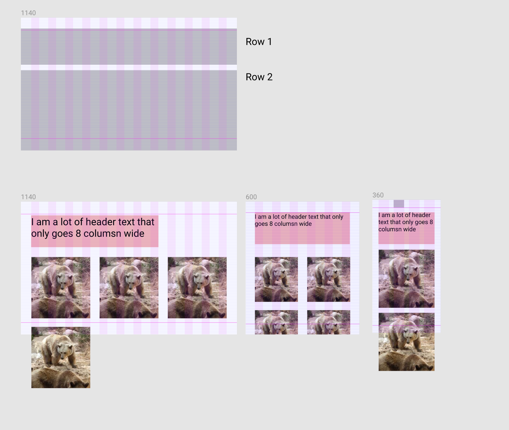
Expected Layout
Problem:
On desktop the element-header should be 8 columns wide and if I don't add grid-rows to element-header and element than <div class="element">1</div> will fill in the next to element-header. Now if I add grid-rows my element will no longer wrap.
Current Layout (problem)


Question
How can I fix my grid to match the "expected layout" screenshot above?
i.e. .element will wrap and start on the second grid row
Code:
HTML:
<section class="section">
  <div class="container">
    <div class="samba-grid">
      <div class="element-header"><h1>I am a lot of header text that only goes 8 columsn wide</h1></div>
      <div class="element">1</div>
      <div class="element">2</div>
      <div class="element">3</div>
      <div class="element">4</div>
    </div>
  </div>
</section>
CSS:
.section {
  width: 100%;
  display: block;
  background: red;
  box-sizing: border-box;
  padding: 40px 24px;

  @media screen and (min-width: 600px) and (max-width: 1139px) {
    background: orange;
    padding: 56px 48px;
  }

  @media screen and (min-width: 1140px) {
    padding: 64px 48px;
    background: green;
  }
}

.container {
  margin: 0 auto;
  background: rgba(244,244,244, .25);
  max-width: 599px;

  @media screen and (min-width: 600px) and (max-width: 1139px) {
    max-width: 1039px;
    background: rgba(244,244,244, .25);
  }

  @media screen and (min-width: 1140px) {
    max-width: 1032px;
    background: rgba(244,244,244, .25);
  }
}

.samba-grid {
  display: grid;
  background: inherit;
  width: 100%;
  grid-template-columns: repeat(4, 1fr);
  grid-template-rows: 'auto auto';
  grid-gap: 24px;

  @media screen and (min-width: 600px) and (max-width: 1139px) {
    grid-template-columns: repeat(6, 1fr);
    grid-gap: 48px;
  }

  @media screen and (min-width: 1140px) {
    grid-template-columns: repeat(12, 1fr);
    grid-gap: 48px;
  }
}

h1 {
  font-size: 52px;
}
.element-header {
  grid-row: 1;
  grid-column: span 8; // SET THIS TO "span 12" TO SEE EXPECTED BEHAVIOR
}

.element {
  display: grid; // important to do this.
  background: rgba(0,0,0,.3);
  grid-column: span 3;
  grid-row: 2; // REMOVE THIS TO SEE EXPECTED BEHAVIOR

  @media screen and (min-width: 600px) and (max-width: 1139px) {
    grid-column: span 3;
  }

  @media screen and (min-width: 1140px) {
    grid-column: span 4;
  }
}
 783
783
You can make the text to take the full row and then inside you decrease its width so it only take the needed width. Like that you will block the 1st row and no element can go there.
Here is a simplified example:
.samba-grid {
  display: grid;
  background: inherit;
  width: 100%;
  grid-template-columns: repeat(12, 1fr);
  grid-gap: 24px;
  border:1px solid;
}

.element-header {
  grid-row: 1;
  grid-column: 1/-1;
}
.element-header > h1 {
  /*we take 8 colmuns (without gaps) + 7 gaps*/
  width:calc(8*(100% - 11*24px)/12 + 7*24px);
  background:red;
  margin:0;
}
.samba-grid > span {
  height:50px;
  grid-column: span 2;
  background:green;
}
<div class="samba-grid">
<div class="element-header">
<h1>I am a lot of header text that only goes 8 columsn wide</h1>
</div>
<span></span>
<span></span>
<span></span>
<span></span>
<span></span>
<span></span>
<span></span>
<span></span>
</div>To make it more dynamic and easy to handle you can consider CSS variables:
:root {
  --grid:12;
  --gap:24px;
}

.samba-grid {
  display: grid;
  background: inherit;
  width: 100%;
  grid-template-columns: repeat(var(--grid), 1fr);
  grid-gap: var(--gap);
  border:1px solid;
}

.element-header {
  grid-row: 1;
  grid-column: 1/-1;
  --grid-column:8; /*simply adjust this value to control the column*/
}
.element-header > h1 {
  width:calc(var(--grid-column)*(100% - (var(--grid) - 1)*var(--gap))/var(--grid) + calc(var(--grid-column) - 1)*var(--gap));
  background:red;
  margin:0;
}
.samba-grid > span {
  height:50px;
  grid-column: span 2;
  background:green;
}
<div class="samba-grid">
<div class="element-header">
<h1>I am a lot of header text that only goes 8 columsn wide</h1>
</div>
<span></span>
<span></span>
<span></span>
<span></span>
<span></span>
<span></span>
<span></span>
<span></span>
</div>Another idea is to consider a hidden element that will take the remaining space of the first row:
.samba-grid {
  display: grid;
  background: inherit;
  width: 100%;
  grid-template-columns: repeat(12, 1fr);
  grid-gap: 24px;
  border:1px solid;
}

.element-header {
  grid-row: 1;
  grid-column: span 8;
  background:red;
  order:-2;
}

.samba-grid:before {
 content:"";
 order:-1;
 grid-column: span 4;
 background:blue;
 height:2px;
}

.samba-grid > span {
  height:50px;
  grid-column: span 2;
  background:green;
}
<div class="samba-grid">
<div class="element-header">
<h1>I am a lot of header text that only goes 8 columsn wide</h1>
</div>
<span></span>
<span></span>
<span></span>
<span></span>
<span></span>
<span></span>
<span></span>
<span></span>
</div>As a side note, setting grid-row: 2 doesn't mean start from the second row but it means be inside the second row which is creating the issue.
69
If you love us? You can donate to us via Paypal or buy me a coffee so we can maintain and grow! Thank you!
Donate Us With

