 Menu
Menu
I am new to css grids, and I am trying to build a page with this layout:
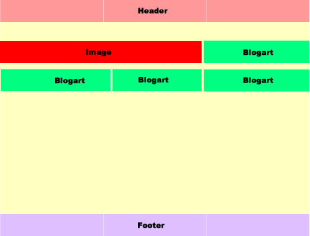
The problem I have is the .main class and the grid inside the container grid.
I think I have the wrong setup for the grid in .main.
For the upper container .container, I can see that three columns layout is working.
On the first row, I want the div image div to span 2 out of three columns, and blogart div to take up one column.
The second row should have three blogart divs spaning one column each.
But in the inner grid .main, all the markup is in a fourth column.

I have setup a codepen Greatful for any suggestions.
This is my markup, the css is in the codepen:
body {
  padding-top: 20px;
  background: #f5f7f8;
}

.container{
  display: grid;
  width: 100%;
  max-width: 750px;
  margin: 0 auto;

  grid-template-columns: repeat(3, 1fr);
  grid-template-rows: 80px 180px 80px;
  grid-gap: 20px;

  grid-template-areas: "header   header   header"
                       "main     main     main"
                       "footer   footer   footer";
}

.container div{
  color: white;
  font-size: 20px;
  padding: 20px;
}

.header {
  background: #b03532;
  grid-area: header;
}

.main {
  background: #33a8a5;
  grid-area: main;

  display: grid;

  grid-template-columns: repeat(3, 1fr);
  grid-template-rows: auto;
  grid-gap: 20px;

  grid-template-areas: "bigimg bigimg blogart"
                       "blogart blogart blogart";

}

.bigimg {
  background: #da6f2b;
  grid-area: bigimg;
}

.blogart {
  background: #3d8bb1;
  grid-area: blogart;
}

.footer {
  background: #6a478f;
  grid-area: footer;
}
<section class="container">
<div class="header">Header</div>
<div class="main">
<div class="bigimg">img</div>
<div class="blogart">blogart</div>
<div class="blogart">blogart</div>
<div class="blogart">blogart</div>
<div class="blogart">blogart</div>
</div>
<div class="footer">footer</div>
</section>-Thanks
 480
480
The problem is this section of your code:
.main {
  grid-template-areas: "bigimg  bigimg  blogart"
                       "blogart blogart blogart";
}
The layout is invalid.
From the spec:
7.3. Named Areas: the
grid-template-areaspropertyThis property specifies named grid areas, which are not associated with any particular grid item, but can be referenced from the grid-placement properties.
The syntax of the
grid-template-areasproperty also provides a visualization of the structure of the grid, making the overall layout of the grid container easier to understand.All strings must have the same number of columns, or else the declaration is invalid.
If a named grid area spans multiple grid cells, but those cells do not form a single filled-in rectangle, the declaration is invalid.
Note: Non-rectangular or disconnected regions may be permitted in a future version of this module.
(emphasis mine)
In short, your .blogart visualization is L-shaped, not rectangular, so it doesn't work.
This is not a problem with your .container visualization, which works fine:
.container {
  grid-template-areas: "header   header   header"
                       "main     main     main"
                       "footer   footer   footer";
}
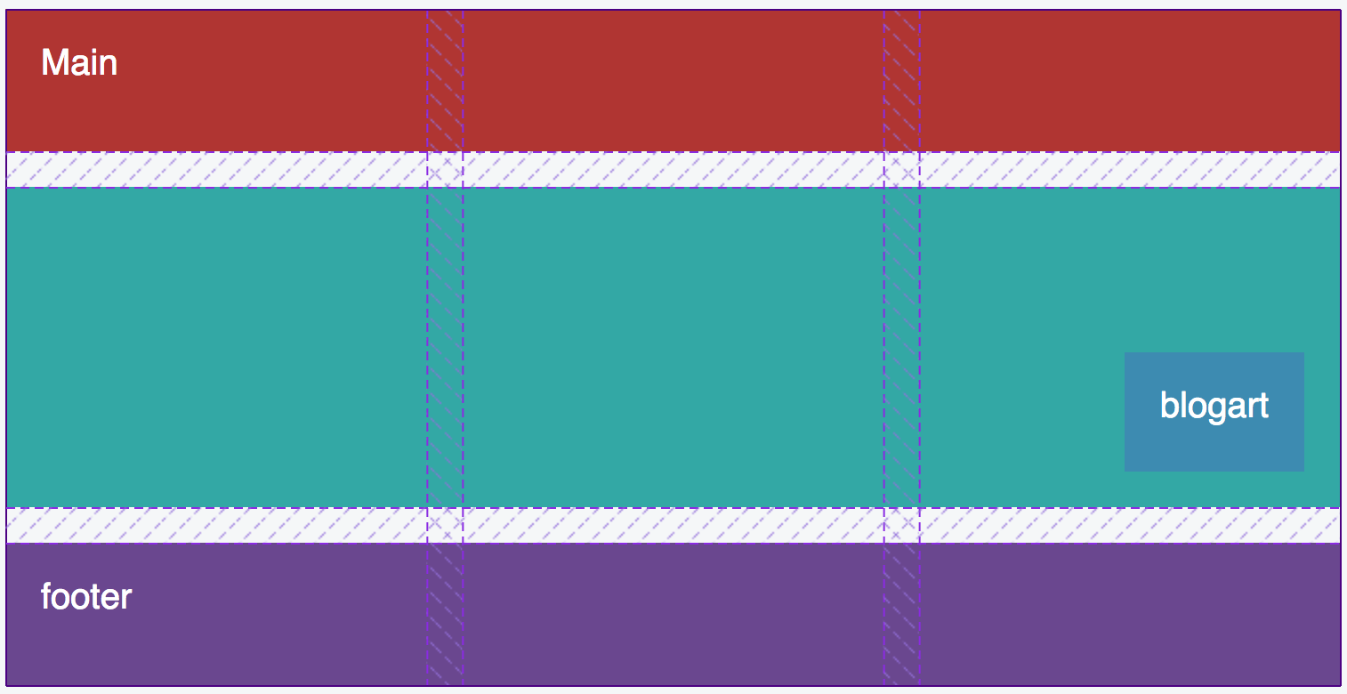
To make your layout work consider using grid-column and grid-row on the grid items. Here's a rough sketch, based on your demo:
body {
  padding-top: 20px;
  background: #f5f7f8;
}
.container{
  display: grid;
  width: 100%;
  max-width: 750px;
  margin: 0 auto;
  grid-template-columns: repeat(3, 1fr);
  grid-template-rows: 80px 180px 80px;
  grid-gap: 20px;
  grid-template-areas: "header   header   header"
                       "main     main     main"
                       "footer   footer   footer";
}
.container div {
  color: white;
  font-size: 20px;
  padding: 20px;
}
.header {
  background: #b03532;
  grid-area: header;
}
.main {
  background: #33a8a5;
  grid-area: main;
  display: grid;
  grid-template-columns: repeat(3, 1fr);
  grid-template-rows: auto;
  grid-gap: 20px;
  /* grid-template-areas: "bigimg bigimg blogart"
                       "blogart blogart blogart"; */

}
.bigimg {
  grid-column: 1 / 3;
  background: #da6f2b;
  /* grid-area: bigimg; */
}
.blogart:nth-child(2) {
  grid-column: 3 / 4;
  background: #3d8bb1;
  /* grid-area: blogart; */
}
.blogart:not(:nth-child(2)) {
  grid-column: auto / span 1;
  grid-row: 2;
  background: orange;
  /* grid-area: blogart; */
}

.footer {
  background: #6a478f;
  grid-area: footer;
}
<section class="container">
<div class="header">Header</div>
<div class="main">
<div class="bigimg">img</div>
<div class="blogart">blogart</div>
<div class="blogart">blogart</div>
<div class="blogart">blogart</div>
<div class="blogart">blogart</div>
</div>
<div class="footer">footer</div>
</section>revised codepen
137
If you love us? You can donate to us via Paypal or buy me a coffee so we can maintain and grow! Thank you!
Donate Us With

