 Menu
Menu
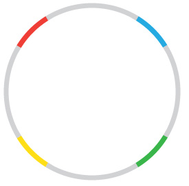
Does anybody know how to create this in CSS or if it's even possible. I know how to make quarter circles but I am not sure how to apply it in this format. Small chunks of the border need to be in different colors.
 752
752
You have already good answers.
Just to give you another way to get this result, you can do it with multiple backgrounds. The good news about this approach is that you only need a div for it.
.test {
  margin: 25px 0;
  width: 200px;
  height: 200px;
  border-radius: 50%;
  border: 12px solid transparent;
  background-size: 100% 100%, 50% 50%, 50% 50%, 50% 50%, 50% 50%;
  background-repeat: no-repeat;
  background-image: linear-gradient(white, white),
                    linear-gradient(30deg, red 36%, lightgrey 30%),
                    linear-gradient(120deg, yellow 36%, lightgrey 30%),
                    linear-gradient(300deg, blue 36%, lightgrey 30%),
                    linear-gradient(210deg, green 36%, lightgrey 30%);
  background-position: center center, left top, right top, left bottom, right bottom;
  background-origin: content-box, border-box, border-box, border-box, border-box;
  background-clip: content-box, border-box, border-box, border-box, border-box;
  transform: rotate(30deg);
}
<div class="test"></div>The sectors can be get with an inclined linear gradient, limited to one quarter of the space available. - we need 4 of these, changing the position and the angle.
Over those, another gradint, set fully to white, will hide the center.
And changing the background-origin and clip to border-box or content-box makes the colors use the space reserved for the border.
Note that this solution will work for any border / border-radius combination
154
This solution uses conic-gradient to draw the color stops, and mask-image with a linear gradient to remove the inner circle.
.target {
  width: 60vmin;
  height: 60vmin;
  background: conic-gradient(
    lightgrey 0deg 30deg,
    red 30deg 60deg,
    lightgrey 60deg 120deg,
    yellow 12deg 150deg,
    lightgrey 150deg 210deg,
    green 210deg 240deg,
    lightgrey 240deg 300deg,
    blue 300deg 330deg,
    lightgrey 330deg 360deg
  );
  -webkit-mask-image: radial-gradient(transparent 65%, black 65%);
  mask-image: radial-gradient(transparent 65%, black 65%);
  border-radius: 50%;
}

body {
  display: flex;
  align-items: center;
  justify-content: center;
  margin: 0;
  height: 100vh;
}
<div class="target"></div>If you love us? You can donate to us via Paypal or buy me a coffee so we can maintain and grow! Thank you!
Donate Us With


