 Menu
Menu
To begin, let me explain what I know exists and have tried variations of:
What I'm interested in is pure CSS solutions, with whatever hacky, new-fangled, experimental properties you can think of, that achieves the following results:
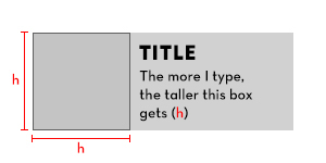
The height of the card is based on content (in this case a title and a paragraph). We'll call that h. Another element within the card should be that same h height (based on the content of a sibling), and whatever that h amount is, it should also be the width of that element (to create a square).
Edit (2019-28-02): I apologize for not being clear on this next point but, in order to get the text to wrap, the area where the text sits should have a maximum width. Marc Bellêtre's solution is admittedly pretty close as of today.
This question is very similar to an older question which did not receive any responses. The difference is that the parent, in this case, is not receiving any explicit height values. The height of the parent card is purely determined by the text inside of it. I can imagine that if that question has not received any responses/solutions that this may fare no different, especially since this is slightly more difficult. However, new technologies have come around since then (ie.: flexbox/grid), that might be helpful.
Please, no JavaScript solutions. I'm very aware of how to achieve this using it.
Sometimes when I load this code, the box isn't even square. The big problem is it doesn't respect the height: 100% at all but then it will be square after fiddling with resizing the browser or content. Updating the ratio makes the box grow unexpectedly large.
.card {
  background: #ddd;
  display: inline-flex;
}

.aspect-ratio {
  border: 1px solid;
  padding: 1em;
  aspect-ratio: 1 / 1;
  background: #ccc;
}

.content {
  padding: 1em;
  flex: 1 1 200px;
}

h3,
p {
  margin: 0;
}
<div class="card">
<div class="aspect-ratio">(h)</div>
<div class="content">
<h3>Title</h3>
<p contenteditable>The more I type, the taller this box gets (h)</p>
</div>
</div> 346
346
You can achieve this using an image with a 1:1 aspect ratio and the flex property.
section {
  display: flex;
}

.square {
  display: grid;
  background-color: lightgrey;
}

img {
  height: 100%;
  width: auto;
  max-width: 200px;
  visibility: hidden;
}

.text {
  padding-left: 1rem;
}
<section>
<div class="square">
<img src="https://upload.wikimedia.org/wikipedia/commons/1/1a/1x1_placeholder.png" />
</div>
<div class="text">
<h1>Title</h1>
<p>Lorem ipsum dolor sit amet, consectetur adipiscing elit. Nulla vulputate lectus nec ligula fermentum suscipit. Nam lobortis turpis sed augue interdum maximus.</p>
</div>
</section>EDIT JULY 2021:
For some reason the previous solution was not working anymore without adding display: grid to the pixel container.
There is still a bug I didn't manage to fix causing the element to have sometimes a wrong aspect ratio before resizing the window.
Also this solution has a major drawback as it breaks as soon as the text wraps into a number of lines making its height too big. The square then grows in width as it is based on the height, reducing the width left for the text which grows again in height... Ending up up in some kind of infinite loop.
This can be avoided using a max-width on the image, but obviously this would break the aspect ratio.
Anyway this more a hack than a real solution to the question but I couldn't find a better way to achieve this without using Javascript.
99
If you love us? You can donate to us via Paypal or buy me a coffee so we can maintain and grow! Thank you!
Donate Us With