 Menu
Menu
I'm trying to animate a sprite image, and found this great example:
Blog: http://simurai.com/blog/2012/12/03/step-animation/ (has succumbed to linkrot).
Wayback Machine: http://web.archive.org/web/20140208085706/http://simurai.com/blog/2012/12/03/step-animation/
Code Fiddle: https://codepen.io/simurai/pen/tukwj
JSFiddle: http://jsfiddle.net/simurai/CGmCe/
.hi {
width: 50px;
height: 72px;
background-image: url("http://s.cdpn.io/79/sprite-steps.png");

-webkit-animation: play .8s steps(10) infinite;
   -moz-animation: play .8s steps(10) infinite;
    -ms-animation: play .8s steps(10) infinite;
     -o-animation: play .8s steps(10) infinite;
        animation: play .8s steps(10) infinite; }
@-webkit-keyframes play { from { background-position: 0px; } to { background-position: -500px; } }
@-moz-keyframes play { from { background-position: 0px; } to { background-position: -500px; } }
@-ms-keyframes play { from { background-position: 0px; } to { background-position: -500px; } }
@-o-keyframes play { from { background-position: 0px; } to { background-position: -500px; } }
@keyframes play { from { background-position: 0px; } to { background-position: -500px; } }
I'd like to do the same thing, but using a square (power-or-two sized) image atlas instead of an animation strip. For example, this one:
 978
978
While it is true that you cannot play two transform animations at the same time (because one transform would overwrite the other), it is not correct to say "You cannot play two animations since the attribute can be defined only once." See the accepted answer about using comma-separated values with animations.
In the CSS, use the @keyframes rule paired with fadeIn. At 0%, set the opacity to 0. At 100%, set the opacity to 1. This creates the fade-in effect.
Since this can be a difficult to debug task, I would like to start with the same problem, but in an easier to debug environment.
I chose to do it as a rectangle animation over the full image.
.hi {
    width: 320px;
    height: 315px;
    background-image: url("http://i.stack.imgur.com/CjMscm.jpg");
    position: relative;
    border: solid 1px black;
}

.hi:before {
    content: "";
    position: absolute;
    width: 100%;
    height: 53px;
    left: 0px;
    top: 0px;
    border: solid 1px red;
    -webkit-animation: playv 18s steps(6) infinite;
}

@-webkit-keyframes playv {
     0% { top:   0px; }
   100% { top: 315px; }
}

.hi:after {
    content: "";
    position: absolute;
    width: 53px;
    height: 100%;
    left: 266px;
    top: 0px;
    border: solid 1px red;
    -webkit-animation: playh 3s steps(6) infinite;
}

@-webkit-keyframes playh {
     0% { left:   0px; }
   100% { left: 320px; }
}
<div class="hi">
</div>Over the image, I display 2 pseudo elements, one is the row selector and the other the column selector. And I adjust the animations until they are ok
.hi {
    width: 320px;
    height: 315px;
    background-image: url("http://i.stack.imgur.com/CjMscm.jpg");
    position: relative;
    border: solid 1px black;
}

.hi:before {
    content: "";
    position: absolute;
    width: 53px;
    height: 53px;
    left: 0px;
    top: 0px;
    border: solid 1px red;
    -webkit-animation: playv 18s steps(6) infinite, playh 3s steps(6) infinite;
}

@-webkit-keyframes playv {
     0% { top:   0px; }
   100% { top: 315px; }
}

@-webkit-keyframes playh {
     0% { left:   0px; }
   100% { left: 320px; }
}
<div class="hi">
</div>.hi {
width: 53px;
height: 53px;
background-image: url("http://i.stack.imgur.com/CjMscm.jpg");
position: relative;
border: solid 1px black;
-webkit-animation: playv 1s steps(6) infinite, playh 0.1667s steps(6) infinite;
animation: playv 1s steps(6) infinite, playh 0.1667s steps(6) infinite;
}
@-webkit-keyframes playv {
0% {
background-position-y: 0px;
}
100% {
background-position-y: -315px;
}
}
@-webkit-keyframes playh {
0% {
background-position-x: 0px;
}
100% {
background-position-x: -320px;
}
}
@keyframes playv {
0% {
background-position-y: 0px;
}
100% {
background-position-y: -315px;
}
}
@keyframes playh {
0% {
background-position-x: 0px;
}
100% {
background-position-x: -320px;
}
}<div class="hi">
</div>All this for a webkit browser, remove prefixes for IE and FF. Also, in this approach it is imposible to avoid displaying the 2 blank images at the lower left corner. If you don't have a full grid, and don't want to display the empty images, you will need to specify all the keyframes one by one
97
Use background-position-x and background-position-y property instead.
For this image
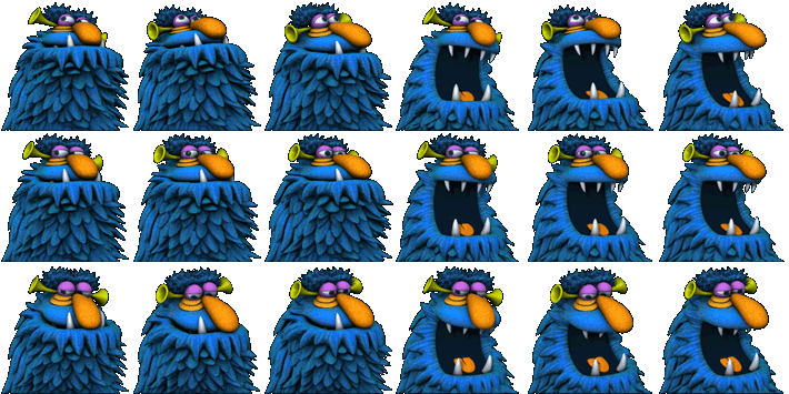
of size 710px × 355px
sprite frame size is 118.333px X 118.333px and we need to travel 6 frames horizontally and 3 frames vertically.
That means we need to create two separate keyframe animations to traverse each direction. When x direction animation is in play, other must froze until it completes.
Also duration of y animation must be 3X.
Here is code
<div class="hi"></div>


.hi {
  width: 118.333px;
  height: 118.333px;
  background-image: url("http://www.fore6.com/wp-content/uploads/2011/09/henson11-hp-1g.png");
  animation: playX 1s steps(6) infinite,
             playY 3s steps(3) infinite;
}

@keyframes playX {
  from {background-position-x: 0px;}
  to {background-position-x: -710px;}
}

@keyframes playY {
  from {background-position-y: 0px;}
  to {background-position-y: -355px;}
}
fiddle here
42
If you love us? You can donate to us via Paypal or buy me a coffee so we can maintain and grow! Thank you!
Donate Us With