 Menu
Menu
I would like to create this shape using just css. I am pretty sure this can be done. But i am having trouble with gradients involved.
This shape will contain some text inside. Suggested html markup is:
<div class="container">
    ... more html contents...
</div>
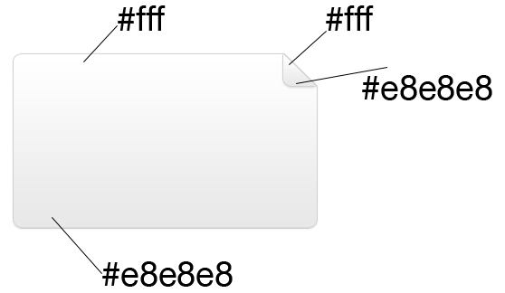
A jsFiddle would be highly appreciated.
Thanks in advance.
 881
881
Try this, http://jsfiddle.net/HshfF/1/
CSS: (From the fiddle in this comment)
.main {
    background: -moz-linear-gradient(top, #ffffff 0%, #e8e8e8 100%); /* FF3.6+ */
    background: -webkit-gradient(linear, left top, left bottom, color-stop(0%,#ffffff), color-stop(100%,#e8e8e8)); /* Chrome,Safari4+ */
    background: -webkit-linear-gradient(top, #ffffff 0%,#e8e8e8 100%); /* Chrome10+,Safari5.1+ */
    background: -o-linear-gradient(top, #ffffff 0%,#e8e8e8 100%); /* Opera 11.10+ */
    background: -ms-linear-gradient(top, #ffffff 0%,#e8e8e8 100%); /* IE10+ */
    background: linear-gradient(to bottom, #ffffff 0%,#e8e8e8 100%); /* W3C */
    position: relative;
    width: 150px;
    height: 100px;
    margin: 10px;
    border: 1px solid #d0d0d0;
    border-radius: 10px;
    padding: 20px;
}

.main:before {
    content: '';
    display: block;
    top: -1px;
    right: -1px;
    width: 20px;
    height: 20px;
    background: -moz-linear-gradient(top, #ffffff 0%, #e8e8e8 100%); /* FF3.6+ */
    background: -webkit-gradient(linear, left top, left bottom, color-stop(0%,#ffffff), color-stop(100%,#e8e8e8)); /* Chrome,Safari4+ */
    background: -webkit-linear-gradient(top, #ffffff 0%,#e8e8e8 100%); /* Chrome10+,Safari5.1+ */
    background: -o-linear-gradient(top, #ffffff 0%,#e8e8e8 100%); /* Opera 11.10+ */
    background: -ms-linear-gradient(top, #ffffff 0%,#e8e8e8 100%); /* IE10+ */
    background: linear-gradient(to bottom, #ffffff 0%,#e8e8e8 100%); /* W3C */
    position: absolute;
    border-radius: 0 0 0 5px;
    border-left: 1px solid #d0d0d0;
    border-bottom: 1px solid #d0d0d0;
}

.main:after {
    content: '';
    display: block;
    position: absolute;
    top: -1px;
    right: -1px;
    border-top: 20px solid #fff;
    border-left: 20px solid transparent;
}
If you love us? You can donate to us via Paypal or buy me a coffee so we can maintain and grow! Thank you!
Donate Us With