 Menu
Menu
With the code below, I can only generate a linear-gradient border-image for the element's bottom edge. How can I modify the code to make one for its top as well?
div {
    /* gradient shining border */
    border-style: solid;
    border-width: 3px;
    -webkit-border-image: -webkit-linear-gradient(
        left,
        rgba(0,0,0,1) 1%,
        rgba(0,255,255,1) 50%,
        rgba(0,0,0,1) 100%
    ) 0 0 100% 0/0 0 3px 0 stretch;
    -moz-border-image: -moz-linear-gradient(
        left,
        rgba(0,0,0,1) 1%,
        rgba(0,255,255,1) 50%,
        rgba(0,0,0,1) 100%
    ) 0 0 100% 0/0 0 3px 0 stretch;
    -o-border-image: -o-linear-gradient(
        left,
        rgba(0,0,0,1) 1%,
        rgba(0,255,255,1) 50%,
        rgba(0,0,0,1) 100%
    ) 0 0 100% 0/0 0 3px 0 stretch;
    border-image: linear-gradient(
        to left,
        rgba(0,0,0,1) 1%,
        rgba(0,255,255,1) 50%,
        rgba(0,0,0,1) 100%
    ) 0 0 100% 0/0 0 3px 0 stretch;
}
Current Output:
 412
412
The first linear gradient is limited to the padding box (i.e., all the content of the element, except the borders).
To show gradients for a border with CSS you can use the border-image property. It allows setting gradient values in the same way as the background-image property. Besides the border-image property, you should specify additional properties to actually show border gradient.
Use two gradients: one rotated 90deg and the other rotated -90deg. Use two color stops: #880015 at 50% and #fff at 50% Use a background-size of 100% width and 3px in height, i.e. background-size: 100% 3px. Position the two backgrounds at the top left and bottom left of your element.
You are using the shorthand border-image property for setting the size of the gradient and according to the values provided, the top, left and right borders are nullified.
Setting 100% as width of the border gradient on top and 3px as its height would result in the gradient getting applied only on top and bottom.
border-image: linear-gradient(to left, rgba(0, 0, 0, 1) 1%, rgba(0, 255, 255, 1) 50%, rgba(0, 0, 0, 1) 100%)
              100% 0 100% 0/3px 0 3px 0 stretch;
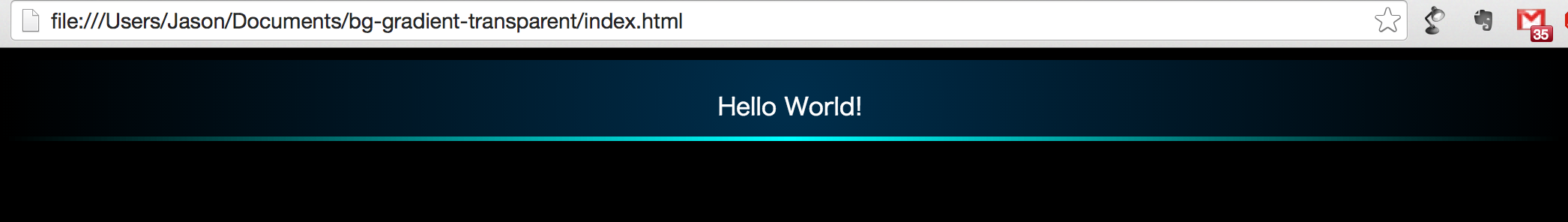
In the above lines of code, the 100% 0 100% 0/3px 0 3px 0 represents the size of the gradient border on each side (read as [top] [right] [bottom] [left]). Originally it was 0 0 100% 0/0 0 3px 0.
div {
  /* gradient shining border */
  border-style: solid;
  border-width: 3px;
  border-image: linear-gradient(to left, rgba(0, 0, 0, 1) 1%, rgba(0, 255, 255, 1) 50%, rgba(0, 0, 0, 1) 100%)
                100% 0 100% 0/3px 0 3px 0 stretch;

  /* other demo stuff */
  height: 50px;
  line-height: 50px;
  background-color: #222;
  color: white;
  text-align: center;
}
<div>Some content</div>Note that border-image property still has pretty low browser support and would not work if you need to support IE10 and lower. Instead of it, you could use background-image like in the below snippet to produce a similar effect though. This works in IE10 also (but still wouldn't work in IE9- because they do not support gradients at all).
div {
  /* gradient shining border */
  background-image: linear-gradient(to left, rgba(0, 0, 0, 1) 1%, rgba(0, 255, 255, 1) 50%, rgba(0, 0, 0, 1) 100%),
                    linear-gradient(to left, rgba(0, 0, 0, 1) 1%, rgba(0, 255, 255, 1) 50%, rgba(0, 0, 0, 1) 100%);
  background-size: 100% 3px;
  background-position: 0% 0%, 0% 100%;
  background-repeat: no-repeat;

  /* other demo stuff */
  height: 50px;
  line-height: 50px;
  background-color: #222;
  color: white;
  text-align: center;
}
<div>Some content</div>If you love us? You can donate to us via Paypal or buy me a coffee so we can maintain and grow! Thank you!
Donate Us With

