 Menu
Menu
Hi I'm trying to create the following Angled Strip Look in HTML & CSS:
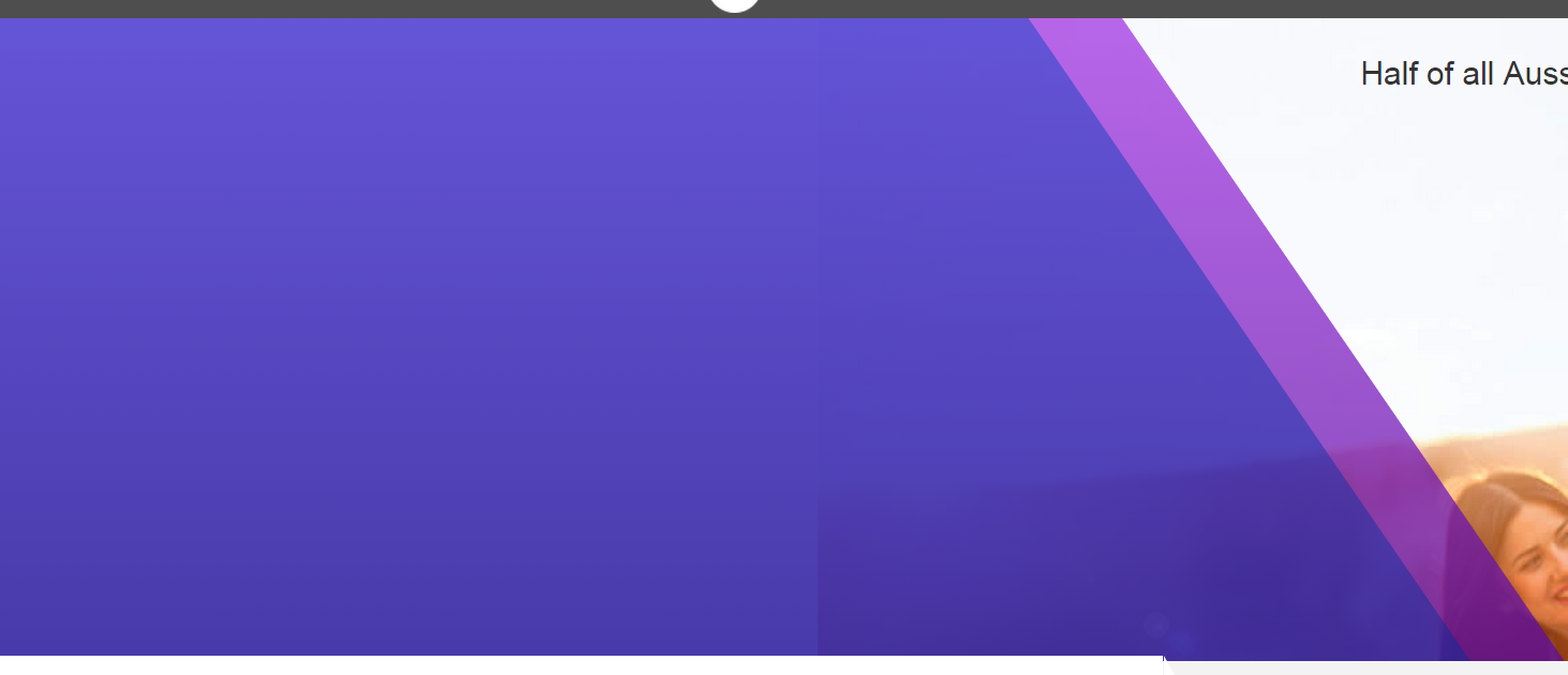
Just the Blue and Purple area with white after.
I can obviously see how to do it using an image but what about HTML/CSS only?
Is this possible?
Its used on the site - www.africa.dating
I know I should have more example code but I'm actually not sure where to begin so I only have the following HTML:
Fiddle: http://jsfiddle.net/e2dr5udr/3/
<div id="container">
    <div id="blue"></div>
    <div id="purple"></div>
</div>

#container {
    width: 100%;
    height: 100px;
    background-color: white;
    position: absolute;
}

#blue {
    width: 100%;
    height: 100px;
    background-color: blue;
    position: absolute;
}

#purple {
    width: 100%;
    height: 100px;
    background-color: purple;
    position: absolute;
}
thankyou
 779
779
Here is a demo of what you want: http://jsfiddle.net/shivanraptor/c4vrLrq7/
Basically it's a Square (#blue), Triangle (#triangle), Parallelogram (#parallelogram)
    #container {
        width: 100%;
        height: 100px;
        background-color: white;
        position: absolute;
    }

    #blue {
        width: 200px;
        height: 100px;
        background-color: blue;
        float: left;
    }

    #triangle {
    	width: 0;
    	height: 0;
    	border-left: 50px solid transparent;
    	border-right: 50px solid transparent;
    	border-bottom: 100px solid blue;
        float: left;
        margin-left: -50px;

    }
    #parallelogram {
    	width: 50px;
    	height: 100px;
    	-webkit-transform: skew(30deg);
    	   -moz-transform: skew(30deg);
    	     -o-transform: skew(30deg);
    	background: purple;
        float: left;
        margin-left: -50px;
    }
<div id="container">
<div id="blue"></div>
<div id="triangle"></div>
<div id="parallelogram"></div>
</div>If you want a background-image, you could make use of rgba() values and a :pseudo-element.
The idea is to apply the background-image to an :after :pseudo-element and the linear-gradient with rgba() values on the main div.
You could change the opacity of the linear-gradient by changing the alpha value in rgba(red, green, blue, alpha)
div {
  position: relative;
  height: 200px;
  background: linear-gradient(55deg, rgba(122, 0, 201, 0.8) 75%, rgba(178, 0, 204, 0.8) 75%, rgba(178, 0, 204, 0.7) 80%, transparent 80%);
}
div:after {
  position: absolute;
  content: '';
  width: 100%;
  height: 100%;
  background: url(http://lorempixel.com/700/200);
  z-index: -1;
}<div></div>You can use a pseudo element and some border manipulation.
This would allow you to create it with only a single element, to create this:
.title {
  height: 1px;
  background-color: transparent;
  border-bottom: 170px solid blue;
  border-right: 170px solid transparent;
  width: 190px;
  position:relative;
}

.title:after{
  content:"";
  position:absolute;
  height: 1px;
  top:0px;
  background-color: transparent;
  border-bottom: 170px solid purple;
  border-right: 170px solid transparent;
  width: 210px;
  z-index:-1;
  }
<div class="title"></div>If you do not want to use this approach, an alternative method (using background gradients) can be viewed here
Using SkewX:
div{
  position:relative;
  height:15vh;
  width:60vw;
  overflow:hidden;
  }
div:before{
  z-index:-1;
  content:"";
  position:absolute;
  top:0;
  height:100%;
  right:50%;
  width:150%;
  border-right:10px solid green;
  background:cornflowerblue;
  -webkit-transform:skewX(45deg);
  transform:skewX(45deg);
}<div>123</div>An other approach using one element, the skewX() property for the slope right side, the transparency is made with rgba() background-color and border on a pseudo element :
DEMO
div{
    height:100%;
    position:relative;
    overflow:hidden;
}
div:before{
    content:'';
    position:absolute;
    top:0; right:0;
    width:100%; height:100%;
    background-color: rgba(90, 74, 199, .8);
    border-right:40px solid rgba(173, 96, 223, .8);

    -webkit-transform-origin:100% 100%;
    -ms-transform-origin:100% 100%;
    transform-origin:100% 100%;

    -webkit-transform:skewX(30deg);
    -ms-transform:skewX(30deg);
    transform:skewX(30deg);
}


/******  FOR THE DEMO  *******/

html, body{
    background: url(http://lorempixel.com/output/people-q-c-640-480-1.jpg);
    background-size:cover;
    margin:0;padding:0;
height:100%;<div></div>If you love us? You can donate to us via Paypal or buy me a coffee so we can maintain and grow! Thank you!
Donate Us With