 Menu
Menu
I know with some border tricks, I could create trapezoid shape. I can also set its border-color to rgba(r,g,b,a) to make it transparent.
But is it possible to create trapezoid that has transparent borders and background ?
See below image for an example,

Currently, I use some png images to achieve this effect,but generating images of different sizes is really boring work,so I'm looking for a css soluation。
 695
695
Personally, I think it's overkill, but it can be done like this:
HTML:
<div class='outer'>
    <div class='content'><!--stuff here--></div>
    <div class='label l1'></div>
    <div class='label l2'></div>
</div>
CSS:
.outer {
    position: relative;
    width: 500px; /* whole thing breaks if this is not a multiple of 100px */
    border: solid .5em rgba(0,0,255,.5);
    border-bottom: solid 0px transparent;
    margin: 7em auto 0;
    background: rgba(0,0,0,.5);
    background-clip: padding-box;
}
.outer:before, .outer:after {
    position: absolute;
    top: 100%;
    height: .5em;
    background: rgba(0,0,255,.5);
    content: ''
}
.outer:before { left: -.5em; width: 15%; border-left: solid .5em transparent; }
.outer:after { right: -.5em; width: 55%; border-right: solid .5em transparent; }
.content {
    padding: .5em;
    margin: 1.5em;
    border-bottom: solid 1.5em transparent;
    background: lightblue;
    background-clip: padding-box;
}
.label {
    overflow: hidden;
    position: absolute;
    top: 100%;
    width: 15%;
    height: 3em;
}
.l1 { left: 15%; }
.l2 { left: 30%; }
.label:before {
    position: absolute;
    top: -.5em;
    width: 100%;
    height: 2.5em;
    border: solid .5em rgba(0,0,255,.5);
    background: rgba(0,0,0,.5);
    background-clip: padding-box;
    content: '';
}
.l1:before { left: 9%; transform: skewX(30deg); }
.l2:before { right: 9%; transform: skewX(-30deg); }
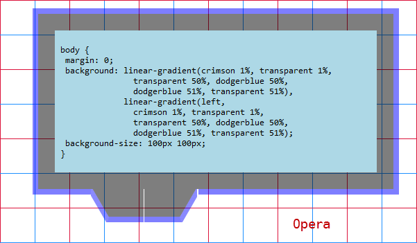
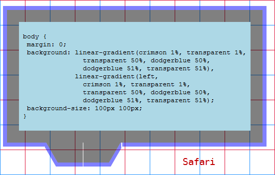
It works in Firefox, Chrome, Opera and Safari (I was afraid to test it in IE9, though both transform and background-clip work) but only if the width for .outer has a value that's a multiple of 100px.
Unless using a width that's a multiple of 100px, it only works in Firefox and Chrome (there is a little glitch in Chrome - could be fixed by using a WebKit-only left to right linear gradient that sharply goes from transparent to that semitransparent blue really close to the start).
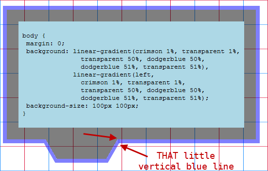
It breaks in Opera and Safari (if using a width that is not a multiple of 100px):
127
You can make the bg color and border colors transparent, but the borders will not follow the shape of the trapezoid:
http://jsfiddle.net/Kyle_Sevenoaks/UZbJh/1/
So your best bet is to stick with the pngs for now.
27
If you love us? You can donate to us via Paypal or buy me a coffee so we can maintain and grow! Thank you!
Donate Us With