 Menu
Menu
I have the following code that generates the silhouette of a PNG image:
#silhouette img {
  -webkit-filter: grayscale(100%) brightness(0);
  filter: grayscale(100%) brightness(0);
  opacity: 0.6;
}
<div id="original">
<img src="https://i.stack.imgur.com/JJ6Vs.png" height="150px" width="auto" />
</div>
<div id="silhouette">
<img src="https://i.stack.imgur.com/JJ6Vs.png" height="150px" width="auto" />
</div>I have found some questions within StackOverflow (1, 2, 3), but all of them focus on getting the shadow/silhouette in black/gray and not in getting a colored version of it (e.g. I want the silhouette to be red or blue).
I tried playing with those solutions and the hue-rotate filter (applied to the img or the div) but I didn't get any good results. I'm guessing that it's because once the brightness has been set to 0/100 the silhouette is black/white and it doesn't matter the hue change.
Is it possible to do what i want only using CSS? How could it be done?
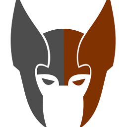
Note: I do not want to tint the image but to fully colorize it, the solutions in Tint image using CSS without overlay are good, but they don't work in my case as what they do is tint the image so it's different tones of one color (as you can see in this JSFiddles I created for each of the solutions: 1, 2, 3, 4), when what I want is to have a solid color silhouette like for example this one:

 319
319
Instead of using greyscale you could set contrast to 0 then play with the other values. A high amount of saturate will help with making bolder colors.
#silhouette img {
  -webkit-filter: contrast(0) sepia(100%) hue-rotate(190deg) saturate(2000%) brightness(100%);
  filter: contrast(0) sepia(100%) hue-rotate(190deg) saturate(2000%) brightness(100%);
  opacity: 1;
}
<div id="original">
<img src="https://i.stack.imgur.com/JJ6Vs.png" height="150px" width="auto" />
</div>
<div id="silhouette">
<img src="https://i.stack.imgur.com/JJ6Vs.png" height="150px" width="auto" />
</div>You can do this by combining the properties hue-rotate() saturate() and brightness().
I first found the base colour of your image (blue) and converted it into hsl 220,100,50 hsl picker . Now find the color that you want to change to and subtract 220 from the hue value that you just got and apply the hue-rotation()
Reference : How to calculate required hue-rotate to generate specific colour?
#silhouette img {
  -webkit-filter: hue-rotate(140deg) saturate(100%) brightness(100%);
  filter: hue-rotate(140deg) saturate(100%) brightness(100%);
}

#silhouette img.grn{
  -webkit-filter: hue-rotate(140deg) saturate(100%) brightness(100%);
  filter: hue-rotate(-107deg) saturate(100%) brightness(100%);
}
<div id="original">
<img src="https://i.stack.imgur.com/JJ6Vs.png" height="150px" width="auto" />
</div>
<div id="silhouette">
<img src="https://i.stack.imgur.com/JJ6Vs.png" height="150px" width="auto" />
<img src="https://i.stack.imgur.com/JJ6Vs.png" height="150px" width="auto" class="grn"/>
</div>If you love us? You can donate to us via Paypal or buy me a coffee so we can maintain and grow! Thank you!
Donate Us With