 Menu
Menu
I need to create a round ProgressBar template.
ControlTemplate :
<ControlTemplate TargetType="{x:Type ProgressBar}">
   <Grid x:Name="TemplateRoot" SnapsToDevicePixels="true">
     <Rectangle x:Name="PART_Track" Margin="1" Fill="White" />

     <Border x:Name="PART_Indicator" HorizontalAlignment="Left" Margin="1"  >
        <Grid x:Name="Foreground" >
            <Rectangle x:Name="Indicator" Fill="{TemplateBinding Background}" />
            <Grid x:Name="Animation" ClipToBounds="true" >
               <Rectangle x:Name="PART_GlowRect" Fill="#FF86C7EB"
                          HorizontalAlignment="Left" Margin="-100,0,0,0" Width="100"/>
            </Grid>
        </Grid>
     </Border>

     <Border x:Name="roundBorder" BorderBrush="{TemplateBinding BorderBrush}"
             BorderThickness="{TemplateBinding BorderThickness}" CornerRadius="10" />
     <TextBlock />

  </Grid>
</ControlTemplate>
This results in :
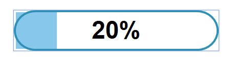
Where PART_Indicator is the LightBlue rectangle on the left (its width is set internally in the ProgressBar control, as seen here with a value of 20) and the roundBorder.
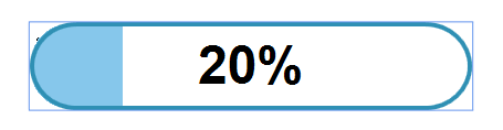
What I need is for the the PART_Indicator to clip over the roundBorder, resulting in something like:
 851
851
There is a ClipToBounds property on the Border class that should clip the content at the bounds of the Border, but unfortunately, it doesn't 'do what it says on the tin':
<Border CornerRadius="25" BorderBrush="RoyalBlue" BorderThickness="3" Width="300"
    Height="50" ClipToBounds="True"> <!-- This doesn't work as expected -->
    <Rectangle Fill="SkyBlue" />
</Border>
However, the Rectangle class also provides some properties that could help. Is there something stopping you from just using the Rectangle.RadiusX and Rectangle.RadiusY properties to round the Rectangle corners?:
<Border CornerRadius="25" BorderBrush="RoyalBlue" BorderThickness="3" Width="300"
    Height="50">
    <Rectangle RadiusX="23" RadiusY="23" Fill="SkyBlue" />
</Border>
I'm aware that you want to clip the coloured fill of the Rectangle, but you could use the Rectangle.Clip property for that:
<Border CornerRadius="25" BorderBrush="RoyalBlue" BorderThickness="3" Width="300"
    Height="50">
    <Grid>
        <Rectangle Name="ClipRectangle" Fill="Green" Margin="50,0,0,0"
            Visibility="Hidden" />
        <Rectangle RadiusX="23" RadiusY="23" Fill="SkyBlue" Clip="{Binding
            RenderedGeometry, ElementName=ClipRectangle}" />
    </Grid>
</Border>
This clips the coloured Rectangle with the RenderedGeometry of the other Rectangle named ClipRectangle... or when I say this clips, perhaps I should have said this is supposed to clip as I've just discovered that this only appears to work in the WPF Designer and not when the application is run.

However, I'm out of time here, so hopefully you can find the final piece of the puzzle and complete this yourself. Potentially, you could also complete this by data binding to the GradientStop.Offset property of a LinearGradientBrush that is set as the Background on the Border, so you wouldn't even need a Rectangle for this method. I'll have another look if I can later.
UPDATE >>>
I had another look at this Clip Rectangle and can't work out why it only works in the Visual Studio Designer. So, giving up with that idea, you can try the LinearGradientBrush idea instead, which is equally good. First, define your Brush:
<LinearGradientBrush x:Key="ValueBrush" StartPoint="0,0" EndPoint="1,0">
    <GradientStop Offset="0.0" Color="SkyBlue" />
    <GradientStop Offset="0.7" Color="SkyBlue" />
    <GradientStop Offset="0.7" Color="Transparent" />
    <GradientStop Offset="1.0" Color="Transparent" />
</LinearGradientBrush>
For now, I've hardcoded the values in to produce this:

From just this code:
<Border CornerRadius="25" BorderBrush="RoyalBlue" Background="{StaticResource
    ValueBrush}" BorderThickness="3" Width="300" Height="50" ClipToBounds="True" />
For your actual requirements, you'd need to create a double property to data bind to the GradientStop.Offset property like this:
<LinearGradientBrush x:Key="ValueBrush" StartPoint="0,0" EndPoint="1,0">
    <GradientStop Offset="0.0" Color="SkyBlue" />
    <GradientStop Offset="{Binding MidPoint}" Color="SkyBlue" />
    <GradientStop Offset="{Binding MidPoint}" Color="Transparent" />
    <GradientStop Offset="1.0" Color="Transparent" />
</LinearGradientBrush>
Now, as long as you provide a value between 0.0 and 1.0, this will create your level meter.
194
A much better solution using an OpacityMask , All The Template Parts aside from the OuterBorder Placed in "MainGrid" are Clipped using an Opacity mask which is set by an object aside it called "MaskBorder".
"TemplateRoot" exist for the inner workings of the PrograssBar control.
  <ControlTemplate TargetType="{x:Type ProgressBar}">
        <Grid x:Name="TemplateRoot">
            <Border x:Name="OuterBorder" BorderBrush="{TemplateBinding BorderBrush}" BorderThickness="{TemplateBinding BorderThickness}" CornerRadius="10">
                <Grid>
                    <Border x:Name="MaskBorder" Background="{TemplateBinding Background}" CornerRadius="9.5" />

                    <Grid x:Name="MainGrid">
                        <Grid.OpacityMask>
                            <VisualBrush Visual="{Binding ElementName=MaskBorder}" />
                        </Grid.OpacityMask>

                        <Rectangle x:Name="PART_Track" Fill="White" />

                        <Border x:Name="PART_Indicator" HorizontalAlignment="Left">
                            <Grid x:Name="Foreground">
                                <Rectangle x:Name="Indicator" Fill="{TemplateBinding Background}" />
                                <Grid x:Name="Animation" ClipToBounds="true">
                                    <Rectangle x:Name="PART_GlowRect" Fill="#FF86C7EB" HorizontalAlignment="Left" Margin="-100,0,0,0" Width="100" />
                                </Grid>
                            </Grid>
                        </Border>
                    </Grid>

                </Grid>
            </Border>
        </Grid>
   </ControlTemplate>
If you love us? You can donate to us via Paypal or buy me a coffee so we can maintain and grow! Thank you!
Donate Us With

