 Menu
Menu
Is it possible to create an inset circle clip path so that the clip path would effectively cut a hole through the div in the center opposed to only showing the center?
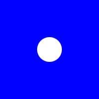
The div should all be shown apart from a hole cut out in the center to create something like this:
I would like to use clip path or something similar so that I can have stuff (images and content) behind the div and the clip path will be used to reveal this. So the div (blue div from my jsfiddle) will disappear from the center using a transition to show the content behind it.
div {
  background: blue;
  width: 200px;
  height: 200px;
  -webkit-clip-path: circle(50px at center);
}<div></div>https://jsfiddle.net/pm4yvbxn/
 778
778
You can create hole in clip-path with this approach:
let precision = 64;
let radius = 25;
let c = [...Array(precision)].map((_, i) => {
  let a = -i/(precision-1)*Math.PI*2;
  let x = Math.cos(a)*radius + 50;
  let y = Math.sin(a)*radius + 50;
  return `${x}% ${y}%`
})

document.querySelector('div').style.clipPath =
 `polygon(100% 50%, 100% 100%, 0 100%, 0 0, 100% 0, 100% 50%, ${c.join(',')})`;
div {
background: blue;
width: 200px;
height: 200px;
}<div></div>or symply use resulting clip string:
div {
  background: blue;
  width: 200px;
  height: 200px;
}<div style="clip-path: polygon(100% 50%, 100% 100%, 0px 100%, 0px 0px, 100% 0px, 100% 50%, 75% 50%, 74.8758% 47.5108%, 74.5043% 45.0463%, 73.8893% 42.6311%, 73.0369% 40.2891%, 71.9555% 38.0437%, 70.656% 35.917%, 69.1511% 33.9303%, 67.4559% 32.1033%, 65.5872% 30.4542%, 63.5637% 28.9994%, 61.4053% 27.7532%, 59.1335% 26.7282%, 56.771% 25.9344%, 54.3412% 25.3798%, 51.8683% 25.0699%, 49.3767% 25.0078%, 46.8914% 25.194%, 44.437% 25.6268%, 42.0378% 26.3018%, 39.7178% 27.2124%, 37.5% 28.3494%, 35.4064% 29.7015%, 33.4579% 31.2555%, 31.6737% 32.9957%, 30.0717% 34.9049%, 28.6677% 36.9641%, 27.4758% 39.1529%, 26.5077% 41.4495%, 25.7731% 43.8311%, 25.2792% 46.2739%, 25.0311% 48.7539%, 25.0311% 51.2461%, 25.2792% 53.7261%, 25.7731% 56.1689%, 26.5077% 58.5505%, 27.4758% 60.8471%, 28.6677% 63.0359%, 30.0717% 65.0951%, 31.6737% 67.0043%, 33.4579% 68.7445%, 35.4064% 70.2985%, 37.5% 71.6506%, 39.7178% 72.7876%, 42.0378% 73.6982%, 44.437% 74.3732%, 46.8914% 74.806%, 49.3767% 74.9922%, 51.8683% 74.9301%, 54.3412% 74.6202%, 56.771% 74.0656%, 59.1335% 73.2718%, 61.4053% 72.2468%, 63.5637% 71.0006%, 65.5872% 69.5458%, 67.4559% 67.8967%, 69.1511% 66.0697%, 70.656% 64.083%, 71.9555% 61.9563%, 73.0369% 59.7109%, 73.8893% 57.3689%, 74.5043% 54.9537%, 74.8758% 52.4892%, 75% 50%);"></div>I don't think you can achieve this with clip-path but you can certainly cut a hole in a div using the radial-gradient background images. This has much better browser support than clip-path too.
Note: This approach (and box-shadow ) will work only when the element that is covering the content below has a colored fill. If instead of sandybrown color, there needs to be another image on top then these approaches will not work because they don't actually cut a hole, they just mimic that effect.
.div-with-hole {
  height: 100vh;
  background: radial-gradient(circle at center, transparent 25%, sandybrown 25.5%);
  background-size: 100% 100%;
  background-position: 50% 50%;
  transition: all 2s ease;
}
.div-with-hole:hover {
  background-size: 400% 400%; /* should be 100% * (100 / transparent % of radial gradient */
}
body {
  background: url(http://lorempixel.com/800/800/nature/1);
  min-height: 100vh;
  margin: 0;
  padding: 0;
}
<div class='div-with-hole'></div>You could also do this with box-shadow on :after pseudo-element
div {
  position: relative;
  width: 300px;
  height: 200px;
  overflow: hidden;
  background: url('http://planetcompas.com/live/wp-content/uploads/2013/04/2015-01-Beautiful-Planet-And-Space-4-Cool-Wallpapers-HD.jpg');
  background-size: cover;
  background-position: center;
}
div:after {
  width: 50px;
  height: 50px;
  content: '';
  border-radius: 50%;
  background: transparent;
  position: absolute;
  top: 50%;
  left: 50%;
  transform: translate(-50%, -50%);
  box-shadow: 0px 0px 0px 300px lightblue;
  transition: all 0.3s linear;
}
div:hover:after {
  opacity: 0;
}<div></div>mask can do this and it will work with any kind of background:
div {
  background: linear-gradient(blue,red);
  width: 200px;
  height: 200px;
  -webkit-mask:radial-gradient(circle 50px,transparent 98%,#fff 100%);
          mask:radial-gradient(circle 50px,transparent 98%,#fff 100%);
}<div></div>Can also be animated:
div {
  background: linear-gradient(blue,red);
  width: 200px;
  height: 200px;
  -webkit-mask:
    radial-gradient(farthest-side,#fff 98%,transparent 100%) center/50px 50px no-repeat,
    linear-gradient(#fff,#fff);
  -webkit-mask-composite:destination-out;

  mask:
    radial-gradient(farthest-side,#fff 98%,transparent 100%) center/50px 50px no-repeat,
    linear-gradient(#fff,#fff);
  mask-composite:exclude;
  transition:0.5s;
}
div:hover {
  -webkit-mask-size:290px 290px,auto;
          mask-size:290px 290px,auto;
}<div></div>If you love us? You can donate to us via Paypal or buy me a coffee so we can maintain and grow! Thank you!
Donate Us With