 Menu
Menu
With the new Chrome update Chrome is displaying improved default form styling. According to the post I would say it should be possible to change this form theme to match the color set of a website.
We were going for beautiful, webby, and neutral. We hope that every design system would see a bit of themselves in the new designs and easily imagine how they might be adapted for their own branding.
I have spend the last few hours searching and trying to get rid of the default blue color that has a very bad contrast with rest of my website. Aside from using '-webkit-appearance: none;' and restyling things like checkboxes myself I'm not sure if it's possible.
Does anyone experience this issue as well or have a solution or documentation I'm missing?
 530
530
My preferred solution just uses css. It targets Safari as well as Chrome, but it's already grayscale anyway, so that's OK.
input[type='checkbox']:checked {-webkit-filter: grayscale(100%);}
input[type='radio']:checked {-webkit-filter: grayscale(100%);}
185
This is Chrome 83 upwards specific - other browsers do other things (grayscale mostly).
This construct seems to work for now - just as long as there is a background color set for "body":
input[type=checkbox] {
    mix-blend-mode: luminosity;
}
Examples:
Though I am not sure this will continue to work, it might be good enough as a temporary workaround to alleviate "designer suffering". Disrupted color schemes is a crisis :-).
<!DOCTYPE html>
<html lang='en'>
<head>
<meta charset='utf-8'>
<title>Test</title>
<style>
body {
background-color: white;
}
input[type=checkbox] {
mix-blend-mode: luminosity;
}
</style>
</head>
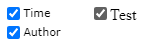
<body>
<label><input type="checkbox" checked>Test</label>
</body>
</html>
Links:
20
Pure CSS solution which allows any color while trying to stay close to the new design. Just replace the --primary-color variable. Works in Chromium browsers (Chrome, new Edge) and Firefox.
:root {
  --primary-color: #f44336;
}

input[type="checkbox"] {
  height: 14px;
  width: 14px;
  position: relative;
    -webkit-appearance: none;
}

input[type="checkbox"]:before {
  content: "";
  display: inline-block;
  position: absolute;
  box-sizing: border-box;
  height: 14px;
  width: 14px;
  border-radius: 2px;
  border: 1px solid #767676;
  background-color: #fff;
}

input[type="checkbox"]:hover::before {
  border: 1px solid #4f4f4f;
}

input[type="checkbox"]:checked:hover::before {
  filter: brightness(90%);
}

input[type="checkbox"]:checked:disabled:hover::before {
  filter: none;
}

input[type="checkbox"]:checked:before {
  content: "";
  display: inline-block;
  position: absolute;
  box-sizing: border-box;
  height: 14px;
  width: 14px;
  border-radius: 2px;
  border: 1px solid var(--primary-color);
  background-color: var(--primary-color);
}

input[type="checkbox"]:checked:after {
  content: "";
  display: inline-block;
  position: absolute;
  top: 5px;
  left: 2px;
  box-sizing: border-box;
  height: 5px;
  width: 10px;
  border-left: 2px solid #fff;
  border-bottom: 2px solid #fff;
  -webkit-transform: translateY(-1.5px) rotate(-45deg);
  transform: translateY(-1.5px) rotate(-45deg);
}

input[type="checkbox"]:disabled::before {
  border: 1px solid #c9ced1;
  border-radius: 2px;
  background-color: #f0f4f8;
}

input[type="checkbox"]:checked:disabled::before {
  border: 1px solid #d1d1d1;
  border-radius: 2px;
  background-color: #d1d1d1;
}
<input type="checkbox"></input>
<input type="checkbox" checked="checked"></input>
<input type="checkbox" disabled="true"></input>
<input type="checkbox" disabled="true" checked="checked"></input>Using hue-rotate() filter, one can change the background color of checked checkboxes. For example, this css makes it green:
Input[type=checkbox]:checked{filter:hue-rotate(290deg);}
Now, by adding grayscale, one can make the green color darker:
Input[type=checkbox]:checked{filter:hue-rotate(290deg) grayscale(50%);}
The brightness() filter can also help to adjust the color.
Using invert(), you can get a black checkbox, then add grayscale and brightness to get white background (which looks like a regular checkbox, only, without a border):
Input[type=checkbox]:checked{filter:invert() grayscale(100%) brightness(180%);}
3
If you love us? You can donate to us via Paypal or buy me a coffee so we can maintain and grow! Thank you!
Donate Us With