 Menu
Menu
I have a div that is positioned absolute with a background color gradient. I have this text on it that I want to change to the color white as I scroll the text up.
I'm using the 'mix-blend-mode' property to achieve this currently but I can't find any setting that will turn the text from black to white. Has anyone done this before or can think of a trick I can do?
.bg-container {
  position: fixed;
  top: -30px;
  left: 0;
  width: 100px;
  height: 100px;
}

.gradient-background {
  position: absolute;
  top: 0;
  left: 0;
  width: 100px;
  height: 200px;
  background-image: linear-gradient(to bottom, rgb(100, 182, 240) 15%, rgb(81, 155, 244));
  transform: skewY(-15deg);
}

.scroll-content {
  position: absolute;
  top: 50px;
}

.scroll-content p {
  color: #000;
  mix-blend-mode: overlay;
}

/*hack for iOS*/
.scroll-content p:after{
    content: '\200c'
}
<div class="bg-container">
<div class="gradient-background">
</div>
</div>
<div class="scroll-content">
<p> abc 1 </p>
<p> abc 2 </p>
<p> abc 3 </p>
<p> abc 4 </p>
<p> abc 5 </p>
<p> abc 6 </p>
<p> abc 7 </p>
<p> abc 8 </p>
<p> abc 9 </p>
<p> abc 10 </p>
<p> abc 11 </p>
<p> abc 12 </p>
<p> abc 13 </p>
<p> abc 14 </p>
<p> abc 15 </p>
<p> abc 16 </p>
<p> abc 17 </p>
<p> abc 18 </p>
<p> abc 19 </p>
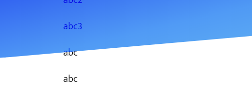
</div>*edit 1: Changed my example snipet code. The background gradient isn't just a rectangular div. It's slanted a bit and that's what makes it so difficult. So the text becomes two-toned at the boundary.
*edit 2 for clarity: I want the text to be black (#000 solid) when it is over the white background and white (#FFF solid) when it is over the gradient/image. My content is scroll-able text as in the code example.
*edit 3: iOS Safari incompatible unless you do the following hack. Add the zero width space ​ ; to every text element in order to make it work. This can be done easily with a CSS property as i show added in the CSS markup.
 673
673
You can use gradient to color the text. The trick is to have this gradient similar to your shape (same degree and coloration change at the edge of the shape). Since your skewed element is fixed, you need to make the gradient to also be fixed to create the magic effect of text scrolling:
.gradient-background {
  position: fixed;
  top: 0;
  left: 0;
  width: 100px;
  height: 200px;
  background-image: linear-gradient(to bottom, rgb(100, 182, 240) 15%, rgb(81, 155, 244));
  transform: skewY(-15deg);
  transform-origin:left;
}

.scroll-content {
  position: absolute;
  top: 50px;
  /* 165deg = 180deg - 15deg   */
  background: linear-gradient(165deg, #fff 195px,#000 195px) fixed;
  background-clip: text;
  -webkit-background-clip: text;
  color: transparent;
  -webkit-text-fill-color: transparent;
}
<div class="gradient-background">
</div>
<div class="scroll-content">
<p> abc 1 </p>
<p> abc 2 </p>
<p> abc 3 </p>
<p> abc 4 </p>
<p> abc 5 </p>
<p> abc 6 </p>
<p> abc 7 </p>
<p> abc 8 </p>
<p> abc 9 </p>
<p> abc 10 </p>
<p> abc 11 </p>
<p> abc 12 </p>
<p> abc 13 </p>
<p> abc 14 </p>
<p> abc 15 </p>
<p> abc 16 </p>
<p> abc 17 </p>
<p> abc 18 </p>
<p> abc 19 </p>
</div>If you love us? You can donate to us via Paypal or buy me a coffee so we can maintain and grow! Thank you!
Donate Us With

