 Menu
Menu
I am trying to change the CSS on a bootstrap popover. I want to change the entire popover background, not just the text.
Any suggestions?
http://bootply.com/110002
$(document).ready(function() {
  $("[rel='android']").popover({
    html: 'true',
    content: '<div id="popOverBox">Coming March 2014</div>'
   });
});
CSS
 #popOverBox {
     background: tomato;
     font-family: serif;
 }
 285
285
You would target the .popover element as opposed to #popOverBox
EXAMPLE HERE
.popover {
    background: tomato;
}
And to change the background of the arrow (pseudo element), you would use:
.popover.bottom .arrow:after {
    border-bottom-color: tomato;
}
Change popover background and text color in Bootstrap-4
while you are using sass-bootstrap-4 you can do easily by just changing some variables values.
These are the variables in _variables.scss file:
$popover-inner-padding: 1px !default;
$popover-bg: #fff !default;
$popover-max-width: 276px !default;
$popover-border-width: $border-width !default;
$popover-border-color: rgba(0, 0, 0, .2) !default;
$popover-box-shadow: 0 5px 10px rgba(0, 0, 0, .2) !default;

$popover-title-bg: darken($popover-bg, 3%) !default;
$popover-title-padding-x: 14px !default;
$popover-title-padding-y: 8px !default;

$popover-content-padding-x: 14px !default;
$popover-content-padding-y: 9px !default;

$popover-arrow-width: 10px !default;
$popover-arrow-color: $popover-bg !default;

$popover-arrow-outer-width: ($popover-arrow-width + 1px) !default;
$popover-arrow-outer-color: fade-in($popover-border-color, .05) !default;
I change them to light blue color using $brand-info variable:
Note: its better if you copy these variables into your own custom.scss file and then change them.
$popover-inner-padding: 1px !default;
$popover-bg: #fff !default;
$popover-max-width: 276px !default;
$popover-border-width: $border-width !default;
$popover-border-color: $brand-info;
$popover-box-shadow: 0 5px 10px rgba(0, 0, 0, .2) !default;

$popover-title-bg: $brand-info;
$popover-title-padding-x: 14px !default;
$popover-title-padding-y: 8px !default;

$popover-content-padding-x: 14px !default;
$popover-content-padding-y: 9px !default;

$popover-arrow-width: 10px !default;
$popover-arrow-color: $popover-bg !default;

$popover-arrow-outer-width: ($popover-arrow-width + 1px) !default;
$popover-arrow-outer-color:$brand-info;
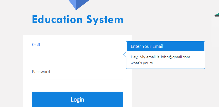
The output after change the variables:
22
.popover {background-color: tomato;}
.popover.bottom .arrow::after {border-bottom-color: tomato; }
.popover-content {background-color: tomato;}
Time is passed anyway I'd like to report my personal solution in LESS (indeed, fits my needs but I think can be useful to some folks over here).
Add a class to class="popover", like class="popover popover-warning" and in less do something like this:
.popover-warning {
  background-color: #f0ad4e !important;
  & .arrow, .arrow:after {
    border-left-color: #f0ad4e !important;
    border-left-color: rgba(0, 0, 0, 0.25);
  }
  & .popover-content, .popover-title {
    background-color: #f0ad4e !important;
  }
}
Hope this helps.
3
If you love us? You can donate to us via Paypal or buy me a coffee so we can maintain and grow! Thank you!
Donate Us With