 Menu
Menu
You can do this by setting the display property to "flex." Then define the align-items and justify-content property to “center.” This will tell the browser to center the flex item (the div within the div) vertically and horizontally.
use text-align:center for div -> this will align text inside div center. include width property in div (i.e. width:200px) and it will work fine.
If it is a block element (a div is), you need to set margin: 0 auto; , else if it is an inline element, you need to set the text-align: center; on its parent element instead.
You need to set margin: 0 auto; on the outer container div, add text-align: center; on the inner div; and use an unordered list to build your menu in the first place. Show activity on this post. Without setting an explicit width, the <div> tag will automatically expand to 100% of the width of its parent.
Update 27 Feb 2015: My original answer keeps getting voted up, but now I normally use @bobince's approach instead.
.child { /* This is the item to center... */
  display: inline-block;
}
.parent { /* ...and this is its parent container. */
  text-align: center;
}
My original post for historical purposes:
You might want to try this approach.
<div class="product_container">
    <div class="outer-center">
        <div class="product inner-center">
        </div>
    </div>
    <div class="clear"/>
</div>
Here's the matching style:
.outer-center {
    float: right;
    right: 50%;
    position: relative;
}
.inner-center {
    float: right;
    right: -50%;
    position: relative;
}
.clear {
    clear: both;
}
JSFiddle
The idea here is that you contain the content you want to center in two divs, an outer one and an inner one. You float both divs so that their widths automatically shrink to fit your content. Next, you relatively position the outer div with it's right edge in the center of the container. Lastly, you relatively position the inner div the opposite direction by half of its own width (actually the outer div's width, but they are the same). Ultimately that centers the content in whatever container it's in.
You may need that empty div at the end if you depend on your "product" content to size the height for the "product_container".
An element with ‘display: block’ (as div is by default) has a width determined by the width of its container. You can't make a block's width dependent on the width of its contents (shrink-to-fit).
(Except for blocks that are ‘float: left/right’ in CSS 2.1, but that's no use for centering.)
You could set the ‘display’ property to ‘inline-block’ to turn a block into a shrink-to-fit object that can be controlled by its parent's text-align property, but browser support is spotty. You can mostly get away with it by using hacks (eg. see -moz-inline-stack) if you want to go that way.
The other way to go is tables. This can be necessary when you have columns whose width really can't be known in advance. I can't really tell what you're trying to do from the example code — there's nothing obvious in there that would need a shrink-to-fit block — but a list of products could possibly be considered tabular.
[PS. never use ‘pt’ for font sizes on the web. ‘px’ is more reliable if you really need fixed size text, otherwise relative units like ‘%’ are better. And “clear: ccc both” — a typo?]
.center{
   text-align:center;
}

.center > div{ /* N.B. child combinators don't work in IE6 or less */
   display:inline-block;
}
JSFiddle
Most browsers support the display: table; CSS rule. This is a good trick to center a div in a container without adding extra HTML nor applying constraining styles to the container (like text-align: center; which would center all other inline content in the container), while keeping dynamic width for the contained div:
HTML:
<div class="container">
  <div class="centered">This content is centered</div>
</div>
CSS:
.centered { display: table; margin: 0 auto; }
.container {
  background-color: green;
}
.centered {
  display: table;
  margin: 0 auto;
  background-color: red;
}
<div class="container">
<div class="centered">This content is centered</div>
</div>Update (2015-03-09):
The proper way to do this today is actually to use flexbox rules. Browser support is a little bit more restricted (CSS table support vs flexbox support) but this method also allows many other things, and is a dedicated CSS rule for this type of behavior:
HTML:
<div class="container">
  <div class="centered">This content is centered</div>
</div>
CSS:
.container {
  display: flex;
  flex-direction: column; /* put this if you want to stack elements vertically */
}
.centered { margin: 0 auto; }
.container {
  display: flex;
  flex-direction: column; /* put this if you want to stack elements vertically */
  background-color: green;
}
.centered {
  margin: 0 auto;
  background-color: red;
}
<div class="container">
<div class="centered">This content is centered</div>
</div>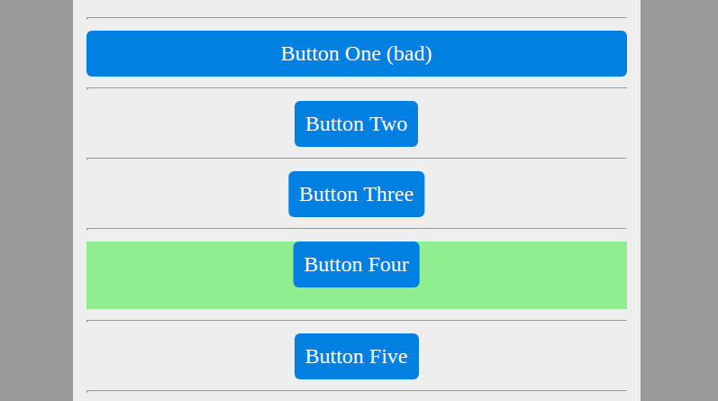
Button one: anything of type display: block will assume the full parents width. (unless combined with float or a display: flex parent). True. Bad example.
Button 2: going for display: inline-block will lead to automatic (rather than full) width. You can then center using text-align: center on the wrapping block. Probably the easiest, and most widely compatible, even with ‘vintage’ browsers...
.wrapTwo
  text-align: center;
.two
  display: inline-block; // instantly shrinks width
Button 3: No need to put anything on the wrap. So perhaps this is the most elegant solution. Also works vertically. (Browser support for transtlate is good enough (≥IE9) these days...).
position: relative;
display: inline-block; // instantly shrinks width
left: 50%;
transform: translateX(-50%);
Btw: Also a great way for vertically centering blocks of unknown height (in connection with absolute positioning).
Button 4: Absolute positioning. Just make sure to reserve enough height in the wrapper, since noone else will (neither clearfix nor implicit...)
.four
  position absolute
  top 0
  left 50%
  transform translateX(-50%)
.wrapFour
  position relative // otherwise, absolute positioning will be relative to page!
  height 50px // ensure height
  background lightgreen // just a marker
Button 5: float (which brings also block-level elements to dynamic width) and a relative shift. Although I've never seen this in the wild. Perhaps there are disadvantages...
.wrapFive
  &:after // aka 'clearfix'
    content ''
    display table
    clear both

.five
  float left
  position relative
  left 50%
  transform translateX(-50%)
Update: Button 6: And nowadays, you could also use flex-box. Note, that styles apply to the wrapper of the centered object.
.wrapSix
  display: flex
  justify-content: center
I found a more elegant solution, combining "inline-block" to avoid using float and the hacky clear:both. It still requires nested divs tho, which isnt very semantic but it just works...
div.outer{
    display:inline-block;
    position:relative;
    left:50%;
}

div.inner{
    position:relative;
    left:-50%;
}
Hope it helps!
<div class="outer">
   <div class="target">
      <div class="filler">
      </div>
   </div>
</div>

.outer{
   width:100%;
   height: 100px;
}

.target{
   position: absolute;
   width: auto;
   height: 100px;
   left: 50%;
   transform: translateX(-50%);
}

.filler{
   position:relative;
   width:150px;
   height:20px;
}
If the target element is absolutely positioned, you can center it by moving it 50% in one direction (left: 50%) and then transforming it 50% in the opposition direction (transform:translateX(-50%)). This works without defining the target element's width (or with width:auto). The parent element's position can be static, absolute, relative, or fixed.
By default, div elements are displayed as block elements, so they have 100% width, making centering them meaningless. As suggested by Arief, you must specify a width and you can then use auto when specifying margin in order to center a div.
Alternatively, you could also force display: inline, but then you'd have something that pretty much behaves like a span instead of a div, so that doesn't make a lot of sense.
If you love us? You can donate to us via Paypal or buy me a coffee so we can maintain and grow! Thank you!
Donate Us With