 Menu
Menu
I wanted to get a center aligned grid list in Angular Material.
This is my code:
<md-content layout-padding>
   <md-grid-list md-cols-gt-md="10" md-cols-md="8" md-cols-sm="6" md-cols="4" md-cols-xs="3"  md-row-height-gt-md="1:1" md-row-height="1:1" md-row-height-xs="110px" md-gutter-gt-md="10px" md-gutter="2px">
      <md-grid-tile ng-repeat="item in homeTilesNavigation">
         <div class="compas-home-text">{{item.name}}</div>
      </md-grid-tile>
   </md-grid-list>
</md-content>
I am getting a result like this:
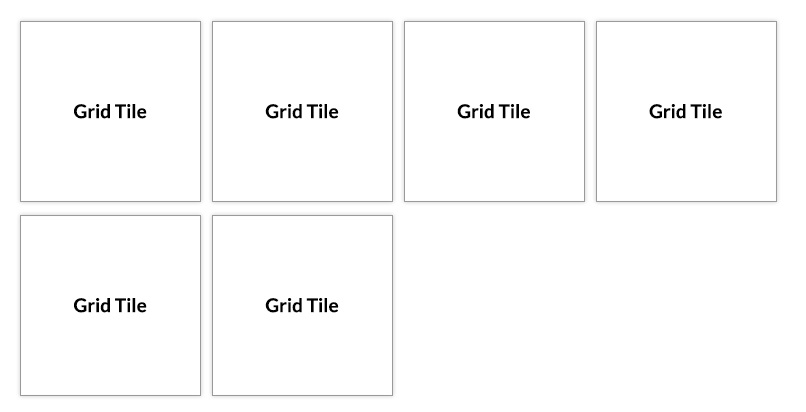
But I wanted like this:
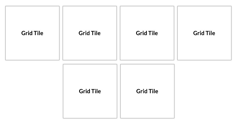
I wanted the same grid list to be center aligned. Here is the fiddle code.
 987
987
You can use CSS Flexbox.
Make your parent (i.e. md-grid-list) a flex container using display: flex & use justify-content: center to align its children (i.e. md-grid-tile) horizontally center. Like:
md-grid-list {
  display: flex;
  flex-wrap: wrap;
  justify-content: center;
}
I've used div's instead of regular md- type components for demonstration:
md-grid-list is equivalent to .list
md-grid-tile is equivalent to .tile
Have a look at the example snippet below (updated fiddle according to your requirements):
.list {
  display: flex;
  flex-wrap: wrap;
  justify-content: center;
}

.tile {
  width: 100px;
  height: 100px;
  border: 1px solid #777;
  margin: 10px;
  display: flex;
  align-items: center;
  justify-content: center;
  box-shadow: 0 0 3px rgba(0, 0, 0, 0.5);
}
<div class="list">
<div class="tile">
<div class="compas-home-text">Grid Title</div>
</div>
<div class="tile">
<div class="compas-home-text">Grid Title</div>
</div>
<div class="tile">
<div class="compas-home-text">Grid Title</div>
</div>
<div class="tile">
<div class="compas-home-text">Grid Title</div>
</div>
<div class="tile">
<div class="compas-home-text">Grid Title</div>
</div>
<div class="tile">
<div class="compas-home-text">Grid Title</div>
</div>
</div>Hope this helps!
177
If you love us? You can donate to us via Paypal or buy me a coffee so we can maintain and grow! Thank you!
Donate Us With