 Menu
Menu
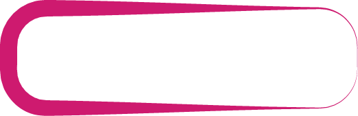
I'm trying to achieve a smooth border size transition like on a picture below:
Right now I doubt if it is possible with a pure CSS/HTML. Am I wrong?
I would use it as an image background, but this solution would be pain in the neck, as there will be a lot of elements with different lenghts.
Is there any other approach?
 841
841
Here is an approximation using transform and perspective (without transparency)
.box {
  width: 200px;
  height: 100px;
  margin: 20px;
  position: relative;
  border: 20px solid red;
  border-width: 20px 3px 20px 20px;
  border-radius:55px;
  transform:perspective(112px) rotateY(5deg);
  z-index: 1;
}

.box:before {
  content: "";
  position: absolute;
  top: -5px;
  left: -5px;
  right: 35px;
  bottom: -5px;
  background: #fff;
  z-index: -1;
  border-radius: 40px;
  transform: perspective(112px) rotateY(-7deg);
  transform-origin: left;
}
<div class="box">
</div>That you can achieve with both pseudo element to be able to add content inside:
.box {
  width: 200px;
  height: 100px;
  margin: 20px;
  position: relative;
  z-index: 0;
  box-sizing: border-box;
  padding: 40px;
}

.box:before {
  content: "";
  position: absolute;
  top: 0;
  left: 0;
  right: 0;
  bottom: 0;
  border: 20px solid red;
  border-width: 20px 3px 20px 20px;
  border-radius: 55px;
  transform: perspective(112px) rotateY(5deg);
  z-index: -1;
}

.box:after {
  content: "";
  position: absolute;
  top: 10%;
  left: 5%;
  right: 19%;
  bottom: 10%;
  background: #fff;
  z-index: 1;
  border-radius: 36px;
  transform: perspective(112px) rotateY(-7deg);
  transform-origin: left;
  z-index: -1;
}
<div class="box">
some text
</div>Here is another idea with a complex background coloration where you will have transparency and better control over the responsive:
.box {
  max-width:200px;
  margin:10px;
  position:relative;
  padding:30px 20px;
  z-index:0;
  box-sizing:border-box;
  display:inline-block;
}
.box:before {
  content:"";
  position:absolute;
  z-index:-1;
  top:0;
  left:0;
  right:0;
  bottom:0;
  border:2px solid red;
  border-radius:40px;
  background:
    /*    gradient                                                    position       / size*/
    radial-gradient(circle at bottom right,transparent 23px,red 25px) top left       /34px 32px,
    radial-gradient(circle at top right   ,transparent 23px,red 25px) bottom left    /34px 32px,
    linear-gradient(red,red)                                          left           /10px 100%,
    linear-gradient(to top left   ,transparent 45%,red 50%)           top left       /85% 10px,
    linear-gradient(to bottom left,transparent 45%,red 50%)           bottom left    /85% 10px;
  background-repeat:no-repeat;
  transform:perspective(100px) rotateY(5deg);
}

body {
 background:pink;
}
<div class="box">
some text some text some text some text some text
</div>
<div class="box">
some text some text
</div>
<div class="box">
some text text
</div>
<div class="box">
some text
some text
some text
</div>To better understand the coloration, change the color of each gradient:
.box {
  max-width:200px;
  margin:10px;
  position:relative;
  padding:30px 20px;
  z-index:0;
  box-sizing:border-box;
  display:inline-block;
}
.box:before {
  content:"";
  position:absolute;
  z-index:-1;
  top:0;
  left:0;
  right:0;
  bottom:0;
  border:2px solid red;
  border-radius:40px;
  background:
    radial-gradient(circle at bottom right,transparent 23px,rgba(200,0,0,0.6) 25px) top left/34px 32px,
    radial-gradient(circle at top right   ,transparent 23px,rgba(200,0,0,0.6) 25px) bottom left/34px 32px,
    linear-gradient(yellow,yellow) left/10px 100%,
    linear-gradient(to top left   ,white 45%,green 50%) top left   /85% 10px,
    linear-gradient(to bottom left,white 45%,black 50%) bottom left/85% 10px;
  background-repeat:no-repeat;
  transform:perspective(100px) rotateY(5deg);
}

body {
 background:pink;
}
<div class="box">
some text some text some text some text some text
</div>If you love us? You can donate to us via Paypal or buy me a coffee so we can maintain and grow! Thank you!
Donate Us With

