 Menu
Menu
How do I create a non-rectangular border like in this image?
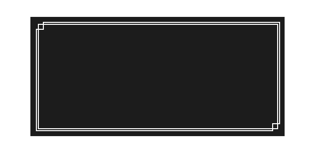
Current Code: http://jsfiddle.net/bqjr5wep/
div {
    background:#1c1c1c;
    width:400px;
    height:200px;
    position:relative;
}

div:before, div:after {
    content:'';
    display:block;
    left:10px;
    right:10px;
    top:10px;
    bottom:10px;
    border:2px solid #FFF;
    position:absolute;
}

div:after {
    left:14px;
    top:14px;
    right:14px;
    bottom:14px;
}
 763
763
Sample 1: Transparent background for shape with non-solid page background
Here is an approach which supports non-solid background for the page (gradient or image), transparent background for the shape and also is scalable. The downside probably is the fact that it requires more than one element.
.shape {
  position: relative;
  height: 200px;
  width: 500px;
}
.shape-inner {
  position: absolute;
  top: 2px;
  left: 2px;
  height: 100%;
  width: 100%;
  border: 2px solid white;
}
.shape:after,
.shape:before {
  position: absolute;
  content: '';
  height: 100%;
  width: 100%;
  border: 2px solid white;
}
.shape:after {
  top: -4px;
  left: 10px;
  border-width: 2px 2px 0px 0px;
}
.shape:before {
  top: 10px;
  left: -4px;
  border-width: 0px 0px 2px 2px;
}
.shape-inner:before,
.shape-inner:after {
  position: absolute;
  content: '';
  height: 12px;
  width: 12px;
  border: 2px solid white;
}
.shape-inner:before {
  top: -6px;
  left: -6px;
  border-width: 0px 2px 2px 0px;
}
.shape-inner:after {
  bottom: -6px;
  right: -6px;
  border-width: 2px 0px 0px 2px;
}
/* Just for demo */

body {
  background: linear-gradient(90deg, crimson, indianred, purple);
}
<div class="shape">
<div class="shape-inner"></div>
</div>Sample 2: Solid color (non-transparent) background for shape
If the shape needs to have a different background compared to the page background and the shape's background is a solid color then the same approach with a small modification can be used. Sample is provided below:
.shape {
  position: relative;
  height: 200px;
  width: 500px;
}
.shape-inner {
  position: absolute;
  top: 2px;
  left: 2px;
  height: 100%;
  width: 100%;
  background: steelblue;
  border: 2px solid white;
}
.shape:after,
.shape:before {
  position: absolute;
  content: '';
  height: 100%;
  width: 100%;
  background: steelblue;
  border: 2px solid white;
  z-index: -1;
}
.shape:after {
  top: -4px;
  left: 10px;
  border-width: 2px 2px 0px 0px;
}
.shape:before {
  top: 10px;
  left: -4px;
  border-width: 0px 0px 2px 2px;
}
.shape-inner:before,
.shape-inner:after {
  position: absolute;
  content: '';
  height: 12px;
  width: 12px;
  border: 2px solid white;
}
.shape-inner:before {
  top: -6px;
  left: -6px;
  border-width: 0px 2px 2px 0px;
}
.shape-inner:after {
  bottom: -6px;
  right: -6px;
  border-width: 2px 0px 0px 2px;
}
/* Just for demo */
body {
  background: linear-gradient(90deg, crimson, indianred, purple);
}
<div class="shape">
<div class="shape-inner"></div>
</div>Sample 3: Gradient/Image background for shape
You can also add an image (or) gradient different from the page background to the shape's background and it would look like in the below snippet. It cannot follow the outer border of the shape exactly.
body {
  background: linear-gradient(90deg, crimson, indianred, purple);
}
.shape {
  position: relative;
  height: 200px;
  width: 500px;
}
.shape-inner {
  position: absolute;
  top: 2px;
  left: 2px;
  height: 100%;
  width: 100%;
  border: 2px solid white;
  background: url(http://lorempixel.com/600/600);
}
.shape:after {
  position: absolute;
  content: '';
  top: -4px;
  left: 10px;
  height: 100%;
  width: 100%;
  border: 2px solid white;
  border-width: 2px 2px 0px 0px;
}
.shape:before {
  position: absolute;
  content: '';
  top: 10px;
  left: -4px;
  height: 100%;
  width: 100%;
  border: 2px solid white;
  border-width: 0px 0px 2px 2px;
}
.shape-inner:before {
  position: absolute;
  content: '';
  height: 12px;
  width: 12px;
  top: -6px;
  left: -6px;
  border: 2px solid white;
  border-width: 0px 2px 2px 0px;
}
.shape-inner:after {
  position: absolute;
  content: '';
  height: 12px;
  width: 12px;
  bottom: -6px;
  right: -6px;
  border: 2px solid white;
  border-width: 2px 0px 0px 2px;
}
<div class="shape">
<div class="shape-inner"></div>
</div>Sample 4: Semi-transparent background for shape
This is the trickiest of the lot but can still be achieved by doing some minor modifications to the snippet. The idea for this was picked from this thread.
.shape {
  position: relative;
  height: 200px;
  width: 500px;
}
.shape-inner {
  position: absolute;
  top: 2px;
  left: 2px;
  height: 100%;
  width: 100%;
  background: rgba(80, 80, 80, 0.75);
  border: 2px solid rgba(255, 255, 255, 0.75);
}
.shape:after,
.shape:before {
  position: absolute;
  content: '';
  height: 100%;
  width: 100%;
  opacity: 0.75;
  border: 2px solid white;
  z-index: -1;
}
.shape:after {
  top: -4px;
  left: 10px;
  border-width: 2px 2px 0px 0px;
  background: linear-gradient(180deg, rgb(80, 80, 80) 5px, transparent 5px) no-repeat, linear-gradient(270deg, rgb(80, 80, 80) 4px, transparent 4px) no-repeat;
}
.shape:before {
  top: 10px;
  left: -4px;
  border-width: 0px 0px 2px 2px;
  background: linear-gradient(0deg, rgb(80, 80, 80) 5px, transparent 5px) no-repeat, linear-gradient(90deg, rgb(80, 80, 80) 4px, transparent 4px) no-repeat;
}
.shape-inner:before,
.shape-inner:after {
  position: absolute;
  content: '';
  height: 12px;
  width: 12px;
  border: 2px solid rgba(255, 255, 255, 0.75);
}
.shape-inner:before {
  top: -6px;
  left: -6px;
  border-width: 0px 2px 2px 0px;
}
.shape-inner:after {
  bottom: -6px;
  right: -6px;
  border-width: 2px 0px 0px 2px;
}
/* Just for demo */

body {
  background: url(http://lorempixel.com/400/200/sports/Dummy-Text/);
}
<div class="shape">
<div class="shape-inner"></div>
</div>I just created a simple SVG image and used the CSS border-image to create the desired effect.
http://jsfiddle.net/bqjr5wep/1/
div {
  width:80%;
  height: 200px;
  position: relative;
  margin:50px auto;
  background-color: #1c1c1c;
}

div:before, div:after {
  content:'';
  display: block;
  position: absolute;
  left: 10px;
  top:10px;
  right: 10px;
  bottom: 10px;
}

div:before {
  border-style: solid;
  border-width: 16px;
  -moz-border-image: url('http://imgh.us/border_1.svg') 16 repeat;
  -webkit-border-image: url('http://imgh.us/border_1.svg') 16 repeat;
  -o-border-image: url('http://imgh.us/border_1.svg') 16 repeat;
  border-image: url('http://imgh.us/border_1.svg') 16 repeat;
}

div:after {
  border:2px solid #FFF;
  left:14px;
  top:14px;
  right:14px;
  bottom:14px;
}
Try This
CSS:
.wrap{
    width: 400px;
    height: auto;
    position: relative;
    background: #000;
    overflow: hidden;
    padding: 20px;
}

.border-1{
    width: 400px;
    height: 200px;
    position: relative;
    border: 1px solid #fff;
}

.border-2{
    width: 391px;
    height: auto;
    position: absolute;
    border: 1px solid #fff;
    top: 3px;
    left: 3px;
    right: 3px;
    bottom: 3px;
    margin: auto;
    z-index: 3;
}

.top-1{
    position: absolute;
    top: -2px;
    left: -2px;
    width: 10px;
    height: 10px;
    background: #000;
    z-index: 2;
    border-top: 1px solid #000;
    border-left: 1px solid #000;
    border-bottom: 1px solid #fff;
    border-right: 1px solid #fff;
}

.bottom-1{
    position: absolute;
    bottom: -1px;
    right: -1px;
    width: 10px;
    height: 10px;
    background: #000;
    z-index: 2;
    border-bottom: 1px solid #000;
    border-right: 1px solid #000;
    border-top: 1px solid #fff;
    border-left: 1px solid #fff;
}
Hope it helps :) Happy Coding.
24
If you love us? You can donate to us via Paypal or buy me a coffee so we can maintain and grow! Thank you!
Donate Us With