 Menu
Menu
I am new in Bootstrap. I want to use the fluid grid system grid with different height and same width like the following image 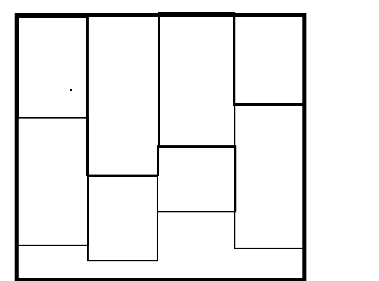 .
.
How can i implement the same? Please help me.
 693
693
The only way to do this with Bootstrap "out-of-the-box" would be to use 4 columns and stack the items in each. This isn't ideal for dynamic content when you don't know how many items you'll have in each column. Also the items order top-to-bottom, and not left-to-right.
<div class="container-fluid"> <div class="row"> <div class="col-md-3"> <!--item1--> <!--item2--> <!--item3--> <!--item4--> </div> <div class="col-md-3"> <!--item5--> <!--item6--> <!--item7--> <!--item8--> </div> <div class="col-md-3"> <!--item--> <!--item--> <!--item--> </div> <div class="col-md-3"> <!--item--> <!--item--> <!--item--> <!--item--> <!--item--> </div> </div> </div> Jquery plugin method
Bootstrap Masonry Demo
Bootstrap Masonry Demo 2
CSS3 columns method (Masonry-like CSS solution)..
This is not native to Bootstrap 3, but another approach using CSS multi-columns. One downside to this approach is the column order is top-to-bottom instead of left-to-right.
CSS3 multi-columns Demo
There is also more detailed info in this answer to a similar question.
Bootstrap 4 includes a Masonry-like solution using CSS3 multi-columns: Masonry cards Demo
116
If you love us? You can donate to us via Paypal or buy me a coffee so we can maintain and grow! Thank you!
Donate Us With

