 Menu
Menu
I want a Bootstrap column to resize buttons nicely when the screen type changes. But the buttons end up with no space between them and and two separate lines (on the small screen).
How do I get them to resize into smaller buttons, and not split onto a new line?

<link href="https://maxcdn.bootstrapcdn.com/bootstrap/3.3.6/css/bootstrap.min.css" rel="stylesheet"/>
<div class="container-fluid">
<div class="row">
<div class="col-md-8 col-md-offset-2">
<div class="panel panel-default">
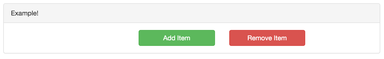
<div class="panel-heading">Example!</div>
<div class="panel-body">
<div class="form-group">
<div class="col-xs-3 col-xs-offset-4">
<a href="#" class="btn btn-success btn-block" role="button">Add Item</a>
</div>
<div class="col-xs-3">
<a href="#" class="btn btn-danger btn-block" role="button">Remove Item</a>
</div>
</div>
</div>
</div>
</div>
</div>
</div>
 276
276
If you want the same styling for small devices as well as large devices, you can omit the md styling and just use sm. If the width get's really small, you can remove the offset and use that gained width on the elements instead on xs widths.
To fix the buttons being cut off, remove the btn-block class.
Demo
<link href="https://maxcdn.bootstrapcdn.com/bootstrap/3.3.6/css/bootstrap.min.css" rel="stylesheet"/>
<div class="form-group">
    <div class="col-sm-3 col-sm-offset-3 col-xs-6">
        <a href="#" class="btn btn-success" role="button">Add Item</a>
    </div>
    <div class="col-sm-3 col-xs-6">
        <a href="#" class="btn btn-danger" role="button">Remove Item</a>
    </div>
</div>
As a side note, if you want the buttons to be centered here, use offset 3 instead of 4.
121
If you love us? You can donate to us via Paypal or buy me a coffee so we can maintain and grow! Thank you!
Donate Us With