 Menu
Menu
This question was already asked here but this don't work because of the Javascript. So in the provided answer only the CSS was changed but not the JS, which means the content of the nav bar is still visible while the toggler is not. Any solution?
Edit:
My question is how to change the breakpoint of the nav bar in Bootstrap 4.xx
 888
888
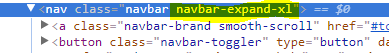
Bootstrap provide an easy way to work with menus. You can use navbar-expand-xl, navbar-expand-lg, navbar-expand-md etc according to your needs.
Thanks
23
Bootstrap 5.0
Bootstrap 5 still uses the navbar-expand* classes to determine the Navbar's collapse breakpoint. There is now an additional navbar-expand-xxl class.
Bootstrap 5 - Navbar Tiers
Bootstrap 4.0.0
Changing the navbar breakpoint is easier in Bootstrap 4 using the navbar-expand-* classes. If you exclude navbar-expand-* the mobile menu will be used at all widths. Here's a demo of all 6 navbar states: Bootstrap 4 - Navbar Tiers
Also see: Change bootstrap navbar collapse breakpoint without using LESS
94
I override the .navbar-expand-lg in native CSS.
Here is the example code:
    @media (min-width: *desired break point here){
.navbar-expand-lg {
    -ms-flex-flow: row nowrap !important;
    flex-flow: row nowrap !important;
    -ms-flex-pack: start !important;
    justify-content: flex-start !important;
  }
  .navbar-expand-lg .navbar-nav {
    -ms-flex-direction: row !important;
    flex-direction: row !important;
  }
  .navbar-expand-lg .navbar-nav .dropdown-menu {
    position: absolute !important;
  }
  .navbar-expand-lg .navbar-nav .nav-link {
    padding-right: 0.5rem !important;
    padding-left: 0.5rem !important;
  }
  .navbar-expand-lg > .container,
  .navbar-expand-lg > .container-fluid {
    -ms-flex-wrap: nowrap !important;
    flex-wrap: nowrap !important;
  }
  .navbar-expand-lg .navbar-collapse {
    display: -ms-flexbox !important;
    display: flex !important;
    -ms-flex-preferred-size: auto !important;
    flex-basis: auto !important;
  }
  .navbar-expand-lg .navbar-toggler {
    display: none !important;
  }}
If you love us? You can donate to us via Paypal or buy me a coffee so we can maintain and grow! Thank you!
Donate Us With


