 Menu
Menu
This is probably a rookie question however, I cannot seem to find any solution to the problem that I am having. On my website I have a background image that renders totally fine on desktop at any screen size but becomes a blurred mess when viewed on mobile. I have seen several similar questions with either no answers or a solution that did not work for me any help would greatly be appreciated.
Here is the website
Here are some screenshots of what I am experiencing. 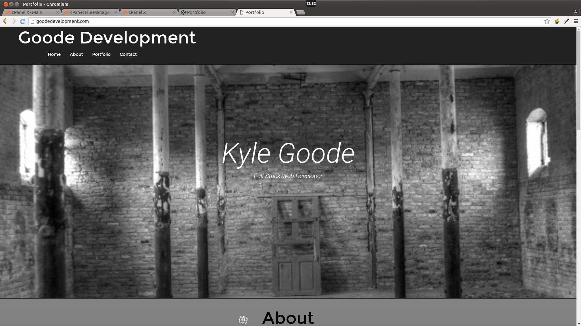
 And here is my code.
<div class="jumbotron">
        <h1 class="text-center" id="head">Kyle Goode</h1>
        <p class="text-center" id="header">Full Stack Web Developer</p>
      </div>
  </div>
  .home {
  background: url(http://mrg.bz/VN5LDd) fixed no-repeat center;
  background-attachment: fixed;
  background-size: cover !important;
  max-width: 100%;
  height: 900px;
  border-top: 1px solid black;
  border-bottom: 1px solid black;
}
 766
766
EDIT: Valentino Kožinec is correct. Appears to be an iOS issue with fixed and cover.
Change .home to this:
.home {
  background: url(http://mrg.bz/VN5LDd) no-repeat center;
and remove
background-attachment: fixed;
It seems to work.
You have Doctype and head tags, then inside your body you have them again. This may be causing your issues. Worth a look.
This is copied and pasted here from your site:
    <!DOCTYPE html>
<html >
  <head>
    <meta charset="UTF-8">
    <title>Portfolio </title>
    <meta name="viewport" content="width=device-width, initial-scale=1">


        <link rel="stylesheet" href="css/style.css">


  </head>

  <body>

    <!DOCTYPE html>
<html lang="en">

<head>

  <!--Meta -->
  <title>Goode Web Development</title>

  <meta charset="utf-8">

  <meta name="viewport" content="width=device-width, initial-scale=1">

  <link rel="stylesheet" href="https://maxcdn.bootstrapcdn.com/font-awesome/4.6.1/css/font-awesome.min.css">

<link rel="stylesheet" href ="https://maxcdn.bootstrapcdn.com/bootstrap/3.3.6/css/bootstrap.min.css">


  <link href='https://fonts.googleapis.com/css?family=Montserrat:700,400' rel='stylesheet' type='text/css'>

  <link href='https://fonts.googleapis.com/css?family=Roboto:300italic' rel='stylesheet' type='text/css'>

 <script   src="https://code.jquery.com/jquery-2.2.4.min.js"   integrity="sha256-BbhdlvQf/xTY9gja0Dq3HiwQF8LaCRTXxZKRutelT44="   crossorigin="anonymous"></script>

  <script src="https://maxcdn.bootstrapcdn.com/bootstrap/3.3.6/js/bootstrap.min.js" integrity="sha384-0mSbJDEHialfmuBBQP6A4Qrprq5OVfW37PRR3j5ELqxss1yVqOtnepnHVP9aJ7xS" crossorigin="anonymous"></script>


 </head>
There is similar answer on stack already,
you probably have issue with background-position: fixed and background-size: cover while using them together. Try to remove first one and see if problem is still there.
You can probably than make media queries for .home class and put cropped image or other workaround.
45
If you love us? You can donate to us via Paypal or buy me a coffee so we can maintain and grow! Thank you!
Donate Us With


