 Menu
Menu
I'm new to AngularJS so please bear with me. I'm using Angular Material Design and I have difficulties in identifying a way to efficiently do responsive grids.
Please see my comments in the code below:
    <div layout="row">
<div layout="row" flex="75" layout-sm="column" class="ptn-info-grid" layout-margin> <!-- USING ROW FOR DESKTOP AND COLUMN FOR MOBILE DEVICES -->

    <div layout="column" flex="66"> <!-- I want this div occupy 2/3 of screen in Desktop but change to 100 in mobile devices (but stays in 66) -->


        <div layout="row" layout-sm="column">
            <div class="ptn-info-grid-item" flex>1</div>
            <div class="ptn-info-grid-item" flex>2</div>
        </div>

        <div layout="row" layout-sm="column">
            <div class="ptn-info-grid-item" flex>3</div>
            <div class="ptn-info-grid-item" flex>4</div>
        </div>

    </div>

    <div layout="column" flex="32"> <!-- I want this div occupy 1/3 of screen in Desktop but change to 100(which actually happens) in mobile devices. Im not using 33 because while using margin for child elements this div goes out of the parent div a little. -->
        <div class="ptn-info-grid-item" flex style="margin-left: 0px;">Right Long
        </div>
    </div>

</div>
<div layout="row" flex="25" id="customer-phone-img"></div>
But changing the above flex values from "flex=66" and "flex=32" to simply flex and flex, gives me desired result in mobile devices, however as you would know, in desktop, instead of the 2:1 ratio its occupying half and half.
Please also see attached images.
Expected
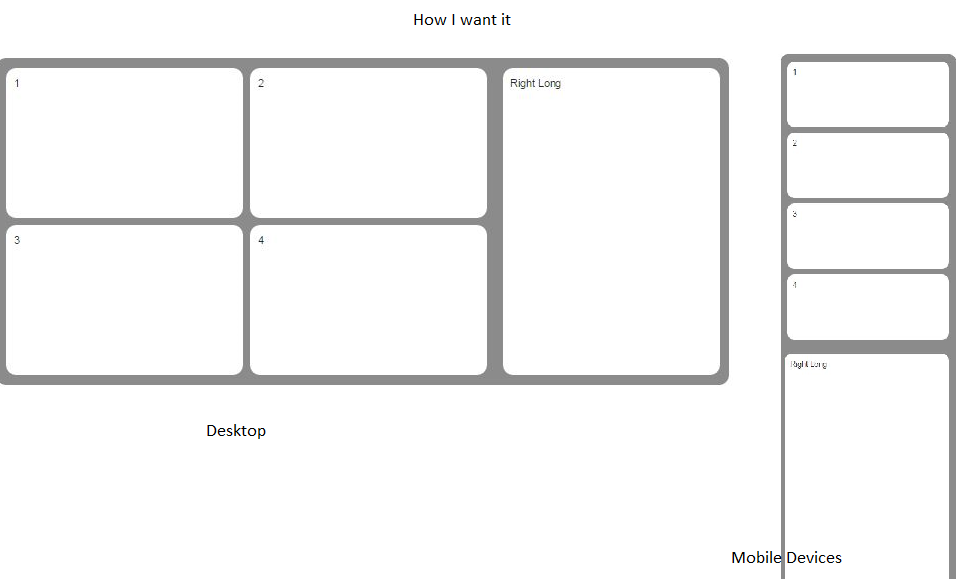
(source: sprintu.com)
How it is
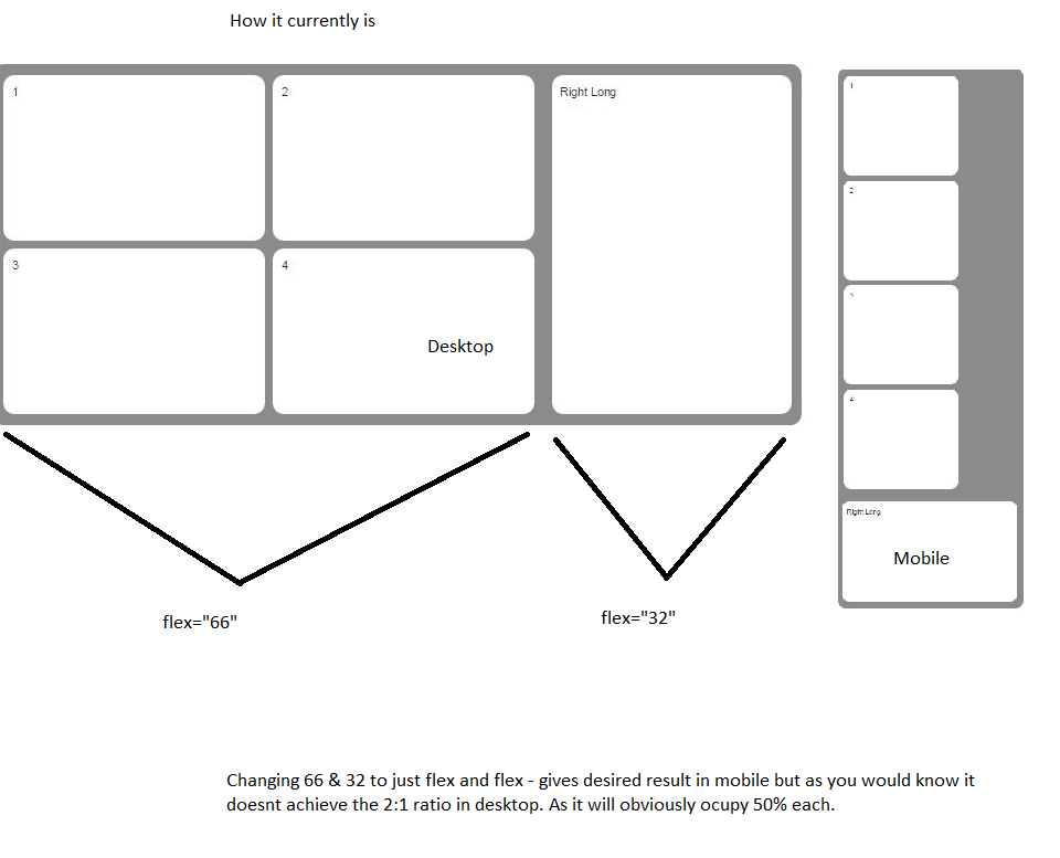
(source: sprintu.com)
So I'm looking for a way to change the flex value for smaller screens (for when layout-sm is applied - change flex=66 to flex=100).
 486
486
Check out the "Responsive Flex & Offset Attributes" section here: https://material.angularjs.org/#/layout/options
Basically, you can use these options:
So change your:
<div layout="column" flex="66">
to
<div layout="column" flex-gt-sm="66">
And that div will only use the 66 width when greater than small (mobile)
71
If you love us? You can donate to us via Paypal or buy me a coffee so we can maintain and grow! Thank you!
Donate Us With

