 Menu
Menu
I have the following html:
<div class="main_container">
    <div class="sub_container">
        <div class="floating">wookie1</div>
        ...
        <div class="floating">wookie5</div>
    </div>
</div>
Consider it's like an image gallery.
main_container has an unfixed size, it's set as a percentage of the user resolution. I want sub_container to have the exact width of the sum of the floating div.
If I use "display:table;" for sub_container and "display: inline-block;" for floating divs, it works fine:
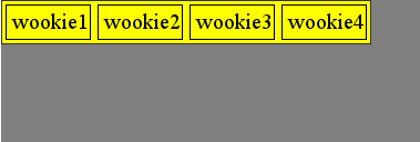
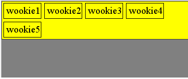
until I have enough div in the list, so that the sum of width is larger than main_container and they break on the next line:
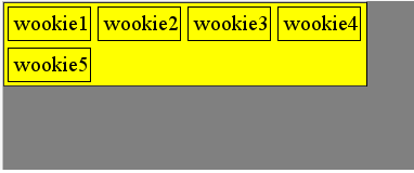
But still, I want subcontainer (yellow background) to to be ALWAYS the EXACT WIDTH of the sum of the divs, even when they go on several lines, like this:
I've googled for hours now, and wasn't able to find an elegant solution (css only, if possible.)
Here's the jsfiddle, to play with this.
 864
864
The problem is that for the items to "know" to wrap to the next line, the container has to have "filled" its available horizontal space, which is your .main_container width. Yet you want the background to not go beyond what is needed for the actual elements themselves. So I've used the elements themselves to create the background with the help of cobbled together pseudo-elements.
Here's the fiddle (tested in IE9, Firefox 18, Chrome 24 on a Win 7 machine)
What I am doing is piecing together the background with each individual .floating element, which makes the right most element to be the right border control for the size of the background (note the two different width examples in the fiddle).
The explanation of each part is given in the comments below. There are a two key limitations to note:
.floating cannot have a position set, so that is a potential limitation based on particular application.background needs to be either a solid color or purely vertical oriented "motion" (i.e. a gradient fading from top to bottom, or horizontal lines would work).KEY CSS (with explanatory comments)
.sub_container {
    border-left: 1px solid #333; /* forms its own left border */
    overflow: hidden; /* needed for background and border to work */
    position: relative; /* positioning background off this */
    z-index: 1; /* needs a stacking context */
}

.floating {
    font-size:20px;
    line-height:30px;
    padding:0 5px 0 5px;
    border: 1px solid black;
    margin: 3px;
    display: inline-block;
    /* NOTE: CANNOT be given positioning  */
}

.floating:after {
    content: '';
    position: absolute; /* will position off subcontainer */
    border-top: 1px solid black; /* makes the top/bottom border itself */
    border-bottom: 1px solid black;
    z-index: -1; /* push it to the background */
    top: 0; /* set it to top of sub_subcontainer */
    bottom: 0; /* set it to bottom of sub_container */
    margin-left: -100%; /* shove it past the far left edge of sub_container */
    /* next, use padding to bring it back to its position at the end
       of the text string of .floating */
    padding-left: 100%;
    /* next, add enough padding on the right to compensate for the right
       padding, right margin, and right border of .floating */
    padding-right: 9px;
    background-color: yellow; /* set your background color */
    /* NOTE: this will not work with a background image that
       has any horizonal differences to it (top to bottom
       gradient would probably be okay) */
}

.floating:before { /* make right border */
    content: '';
    padding-top: 10000px; /* give it some obscene height that will not be exceeded */
    margin: -5000px 0; /* counter the padding height by half size margins top/bottom */
     /* next, push this behind the background with an even lower z-index
        to hide it if it is not the right most element beign used to
        form the right border */
    z-index: -2;
    border-right: 1px solid black; /* make the right border */
    float: right; /* get the before element to the right */
    position: relative; /* needs to be adjusted in position */
    right: -9px; /* move it same as padding-right of the after element */
    display: block; /* give it a display */
}
If you love us? You can donate to us via Paypal or buy me a coffee so we can maintain and grow! Thank you!
Donate Us With

