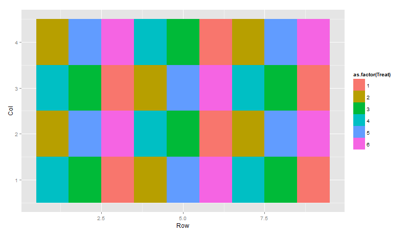
When I make an experimental design, I use ggplot to show the layout. Here's a simple example:
df <- data.frame(Block=rep(1:2, each=18),
            Row=rep(1:9, 4),
            Col=rep(1:4, each=9),
            Treat=sample(c(1:6),replace=F))
Which I'll plot like:
df.p <- ggplot(df, aes(Row, Col)) + geom_tile(aes(fill=as.factor(Treat)))
to give:
Sometimes I have a structure within the design I would like to highlight by putting a box around it, for example a mainplot. In this case:
df$Mainplot <- ceiling(df$Row/3) + 3*(ceiling(df$Col/2) - 1)
I then use geom_rect and some messy code that needs adjusting for each design to generate something like:
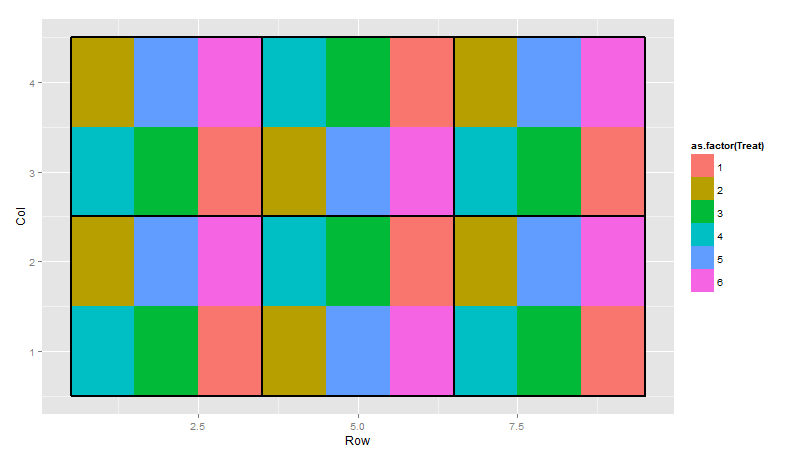
Question: How do I add the rectangles around the mainplots in a simple way? It seems like a simple enough problem, but I haven't found an obvious way. I can map colour or some other aesthetic to mainplot, but I can't seem to surround them with a box. Any pointers greatly appreciated.
Here is a possible solution where I create an auxiliary data.frame for plotting borders with geom_rect(). I'm not sure if this is as simple as you would like! I hope the code that computes the rectangle coordinates will be reusable/generalizable with just a bit of additional effort.
library(ggplot2)

# Load example data.
df = data.frame(Block=rep(1:2, each=18),
            Row=rep(1:9, 4),
            Col=rep(1:4, each=9),
            Treat=sample(c(1:6),replace=F))
df$Mainplot = ceiling(df$Row/3) + 3*(ceiling(df$Col/2) - 1)

# Create an auxiliary data.frame for plotting borders.
group_dat = data.frame(Mainplot=sort(unique(df$Mainplot)),
                       xmin=0, xmax=0, ymin=0, ymax=0)
# Fill data.frame with appropriate values.
for(i in 1:nrow(group_dat)) {
    item = group_dat$Mainplot[i]
    tmp = df[df$Mainplot == item, ]
    group_dat[i, "xmin"] = min(tmp$Row) - 0.5
    group_dat[i, "xmax"] = max(tmp$Row) + 0.5
    group_dat[i, "ymin"] = min(tmp$Col) - 0.5
    group_dat[i, "ymax"] = max(tmp$Col) + 0.5
}


p2 = ggplot() +
     geom_tile(data=df, aes(x=Row, y=Col, fill=factor(Treat)),
               colour="grey30", size=0.35) +
     geom_rect(data=group_dat, aes(xmin=xmin, xmax=xmax, ymin=ymin, ymax=ymax),
               size=1.4, colour="grey30", fill=NA)

ggsave(filename="plot_2.png", plot=p2, height=3, width=6.5)

Here's a solution that might be a easier. Just use geom_tile with alpha set to 0. I didn't take the time to give you an exact solution, but here's an example. To achieve what you want I'm guessing you'll need to actually create a new data frame, which should be easy enough.
df <- data.frame(Block=rep(1:2, each=18),Row=rep(1:9, 4),Col=rep(1:4, each=9),Treat=sample(c(1:6),replace=F))
df$blocking <- rep(sort(rep(1:3,3)),4)
df.p <- ggplot(df, aes(Row, Col)) + geom_tile(aes(fill=as.factor(Treat)))
df.p+ geom_tile(data=df,aes(x=Row,y=blocking),colour="black",fill="white",alpha=0,lwd=1.4)
the alpha=0 will create a blank tile, and then you can set the line width using lwd. That's probably easier than specifying all the rectangles. Hope it helps.
If you love us? You can donate to us via Paypal or buy me a coffee so we can maintain and grow! Thank you!
Donate Us With


