 Menu
Menu
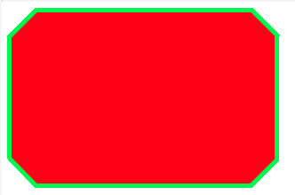
I need to add borders to this "shape". It's kinda difficult because the shape is made with the after and before pseudo-elements. I can't find the right way.
What I need to achieve:
The code I have so far:
https://jsfiddle.net/jimmyadaro/xfcjfz3d/
#octagon {
    width: 300px;
    height: 200px;
    background: red;
    position: relative;
    -webkit-box-sizing: content-box;
    -moz-box-sizing: content-box;
    box-sizing: content-box;
    display: block;
}

#octagon:before,
#octagon:after {
    content: "";
    position: absolute;
    left: 0;
    right: 0;
}

#octagon:before {
    top: 0;
    border-bottom: 30px solid red;
    border-left: 30px solid #fff;
    border-right: 30px solid #fff;
}

#octagon:after {
    bottom: 0;
    border-top: 30px solid red;
    border-left: 30px solid #fff;
    border-right: 30px solid #fff;
}

<div id="octagon"></div>
I tried with shadows and outlines without success.
Thanks for reading.
Note: I'll use a solid background color, if that matters.
 838
838
Here's my solution. No solid background color is required. This may or may not suit your actual use case.
JSFiddle
#octagon {
    display: flex;
    justify-content: center;
    align-items: center;

    width: 300px;
    height: 200px;
    overflow: hidden;
    position: relative;
}

#octagon:before,
#octagon:after {
    content: "";
    display: block;
    width: 300px;
    padding-top: 100%;
    position: absolute;
    top: 50%;
    left: 50%;
    transform: translate(-50%, -50%) rotate(45deg);
    z-index: -1;
}
#octagon:before {
    background: red;
}
#octagon:after {
    background:
        linear-gradient(
    		45deg,
	    	#0e0 calc(50% - 150px + 10px), transparent 0,
    		transparent calc(50% + 150px - 10px), #0e0 0%),
    	linear-gradient(
    		-45deg,
    		#0e0 calc(50% - 100px + 10px), transparent 0,
    		transparent calc(50% + 100px - 10px), #0e0 0);
    box-shadow: 0 0 0 10px #0e0 inset;
}
<div id="octagon">Hello World!</div>Well, this is the only way I could think of approaching it in pure CSS:
JSfiddle here: https://jsfiddle.net/xfcjfz3d/7/
body {
    background:#fff;
}

#octagon {
  position:relative;
	width: 300px;
	height: 200px;
	background: green;
	position: relative;
	-webkit-box-sizing: content-box;
	-moz-box-sizing: content-box;
	box-sizing: content-box;
	display: block;
}

#octagon:before,
#octagon:after {
	content: "";
	position: absolute;
	left: 0;
	right: 0;
}

#octagon:before {
	top: 0;
	border-bottom: 30px solid green;
	border-left: 30px solid #fff;
	border-right: 30px solid #fff;
}

#octagon:after {
	bottom: 0;
	border-top: 30px solid green;
	border-left: 30px solid #fff;
	border-right: 30px solid #fff;
}

.tall {
  position:absolute;
  background:red;
  width:230px;
  height:190px;
  left:35px;
  top:5px;
  z-index:1;
}

.wide {
  position:absolute;
  background:red;
  width:290px;
  height:130px;
  left:5px;
  top:35px;
  z-index:1;
}

.corner {
  position:absolute;
  background:red;
  width:45px;
  height:43px;

  z-index:1;
  transform: rotate(45deg);
}

.topleft {
  left:14px;
  top:14px;
}

.topright {
  //background:black;
  left:241px;
  top:13px;
}

.bottomleft {
  background:red;
  left:13px;
  top:143px;
}

.bottomright {
  background:red;
  left:241px;
  top:143px;
}
<div id="octagon">
<div class="tall"></div>
<div class="wide"></div>
<div class="corner topleft"></div>
<div class="corner topright"></div>
<div class="corner bottomleft"></div>
<div class="corner bottomright"></div>
</div>If you love us? You can donate to us via Paypal or buy me a coffee so we can maintain and grow! Thank you!
Donate Us With