 Menu
Menu
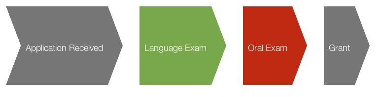
I want to achieve the following shapes using pure CSS, no images.

I've come to the following point.
Here is the HTML structure:
<div class="sixteen columns">
    <div id="applicationStatus">
        <ul>
            <li class="applicationStatus">Application Received</li>
            <li class="applicationStatusGood">Language Exam</li>
            <li class="applicationStatusNoGood">Oral Exam</li>
            <li class="applicationStatus">Grant</li>
        </ul>
    </div>
</div>
And here is the CSS:
#applicationStatus {
  position: relative;
  width: auto;
  height: 140px;
  left: 40px; }

ul.applicationStatus {
  list-style: none; }

li.applicationStatus, li.applicationStatusGood, li.applicationStatusNoGood {
  height: 140px;
  background-color: #767676;
  display: inline-block;
  /* Dirty IE Hack */
  zoom: 1;
  *display: inline;
  margin-right: 30px;
  margin-left: 30px;
  padding: 10px;
  color: white;
  font-size: 18px;
  text-align: center;
  line-height: 150px;
  /*        vertical-align: middle; */ }
  li.applicationStatus:after, li.applicationStatusGood:after, li.applicationStatusNoGood:after {
    content: "";
    position: absolute;
    width: 0;
    height: 0;
    border-top: 80px solid transparent;
    border-left: 30px solid #767676;
    border-bottom: 80px solid transparent;
    margin: -10px 90px 0 10px; }
  li.applicationStatus:before, li.applicationStatusGood:before, li.applicationStatusNoGood:before {
    content: "";
    position: absolute;
    width: 0;
    height: 0;
    left: 0px;
    border-top: 80px solid transparent;
    border-left: 30px solid white;
    border-bottom: 80px solid transparent;
    margin: -10px 0px 0 0px; }
  li.applicationStatus:first-child, li.applicationStatusGood:first-child, li.applicationStatusNoGood:first-child {
    margin-left: 0px;
    text-indent: 30px; }
  li.applicationStatus:last-child, li.applicationStatusGood:last-child, li.applicationStatusNoGood:last-child {
    border-top: 0px solid transparent;
    border-left: 0px solid transparent;
    border-bottom: 0px solid transparent; }

li.applicationStatusGood {
  background-color: #77a942; }
  li.applicationStatusGood:after {
    border-left: 30px solid #77a942; }

li.applicationStatusNoGood {
  background-color: #c42c00; }
  li.applicationStatusNoGood:after {
    border-left: 30px solid #c42c00; }
Why doesn't the :before selector apply to all of the shapes or all in all how can I achieve what I want?
 954
954
Arrows. To create a simple arrow without a tail, make a box with a width and height, border, as well as zero left and top borders. To make an up arrow, add the transform: rotate(225deg); property, and to make a down arrow, add the transform: rotate(45deg); property to rotate the arrow to 225 and 45 degrees respectively ...
The main issue you faced was not having position: relative on your li elements. But there were other things that needed tweaking too.
Here is a fiddle example to see.
I added the class you failed to reference in your HTML above to the ul element, so here is the HTML:
<div class="sixteen columns">
    <div id="applicationStatus">
        <ul class="applicationStatus">
            <li class="applicationStatus">Application Received</li>
            <li class="applicationStatusGood">Language Exam</li>
            <li class="applicationStatusNoGood">Oral Exam</li>
            <li class="applicationStatus">Grant</li>
        </ul>
    </div>
</div>
Then I modified your CSS a bit to condense it (could be more condensed if CSS3 only was being supported):
#applicationStatus {
  position: relative;
  width: auto;
  height: 140px;
  left: 40px; }

.applicationStatus li { /* Added this and moved much code to here */
  position: relative; /* this was a key property missing from your code */
  text-indent: 30px;
  height: 140px;
  background-color: #767676;
  display: inline-block;
  /* Dirty IE Hack */
  zoom: 1;
  *display: inline;
  /* margin-right: 30px; Eliminated this */
  margin-left: 30px;
  padding: 10px 10px 10px 30px; /* tweaked this */
  color: white;
  font-size: 18px;
  text-align: center;
  line-height: 150px;
}

ul.applicationStatus { /* this was irrelevant with the HTML you gave, but I added the class to the ul */
  list-style: none; }

/* tweaked various things below here */

li.applicationStatus:first-child:after, li.applicationStatusGood:after, li.applicationStatusNoGood:after {
    content: "";
    position: absolute;
    width: 0;
    height: 0;
    border-top: 80px solid transparent;
    border-left: 30px solid #767676;
    border-bottom: 80px solid transparent;
    margin: -10px 90px 0 10px;
}
li.applicationStatus:last-child:before, li.applicationStatusGood:before, li.applicationStatusNoGood:before {
    content: "";
    position: absolute;
    width: 0;
    height: 0;
    left: 0;
    border-top: 80px solid transparent;
    border-left: 30px solid white;
    border-bottom: 80px solid transparent;
    margin: -10px 0px 0 0px;
}

li.applicationStatus:first-child {
    padding-left: 10px;
    margin-left: 0;
}
li.applicationStatus:last-child {
    padding-right: 30px;
}

li.applicationStatusGood {
  background-color: #77a942; }
  li.applicationStatusGood:after {
    border-left: 30px solid #77a942; }

li.applicationStatusNoGood {
  background-color: #c42c00; }
  li.applicationStatusNoGood:after {
    border-left: 30px solid #c42c00; }
If you love us? You can donate to us via Paypal or buy me a coffee so we can maintain and grow! Thank you!
Donate Us With